Table of Contents
Introduction
Colors have been a vital element in our world, both in nature and in man-made architectural structures. Color always played an important role in human evolution, to help in developing feelings and emotions. Color in architecture helps create a perception of the general environment of the space. Our brain has a way to process and judge the emotional purpose of the type of space that is being portrayed.
There are many renowned Architects and astonishing architectural structures all over the world known for their vivid and bold use of color, attracting people and triggering various emotions in them, and helping them experience and feel them.
Importance of Colors in Architecture

Color is a sensory experience; hence, its influences are very emblematic, associatory, synesthetic, and emotional. The body and mind are a whole due to which neuropsychological aspects, psychosomatic effects, visual aspects, and color psychological effects are the factors of color in terms of design comfort.
Color is incorporated into the designed considerations that demand adherence to take care of human psychological and physiological well-being within their artificial environment or structures created by humans. Differing from the use of colors, a building environment also can become under-stimulated or over-stimulated. Using color is an important factor only for humans psychologically, but is a way to create a statement all over the world.
7 Architects who love using color in their designs
Antoni Gaudi
Casa Vicens
The Casa Vicens, on 24 Carolines Street, was the first house designed by Spanish architect Antoni Gaudí. In 1883, Manel Vicens commissioned Antoni Gaudí to build as his summer home. Then known as Gràcia, now a cosmopolitan neighborhood, was a separate town. Colors were mostly drawn from nature, mythology, religion, and the culture of Barcelona. Antoni Gaudí’s remarkable use of colors like blue, red, white, green, yellow, etc. is clear in the polychromatic tile, brick, and stonework in projects.
Casa Batlló
Casa Batlló is a structure in the center of Barcelona. It was designed by Antoni Gaudí and is believed to be one of his masterpieces. Antoni Gaudí explored fluid shapes, patterns, and colors in the Casa Batlló, designed for the wealthy cotton tycoon Josep Batlló as a jolting contradiction to the rigid forms around it. Gaudi redesigned a remodel of a formerly built house in 1904 by Gaudí and had been refurbished numerous times after that. Domènec Sugrañes, Josep Canaleta and Joan Rubió, Gaudí’s assistants who also helped with the renovation of Casa Batlló.
The concept was drawn from Antoni Gaudí’s blend of animal shapes, curves of the vines, traces of bone and skeleton, and his use of lustrous colored bits of glazed ceramic of warmer colors like white, yellow, orange, and red and glass to produce a masterpiece.
Theo van Doesburg
Café l’Aubette
Theo van Doesburg was a self-educated artist and architect who was one of the major proponents of De Stijl. Theo van Doesburg used his concepts about bold colors with dynamism in the spaces that were designed in collaboration. The De Stijl movement commenced by an association of painters, sculptors, artists, and architects in the Netherlands in 1917. The Beaux art school dominated Western design in the 19th century, rejecting the decorative and spatial belief, participants of the movement instead advocated for the relative purity of abstraction.
Using several surfaces and planes in the space helped Theo van Doesburg to work with distinct tones, contrasting faces, horizontal and vertical components, and geometry. Especially the use of bold primary colors that became a statement in terms of abstraction and purity.
Luis Barragán
Casa Gilardi

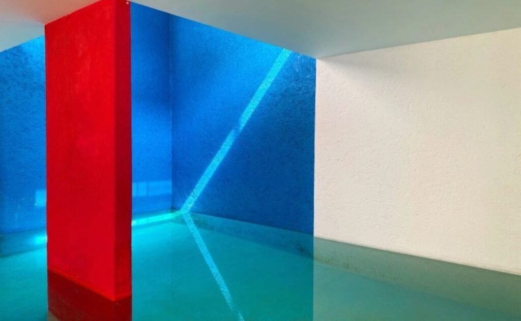
This Casa Gilardi was designed just like a house, enhancing the facades, and adding natural elements like light and water. The dark, bold Mexican hues of red, blue, and yellow convey the cultural respect Luis Barragán has for his works. Casa Gilardi was constructed around an existing tree and was strongly influenced by painters; this was one of their most colorful works of his.
Luis Barragán has worked along a lot of contemporary concepts and kept in mind the environmental considerations. The colors, textures, compositional components are a result of Mexican culture. The inspiration of painters such as Diego Rivera and Frida Kahlo, but particularly in this house.
Peter Cook
Departments Of Law and Central Administration
Peter Cook of Robotham Architectural Bureau has won the inauguration Colour Prize at World Architecture Festival 2014 for its Departments of Law and Central Administration, Vienna University of Economics and Business project in Austria. The award then was first of its kind, the only criterion for the use of color as an essential part of the exterior of the design.
The Departments of Law and Central Administration has given a boost in the trend of using color, helping to add push for the recently launched Human Cities initiative, where color plays as one of its main design elements. Colour Futures emphasizes AkzoNobel’s wealth of color proficiency and profound understanding of the evolutionary power of color.
Ricardo Bofill
La Muralla Roja
La Muralla Roja, Spanish for ‘The Red Wall,’ is a housing project in La Manzanera in Spain’s Calpe. The project makes strong references to the famous architecture of the Arab Mediterranean Area because the architects inspire the Mediterranean tradition of the casbah. The striking red color that completely washes the outer and inner facades was selected to appreciate contrast with nature and balance its purity.

Kafka Castle
El Castillo de Kafka is an iconic complex of 90 apartments in Sant Pere de Ribes, near Sitges in Catalonia, Spain. It was designed by Ricardo Bofill Taller de Arquitectura and was completed in 1968. Ricardo Bofill, a Spanish Postmodern architect, was known for apartment buildings as memorable as well as thought-provoking. El Castillo de Kafka is a swelling mass of purple cubes and mind-baffling angles, boldness, and a refreshing break from any standard or global tradition.
Michael Graves

St. Coletta was founded in 1959 by a couple with a child diagnosed with Down Syndrome. The couple had to deal with the struggle to find a proper educational system that worked for their child. Hence, they opted to establish the school as a special education environment that helped to service and educate children with severe or multiple disabilities. The use of bright colors and simple forms by Michael Graves makes it very comfortable and fitting for the children that are going to use the building, as it is exciting, lively, and appealing.
Few examples of a few colorful structures
Kuggen Building by Wingårdh Arkitektkontor
Kuggen building is owned by a real estate company, Chalmersfastigheter, for the Chalmers University of Technology in Gothenburg, Sweden, designed by Wingårdh Arkitekt Kontor. Kuggen, in Swedish, means cogwheel similarly the building is cylindrical, a distinctive structure with rotating exteriors, in the middle of the town square is an urban planning pattern with roots in the Italian Renaissance.
A rotating screen shades the top floors are brocade of glazed terracotta panels of vivid colors, takes on different appearances differing for different viewing angles which also change according to daylight conditions. The red colors refer to the industrial paint that was strongly associated with the wharves and the harbor. There is also a contrasting green patch influenced by an autumn leaf. These details change the building’s aura from one side to another, and over the day.
BioMuseo by Frank Gehry
Biomuseo is a museum concentrating on the natural history of Panama, whose bridge was formed currently in geologic time, with the major influence being on the ecology of the Western Hemisphere. Biomuseo is on the Amador Causeway in Panama City, Panama, it was designed by renowned architect Frank Gehry.
The Biomuseo aimed to offer an impressive and informative experience regarding the biodiversity and emergence of the isthmus in Panama to encourage all Panamanians to learn and value this natural component of their identity. Hence, the vivid use of colors was incorporated into the design to attract international attention.
Santa Monica Civic Parking Garage by Moore Ruble Yudell Architects & Planners

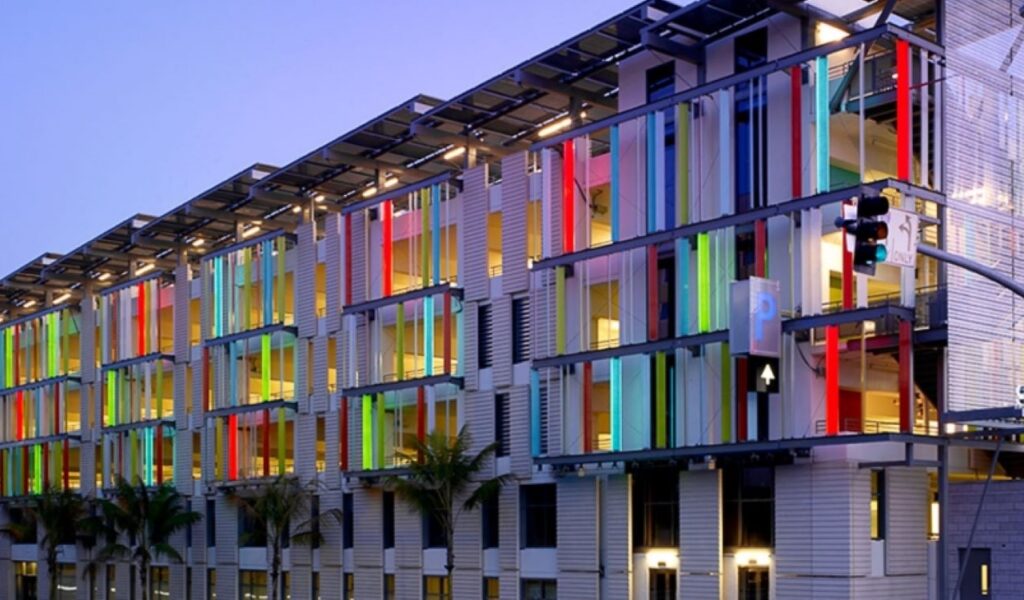
A Civic Gateway completed a Master Plan for the Civic Center in Santa Monica, where California defined a new civic gateway at Fourth Street and the new Olympic Drive to the latest district that comprises the renovated historic City Hall and Courthouse and the new Public Safety Building.
The Santa Monica Civic Parking structure is the first LEED® certified building in the United States. Monica Civic Parking has photovoltaic panels on the roof, east and west facades help provide for most of the building’s energy requirements. The design uses components such as canopies and photovoltaic panels to assist with self-shading panels to reduce heat spots.
Netherlands Institute for Sound and Vision by Willem Jan Neutelings and Michiel Riedijk
The Netherlands Institute for Sound and Vision was devised as an ideal cube, where half of it seems to be buried underground. Netherlands Institute for Sound and Vision residences broadcasting documents, offices, and a museum, creating it a cultural attraction for the city of Hilversum. The Netherlands Institute for Sound and Vision is a structure wrapped in a skin of colorful cast-glass panels with a mixture of bold and vibrant colors.
Conclusion
Color has always played an important role or is said to be one of the key elements of designing. Applying colors in design not only helps to make a statement but has various other benefits as it helps to define depths and meaning in structure. Use of color to mold a dynamic surrounding, especially in terms of urban planning and designing.
Using colors in architecture also displays its cultural significance in the geographical location. Colors, textures, materials help make architectural features more prominent and beautiful. Color used also helps to experiment with new materials as well as elements to create various textures, illusions, and emphasis in a structure. Architects and designers are now breaking the traditional norms and use of colors, making bolder choices to make an impact.

