Author: Dikshya Pattnaik

  • Historic Hotels: Examples of World’s Popular Hotels

    Historic Hotels: Examples of World’s Popular Hotels

    Introduction

    The word hotel is derived from the French hotel, which refers to a French version of the townhouse. The term hotel was used for the first time by the fifth Duke of Devonshire to name a lodging property in London in AD 1760. The precursor to the modern hotel was the inn of medieval Europe. For a period of about 200 years from the mid-17th century, coaching inns served as a place for lodging for coach travellers. Inns catered to rich clients in the mid-18th century.

    Many of us may argue that traveling is more about experiencing a city than it is about enjoying the hotel, but some would beg to differ. After all, a hotel, whether it’s a boutique architectural relic with only 20 guest rooms, or a sprawling space boasting over one resident restaurant, has much more to offer than simply a place to spend the night. There’s something refreshing and even grounding about living within walls that has been standing for centuries. Luckily, there’s no shortage of historic hotels across the world.

    Examples of Historic Hotels

    Hamilton Hotel, D.C, USA

    Historic hotels
    Source

    Brief

    Hamilton Hotel Washington, D.C., an iconic landmark in the heart of downtown D.C. with a modern approach to hospitality. Famed 14th Street, the Hamilton Hotel, a classic European structure with a distinctly American presence, has stood the test of time. Stood in 1851, the stately brick building served as a private school, but only a few years later, Admiral Horatio Bridge purchased the property and transformed it into a hotel dubbed Hamilton as a tribute to Mrs. Hamilton Holly, a family friend and the daughter of founding father Alexander Hamilton.

    Design Process/Style

    In 1921, the 70-year-old building was purchased by the Hamilton Hotel Corporation, a group of business people and bankers from Washington and New York. The group planned to demolish and build an 11-story, 300-room hotel, which was to be designed by celebrated architect Jules Henri de Sibour. Completed in 1922, the new Hamilton Hotel blended elements of the Beaux Arts and Art Deco styles, and featuring bas relief ornamentation of terracotta and stone.

    With its triumphal arch and vaulted entry, grand lobby, marble floors, ornately designed interiors, and natural light in every room, the hotel offered a luxurious experience at a reasonable price, and it quickly became a hub of social life and commerce. Over the ensuing decades—as Hamilton Hotel underwent several major renovations, in keeping with the demands of a modern hotel—it has hosted everyone from musicians and entertainers to labour leaders and presidents. 

    Nishiyama Onsen Keiunkan, Japan

    Brief

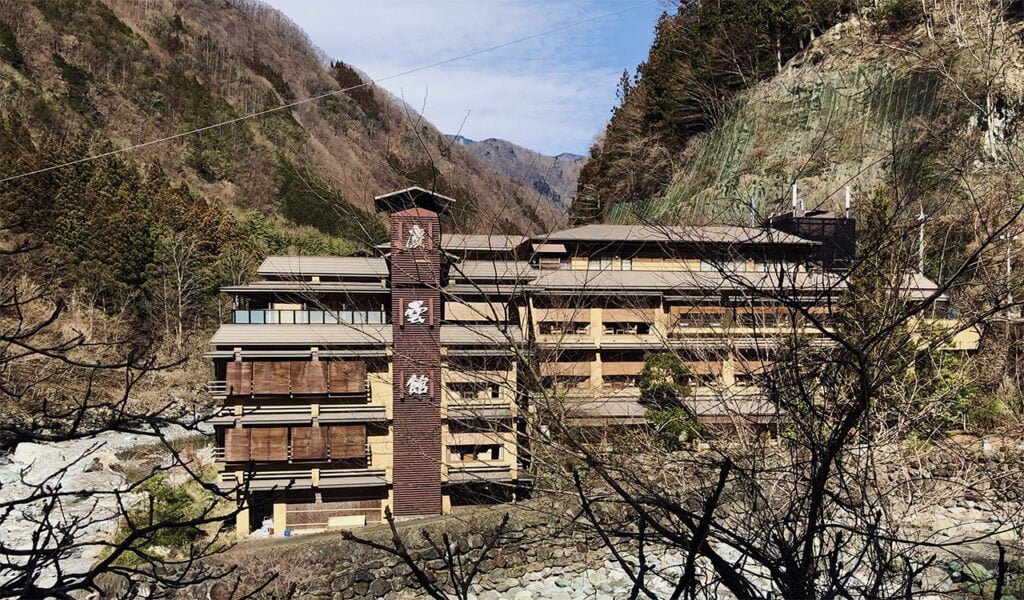
    The one of the oldest historic hotels in the world, Nishiyama Onsen Keiunkan opened in 705 AD and has been passed down through the same family for an astounding 52 generations. But its historic pedigree isn’t the only reason to visit, with a mountaintop location in the town of Hayakawa and hot springs that pump out thousands of litres of hot mineral water a day into the hotel’s private hot spring baths (onsen), it’s a super relaxing setting. And you’ll be walking in the footsteps of all the legendary samurai and shogun that once stayed here, seeking the healing waters to soothe their weary, post-battle muscles.

    Design Process/Style

    The hotel has 37 rooms, a kaiseki restaurant, and a moon-viewing platform. The hotel underwent a major renovation in 1997 but preserved the traditional architectural style of the original onsen. During the stay at the hot springs at the base of Kyoto’s mountains, you can enjoy the same caliber of legendary hospitality experienced by noble samurai, famed shogun, and tourists for more than a thousand years. The hotel restaurant offers unique Miyama Kaiseki meals, seafood from Sanga, and some of the best Koshu beef in the entire world.

    Kennebunkport Inn, USA
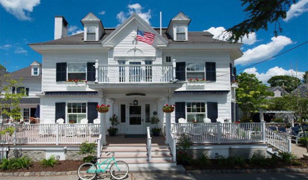
    Kennebunkport Inn
    Source

    Brief

    Built in the late 1890s, the Inn was once a tea merchant’s mansion. Design updates have respected the historic architecture while adding contemporary flair to its timeless appeal. Whether staying in the main house or in the River house, guests will delight in the understated luxury of their hotel room in every season. From a 35-room former mansion in Kennebunkport, Maine, to the iconic 19th-century Ritz Paris, the storied lodgings on offer are palpable.

    Design Process/Style

    There’s a completely different escape for spending a few days in some of the world’s longest-established hotels. The inn, which sits on four acres along 400 feet of frontage on the Kennebunk River, still boasts quite a few of the former Federal-style home’s original elements, including four open fireplaces, a parlour, a library, a butler’s pantry, and a servants’ dining room. And by 1961, Kennebunkport Inn had 10 guest rooms in the main building and 26 in the annex, which was constructed in the mid-20th century for locals and travellers alike.

    The Stafford, London, UK

    Brief

    Tucked away in the heart of historic St James’s, and just minutes from London’s iconic landmarks and vibrant West End, The Stafford London is one of the finest luxury hotels in the Capital. Constructed solely as private residences on St. James’s Place in the 17th century, the several structures that make up what is now The Stafford London have changed hands quite a few times. It was formerly Richmond Club Chambers, Green’s Private Hotel, and St. James’s Palace Hotel.

    Design Process/Style

    The Stafford opened its doors to guests who can book a room or suite in any of the hotel’s three charming buildings: the main house, the mews house, and carriage houses, where the English nobility’s thoroughbreds lived. Though the hotel has been around for quite a lot—two world wars, the Titanic’s demise, and the longest-reigning monarch’s coronation.

    The Stafford London’s guest rooms and suites are a masterclass in charismatic contemporary design with jewel-toned tufted quilts, geometric-inspired wallpaper, and unique patterns at play in nearly every nook and cranny. During World War II, The Stafford London served as a club for American and Canadian officers stationed overseas who sought refuge in the Wine Cellars. Originally built as stables to house the thoroughbreds of the nobility, The Carriage House was transformed to luxury accommodation in the late 1990s.

    Rambagh Palace, Rajasthan, India

    Rambagh Palace, Rajasthan
    Source

    Brief

    The Rambagh Palace in Jaipur, Rajasthan, is the former residence of the Maharaja of Jaipur located 5 miles outside the walls of the city of Jaipur on Bhawani Singh Road. Now a hotel, this 47-acre complex in the centre of Jaipur keeps all the regal grandeur of its previous incarnation. Staying in suites that have hosted the likes of Prince Charles and Jackie Kennedy, guests can take afternoon tea with Champagne on the veranda, play croquet amid peacocks and sip sundowner cocktails in the stately gardens.

    Design Process/Style

    Today, this jewel in the Taj’s crown offers 78 stunningly restored grand luxury rooms and suites in Jaipur, which were the chambers of the former Maharaja. The palace keeps its elaborate splendour, extravagantly decorated with hand-carved marble ‘jalis’ or latticework, sandstone balustrades, cupolas and ‘chattris’ or cenotaphs, and elaborate Mughal Gardens.

    Within this most glorious of palaces showcasing the best of Rajasthan’s royal heritage, you also experience the best fine-dining restaurants in Jaipur. With the exquisite palace offering a scenic backdrop, our enormous selection of indoor and outdoor venues, along with the Sawai Man Mahal ideal for royal destination weddings and business events in Jaipur.

    Copacabana Palace, Brazil
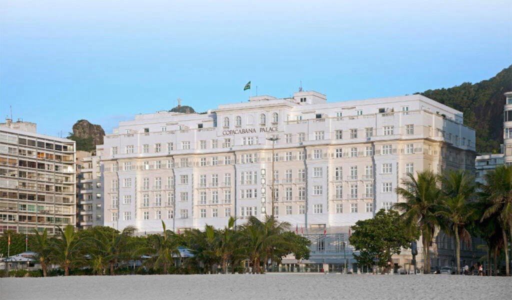
    Copacabana Palace
    Source

    Brief

    This Art Deco palace is a Rio de Janeiro landmark and was erected right on the edge of Copacabana Beach in 1923. Designed by French architect, Joseph Gire, the facade fuses Latin and European styles, partially resembling the extravagant mansions of the Cote d’Azur. It was immortalised in the 1933 film Flying Down to Rio, starring Fred Astaire and Ginger Rogers, and has attracted guests over the years including Albert Einstein, Nelson Mandela, Marilyn Monroe and Princess Diana. More recently, the Rolling Stones gave an impromptu, free concert on the beach while staying at the hotel in 2006.

    Design Process/Style

    The hotel was only inaugurated on August 13, 1923, almost a year after the Centennial Exposition. This was because of the difficulties in the importation of marbles and crystals and in the execution of its foundations to the lack of technology and experience in the country for such manufacturing. But for over 40 years, they have followed the pioneering spirit and passion for authenticity to create and uncover some of the world’s greatest travel adventures. On today’s date, their collection includes one-of-a-kind hotels, trains, river cruises and safari lodges in stunning destinations across the globe.

    Waldorf Astoria, New York, USA

    Brief

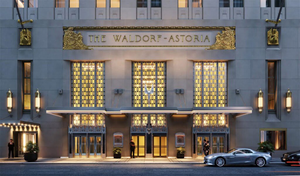
    The Waldorf Astoria, New York is a luxury hotel in Midtown Manhattan in New York City. The structure is a 47-story- 625 ft Art Deco landmark designed by architects Schultze and Weaver, which was completed in 1931. The building was the world’s tallest hotel from 1931 until 1963. The Waldorf Astoria and Towers has 1,413 hotel rooms as of 2014. In 2009, when it had 1,416 rooms, the main hotel had 1,235 single and double rooms and 208 mini suites, while the Waldorf Towers, from the 28th floor up to the 42nd, had 181 rooms, of which 115 were suites, with one to four bedrooms.

    Design Process/Style

    Such is the architectural and cultural heritage of the hotel those tours are conducted of the hotel for guests in the main foyer is a chandelier measuring 10 feet by 10 feet. The elevator is furnished with panelled pollard oak and Carpathian elm. The grand clock, a 4000-lb bronze, was built by the Goldsmith’s Company of London originally for the 1893 World Columbia Exposition in Chicago, but was purchased by the Waldorf owners. The original Peacock Alley had been a 300-ft-long corridor lined with amber marble between the original two hotel buildings. Gilded, women of the times would enjoy walking along with it and admiring themselves in the mirrors.  

    Lygon Arms, London, UK
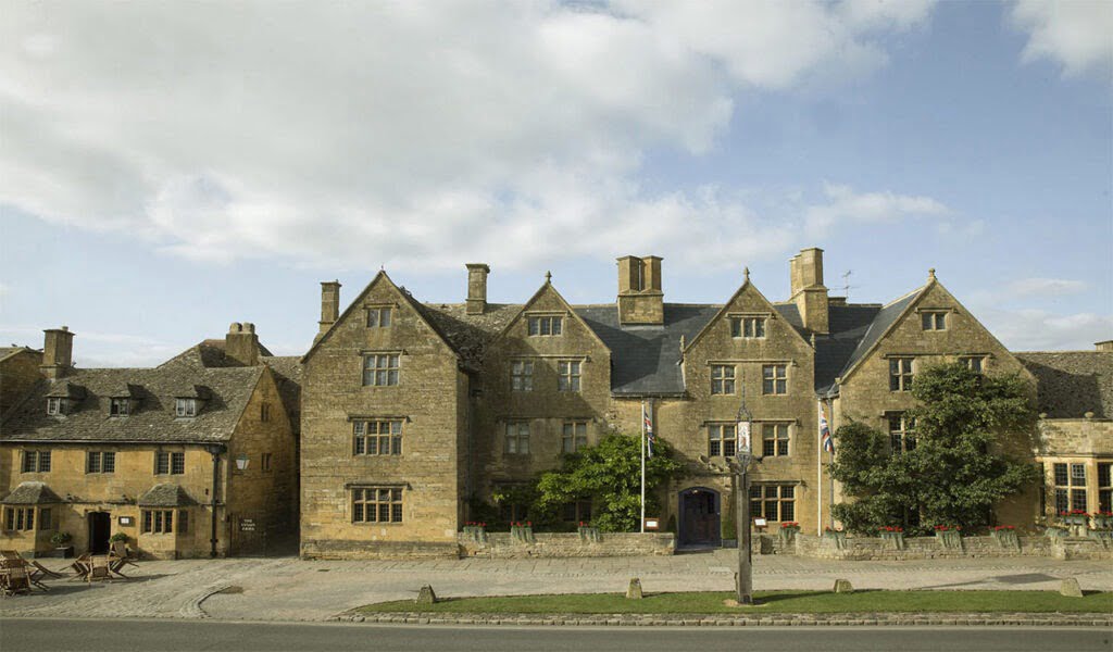
    Lygon Arms, London
    Source

    Brief

    Set in the heart of the Cotswolds, a UNESCO World Heritage Site, the structure that makes up The Lygon Arms is so antiquated that its exact history is more or less unknown. However, documentary evidence from 1377 shows that a coaching inn stood on this site long before the current Tudor building. Further evidence of a medieval past is suggested by its then name: ‘The White Hart’, since the hart–a stag – was the personal symbol of King Richard II (1367-1400).

    Design Process/Style

    And in 1620, a man named John Trevis, perhaps the building’s then owner, stonemason, or maybe a local benefactor who sought to preserve his legacy long beyond his death, carved his name into the wall in the structure’s entry. Today, however, its deed rests in the capable hands of Iconic Luxury Hotels, who’ve honoured the former inn’s 650-year history in more ways than one. With charming guest rooms and suites spread across the main house, annex, courtyard, and cottage, there’s hardly a shortage of places to spend the night.

    Jared Coffin House, Massachusetts, USA

    Jared Coffin House, historic hotels
    Source

    Brief

    Built in 1845 as his family’s residence by Jared Coffin, one of Nantucket’s wealthiest shipowners during the heyday of the whaling industry, the classic New England mansion now serves as a boutique hotel on the island’s powdery sand shores. Though much of the original structure has been expertly maintained, it’s had a bit of work done over the years: in 1857, the new owner, Eben W. Allen, constructed 3-story addition housing 16 bedrooms, and in 1961, the Nantucket Historical Trust completely renovated the estate and reopened it as the Jared Coffin House.

    Design Process/Style

    With 48 rooms spread across two buildings, including the original residence and a neighbouring one, the Daniel Webster house, there is definitely plenty of space to spread out. As one of the oldest hotels in Nantucket, Jared Coffin House embodies the essence of this former whaling town, offering charming accommodations combined with a host of modern-day comforts. 

     Riggs, Washington D.C, USA
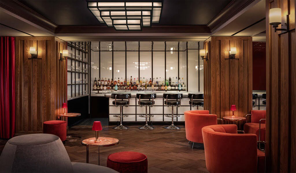
     Riggs, Washington D.C
    Source

    Brief

    Riggs Washington, DC, was built in 1891 as the new Riggs Bank building completed in the Richardsonian Romanesque style. The bank described itself as “the most important bank in the most important city in the world”. Following a complete refurbishment, led by Lore Group Creative Director Jacu Strauss – Riggs has been reinvented as a luxury destination for modern travellers. Strauss was inspired by the building’s history and by the golden age of banking during his refurbishment.

    Design Process/Style

    Though the heart of many hotels is typically the guest rooms, that of the Riggs Washington D.C., within the former Riggs National Bank building, is the resident restaurant, Café Riggs. The ground-floor restaurant offers a masterclass in interior design by citrus-hued velvet swivel chairs, ornately carved coffered ceilings, and dramatic green marble floors so dark that, upon first glance, they almost look black. Of course, the private safe deposit box–inspired stay rooms, which follow the hotel’s Richardsonian Romanesque lead, hardly offer guests a reason to leave their rooms.

    The Historic Anchorage Hotel, Alaska, USA

    historic hotels
    Design

    Historic Hotels Brief

    In the heart of downtown Anchorage, The Historic Anchorage Hotel is listed on the National Register of Historic Places and is the only historic hotel in the city. Anchorage was in its infancy when the original Anchorage Hotel structure, on the corner of 3rd Avenue and E Street, was built. By 1936, the city of Anchorage was growing so rapidly that expansion was required.

    Design Process/Style

     The current building, the Anchorage Hotel Annex, was built across the alleyway and a sky bridge was constructed, connecting the two buildings. For many years, The Anchorage Hotel served as the city’s primary meeting and gathering place, and at one time, it was the only place in the new city where you could enjoy a meal served on fine China with linen and silver. Curtains rumbling, shower curtains swaying, pictures flying—it’s all par for the course at The Historic Anchorage Hotel. Stories of ghostly happenings have been circulating at the hotel for many years, and are considered being related to the death of Anchorage’s first Chief of Police.

    Palmer House, Chicago, USA
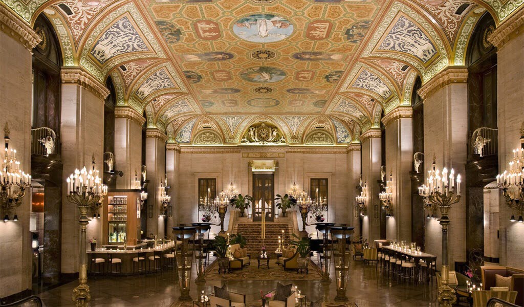
    historic hotels
    Source

    Brief

    The story of downtown Chicago’s Palmer House Hilton is one of romance and undeniable charm. The country’s oldest continuously operating hotel got off to a rocky start. Thirteen days after its initial opening, it fell prey to the Great Chicago Fire. The resilient property rebounded and became a popular performance venue for the likes of Ella Fitzgerald, Louis Armstrong, and Liberace. Oh yeah, the brownie was invented here, too.

    Design Process/Style

    On November 8, 1873, the new Palmer House welcomed its first guests, marking the opening of what would become the nation’s longest continually operating hotel. Bertha Palmer began decorating the Palmer House with paintings and other pieces inspired by her French heritage. She eventually accumulated the largest collection of impressionist art outside of France. The Palmer House was bedecked with garnet-draped chandeliers, Louis Comfort Tiffany masterpieces, and a breath-taking ceiling fresco by French painter Louis Pierre Rigal.

    In recent years at the historic Chicago hotel, Palmer House has undergone a $170 million renovation to ensure that it includes all the conveniences and comforts 21st-century guests expect while also preserving our significant history.

  • Chicago Architecture: A Fascinating Destination for Cultural Enthusiasts

    Chicago Architecture: A Fascinating Destination for Cultural Enthusiasts

    Introduction

    The buildings and architecture of Chicago have influenced and reflected the history of American architecture. The man-made environment of Chicago reflects the city’s history and multicultural heritage, featuring prominent buildings in a variety of styles by many important architects. Chicago buildings are noted for their originality rather than their antiquity. Many architects have constructed landmark buildings of varying styles in Chicago. Among them are the so-called “Chicago 7”: James Ingo Freed, Tom Beeby, Larry Booth, Stuart Cohen, James Nagle, Stanley Tigerman, and Ben Weese.

    History of Chicago

    The Great Chicago Fire in 1871 killed 300 people, destroyed about 3.3 square miles, and left over 100,000 residents homeless. However, by that time Chicago had become the world’s fastest-growing city and its population had risen over 300,000 inhabitants. The fire meant these ambitious citizens had to start again. With admirable strength, the city was reborn from the ashes and some of Chicago’s best architecture was constructed immediately after. Since then, Chicago has only continued adding value to its urban grid and new buildings have been progressively enhancing the city’s beautiful skyline. 

    Frank Lloyd Wright’s Prairie School influenced both building design and the design of furnishings. In the early half of the 20th century, popular residential neighbourhoods were developed with Chicago Bungalow style houses, many of which still exist. A two-flat includes two apartments, each of which occupies a full floor, usually with a large bay window and with a grey stone or red brick facade. The apartments typically have the same layout with a large living and dining room area at the front, the kitchen at the back, and the bedrooms running down one side of the unit.

    Architecture, design, and art lovers, here’s a list of all the mesmerizing places in the city of Chicago that will make you plan a vacation ASAP.

    Examples of famous Chicago Architecture

    Modern Wing, Art Institute of Chicago

    Brief

    The Art Institute of Chicago, one of the oldest and largest museums in the United States, was founded in 1879. The new Modern Wing is being built between Michigan Avenue and Columbus Drive; at the northeast corner of the block the Art Institute of Chicago currently occupies. The addition will complete the cultural, urban campus of the museum. On the first floor, a day-lit court is flanked by new educational facilities, public amenities, galleries, and a garden. The second and third floors are dedicated to art and the viewing of art. The third floor will be completely lit by natural light.

    Design Process/Style

    Limestone, a material used in the construction of the entire museum from its original Beaux arts palace to recent additions, rises from the ground like a topographic relief, massive and solid, as though it has always been there. The Modern Wing shelter will give the museum what it needs in terms of light, much as the open lattice of the Pritzker Pavilion gives shelter to the Great Lawn in terms of sound. Flying above the art pavilion will be a shelter that filters the sun to create the natural shaded light conditions ideal for the enjoyment of art.  

    Aqua Tower

    Brief

    The best 21st-century addition to Chicago’s skyline, Aqua Tower starts with a venerable and well-worn Chicago high-rise trope: the Modernist glass box. But Gang’s design adds sculptured whorls of concrete floor slabs that extend beyond the glass facade. The design was inspired by the striated limestone outcroppings common in the Great Lakes area. But this sinuous shape is not just a mere formal gesture, but it is also a strategy to extend the views and maximize solar shading.

    Design Process/Style

    These concrete slabs are fenced off as balconies for the building’s apartments, offices and hotel units. Each is custom-designed to give visitors and residents better access to skyline views of the surrounding Loop and Lake Michigan. Together, across 82 stories, they appear to ripple like water. It has got the following amenities: 82-story mixed-use residential tower (819 ft), 215 hotels rooms, 476 rental residential units, 263 condominium units and penthouses, 55,000 sq. ft of retail and office space and 6 levels of underground parking.

    Apple Store, Michigan Avenue

    Brief

    Inspired by the pulse of Chicago’s artistic energy, designed by Architects Fosters+Partners, Apple has created a new platform for performance in a city charged by music. Pioneer Court is an urban plaza steeped in Chicago history. It is the spot where Point de Sable–the founding father of Chicago–first lived and worked. Apple Michigan Avenue sits atop a wide new public stair, created to lead down from the plaza to the river. The gentle descent of levels creates active spaces where people can connect, create, and experience the city and river together.

    Design Process/Style

    As the interior steps down to the river, it acts as a seating space around the Forum–the hub of Today at Apple and a live source of creativity, education and entertainment. The stairway transitions seamlessly between the outside and inside. It passes through the building’s walls–dematerialized to pure glass–and connects to the store’s buzzing centre, sheltered by an impossibly thin carbon fibre roof, supported on slender stainless-steel columns.  

    Apple Michigan Avenue is about removing boundaries between inside and outside, reviving important urban connections within the city. It unites a historic city plaza that had been cut off from the water, giving Chicago a dynamic new arena that flows effortlessly down to the river. The design of Apple Michigan Avenue embodies this in its structure and materiality with a glass wall that dissolves into the background, revealing the only visible element of the building–its floating carbon fibre roof.

    Robie House

    Brief

    One of Frank Lloyd Wright’s most favoured projects, the Robie House in Hyde Park, is a culmination of his long-simmering meditation on Midwestern landscapes, and precedes when he departed off to more abstracted experiments such as Fallingwater. It has become emblematic of the architect’s Prairie Style. The Robie House creates a clever arrangement of public and private spaces, slowly distancing itself from the street in a series of horizontal planes. By creating overlaps of the planes with this gesture, it allowed for interior space expanded towards the outdoors while still giving the space a level of enclosure.  

    Design Process/Style

    The prairie has a beauty of its own and we should recognize and accentuate this natural beauty, its quiet level. Hence, gently sloping roofs, low proportions, quiet sky lines, suppressed heavy-set chimneys and sheltering overhangs, low terraces and out-reaching walls sequestering private gardens. As is seen in many of Wright’s project, the entrance of the house is not clearly distinguishable at first glance because Wright believed the procession towards the house should involve a journey.

    Inside is a classic Wright composition of dark wood, stained glass and custom-designed high-backed chairs. The house was built for a bicycle and motorcycle manufacturer and was included on the very first National Register of Historic Places list in 1966. Made of artfully composed horizontal lines of red brick and limestone, the strong terraced layers resemble stratified rock. The protrusions of windows on the East and West facade, along with low ceilings, emphasized the long axis of the house and directed views towards the outside. These windows were also stretched on French doors along the entire south wall on the main level, opening up to a balcony.

    Willis Tower

    Brief

    Towering over the windy city of Chicago, the Willis Tower was once the tallest building in the world upon its completion in 1973. The design also had to incorporate extra office space for the expected future growth of the company. The building is 108 stories tall, rising 1,450 feet above the city. The height of the building is because of spacial needs. The company analysed their current spacial needs, as well as the space needed for growth up to the year 2003, being as meticulous as determining the number of desks for personnel.

    Design Process/Style

    The different heights allow for the building to step back, meeting setback regulations and creating the iconic staggering effect that the building is known for. The structure system also saved ten million dollars in steel costs. Aluminium cladding was used for the structure, and the entire rest of the building was clad in bronze-tinted vision glass panels which allowed the skyscraper to receive ample natural lighting and views from every exterior wall. Completing the tower at the peak of its height are antennas that allow for local radio and television broadcasts.

    The 103rd floor of the tower is the location of the famous Skydeck Chicago, which is visited by 1.3 million tourists a year. In just 60 seconds tourists can soar to the Skydeck to experience the swaying of the skyscraper on a windy day and as of 2009, look at the city beneath their feet from glass boxes that protrude from the deck.

    IIT McCormick Tribune Campus Center

    Brief

    The McCormick Tribune Campus Center is one of only a few non-Mies designed buildings at the Illinois Institute of Technology. It also was Rem Koolhaas’ first American project. The entire complex squats under an elevated rapid-transit rail line and contains a bookstore, auditorium and food court. A stainless-steel tunnel dampens the roar of passing trains. The site was previously a heavily used student parking lot with tracks of the Green Line passing overhead. Koolhaas tracked movements of students across the lot, which led to diagonal passageways as the centre’s interior thoroughfares. Campus functions which had been spread around campus, such as the student bookstore and a post office, were relocated between these pathways. 

    Design Process/Style

    With its canted lines, bright orange-tinted glass, and free-form intersecting planes, the building is easy to cast as an arrogant boom-era misfit. But despite Koolhaas’ intellectual Deconstructivist rigour, the structure shows true reverence for Mies van der Rohe’s university campus. A major design challenge was the noise of the Green Line tracks passing over the lot. The solution was to enclose a 160 m section of the tracks in a stainless-steel tube passing over the building. The tube’s support structure is completely independent of the building’s, to minimize vibration passing between them.

    Rectilinear right angles have broken apart and reconfigured to create a procession of sculptural spaces, creating quiet study nooks, as well as bright public spaces. A small patch of prairie grasses on a depressed roof garden (visible from the inside) provides relief from the building’s raw, rough materials and dot-matrix glass murals. The university wanted an architecturally significant building to add onto its original main campus, which is home to the densest concentration of buildings designed by Ludwig Mies van der Rohe in the world.

    Rookery Building

    Brief

    Designed by architects Daniel Burnham and John Wellborn Root of Burnham and Root in 1888, it is one of their masterpiece buildings, and was once the location of their offices. This is an 11-storey office, featuring a red granite base with a Romanesque entrance arch. The building is essentially a cube with a hollow core. Its hybrid structural system uses both load-bearing masonry and steel framing. The building is 181 feet in height, 12 stories tall, and is considered the oldest standing high-rise in Chicago. It has a unique construction style featuring exterior load-bearing walls and an interior steel frame, providing a transition between accepted and new building techniques.

    Design Process/Style

    Prodigiously using light and ornamentation, Root and Burnham designed a central light court to serve as the focal point for the entire building and provide daylight to interior offices. Rising two stories, the light court received immediate critical acclaim. A reinforced concrete slab that provided the building’s weight with a solid platform atop Chicago’s notoriously swampy soil. The term for the type of foundation that Root designed is grillage foundation, a foundation where iron rails and the structural beams are combined in a crisscross pattern and encased in concrete to support the building’s immense weight without heavy foundation stones.

    The building is a combination of Roman Revival and Queen Anne styles that embraced Richardsonian Romanesque architecture. Aside from the first two floors of metal-framed perimeter walls, the walls are all masonry. The building is known for its semi-circular staircase west of the light court.

    Jay Pritzker Pavilion

    Brief

    Designed by Architects Gehry Partners, Jay Pritzker Pavilion is an open-air venue featuring performances by the Grant Park Symphony Orchestra, as well as jazz, blues, and other world music performances. The Pavilion is a highly sculptural design element clad in stainless steel panels. Large glass doors allow the Pavilion to be used during winter months for public functions including banquets, receptions, and lectures. A decorative lighting system enhances the Pavilion with coloured light washes and projections during evening performances.

    Design Process/Style

    The main seating area accommodates up to 4,000 people in fixed seats and is located immediately next to the Pavilion. Beyond the main seating area, a lawn area can seat up to an additional 7,000 people in a more informal seating. The Pavilion is located atop a 3-level underground parking structure. A bus way and metro rail tracks which run next to Millennium Park pass beneath the Pavilion at the lowest level of the parking structure.

    Joe & Rika Mansueto Library

    Joe & Rika Mansueto Library
    Source

    Brief

    Designed by Architects Murphy/Jahn this site in the centre of the University of Chicago Campus is surrounded by a variety of different buildings with a mixture of styles, ranging from the gothic quadrangle to the south, the Limestone Brutalism of Netsch’s Regenstein Library to the east, the Henry Moore monument and Legorreta’s colourful Student Housing to the north. The people-oriented spaces could thus be at grade in a minimal elliptical glass dome, which fits the context, because it defies conventional relationships.

    Design Process/Style

    The structural grid-shell of 120 x 240 feet and the insulated glazing represent a very minimal and intelligent system for mediating between the varying exterior conditions and the desired interior comfort. At the interior, there is a seamless integration between lighting, air supply and furnishings, which were fabricated in solid European White Oak.

    Sullivan Center

    Brief

    The Sullivan Center, formerly known as the Carson, Pirie, Scott and Company Building, is a commercial building at 1 South State Street at the corner of East Madison Street in Chicago. This commercial behemoth by Louis Sullivan embodies many design traditions that have made Chicago an architectural epicentre. Formerly the Carson Pirie Scott and Co. Building, the structure is clad in white terracotta. It is one of the best examples of the city’s embrace of this fire-resistant material after the Great Fire of 1871.

    Design Process/Style

    The building is remarkable for its steel-framed structure, which allowed a dramatic increase in window area created by bay-wide windows, which in turn allowed for the greatest amount of daylight into the building interiors. This steel framed structure uses the post-and-lintel technique to provide a strong, light, and fireproof steel skeleton. The exterior of the building consists of a grid of piers and spandrels that reveals the post-and-lintel technique that supports the building. The ground floor is covered in a dark cast iron swirl of nature-inspired reliefs, creating a three-dimensional mural of abstracted leaves, branches, and fruits.  

  • Bus Station Architecture: Modern Bus Terminals Around the World

    Bus Station Architecture: Modern Bus Terminals Around the World

    Introduction

    A bus station is a structure where city or intercity buses stop to pick up and drop off passengers. While the term bus depot can also refer to a bus station, it refers to a bus garage. A bus station is larger than a bus stop, which is usually simply a place on the roadside where buses can stop. It may be intended as a terminal station for several routes, or as a transfer station where the routes continue.

    Bus stations and terminals are a significant element in the operation of bus services. Their design and location affect the efficiency of a transport system, and its impact on other road users. Bus stop design can encompass many styles, materials, locations, and purposes. Some cities need bus stops that can accommodate large numbers of people, while others may need to ensure that the structure can withstand the elements and offer protection to waiting passengers.  

    Mainly, the bus stop design needs to match the style and tone of the city it’s installed in. While modern bus stop design is becoming increasingly popular in large, metropolitan areas, these looks won’t mesh well with smaller, suburban bus routes. This modern bus stop has everything necessary from seating to advertising, while being quietly sleek and minimal in design. With three sides and a roof, it offers plenty of protection from the elements, along with a floating bench for seating.  

    Top Bus Terminal architecture around the world

    Kayseri West City Bus Terminal, Turkey

    Brief

    A western district and villages terminal was designed in the city’s west, Kayseri. The idea of creating a district terminal came up because of the transportation access difficulty of the existing travel agencies in the area. The structure is on the local road, which is 8 km away from the city centre where the new intercity bus terminal also exists. The structure which is designed in an area of 1,200 sq. m has a construction area of 10,000.  

    Design Process/Style

    The premier design criteria of the building are creating different foyers under the same structure as the passengers. For this reason, transparent foyers are lodged on a massive block wall, surface from two different directions in a ‘Z’ form. The perception of the platforms is improved by the transparent foyers. Convenience of the linkage to the new local road, the connection with the intercity bus terminal and the existence of the rail system near the city were the reasons of choose for this area.

    The wet areas and the technical buildings are configured at the same spot for both terminals. The terminal management office, agency offices, security offices, kiosks, prayer rooms, restrooms and technical offices are within the passenger foyer of the county terminal.

    Zvonarka central bus terminal, Czech Republic

    Brief

    Though it was still in use, the structure wasn’t being maintained and was increasingly falling apart. Without intervention, the station would’ve likely continued to decay and eventually be at risk of demolition. Self-initiated in 2011, this redesign and restoration project saw the architects actively engage in preserving the existing Brutalist structure and its original architectural identity, reflecting CHYBIK + KRISTOF’s commitment to architectural heritage. Placing transparency and access at the root of their design, they have transformed the bus terminal into a functional entity adapted to current social needs. 

    Design Process/Style

    Transparency is at the root of their new design. Paying homage to its original architect Radúz Russ, they proudly expose the station’s characteristically raw Brutalist structure, contrasting its angularity with an organic wave that mirrors the seamless flow of vehicles and passengers. Following the original square floorplan, they reconfigure the main hall as an open structure devoid of walls. A 2-sided roof, the inner space, houses the individual bus stops while the outer area serves as a parking space for buses.

    Adding new light fixtures onto the main worn-down structure, which they repaint in white, they introduce a new information office, ticketing and waiting areas, platforms, and an orientation system accessible to the disabled. Other recent additions to the Zvonařka Bus Terminal include a second entry at street level, new platforms and an accessible way-finding system.

    Pforzheim Central Bus Station, Germany

    Brief

    Architecture studio Metaraum has completed a bus station in the German city of Pforzheim, featuring curving canopies that swoop up and over waiting areas. This sits next to the city’s main railway station and forms part of a masterplan aimed at improving traffic flow and raising the architectural quality of the area. Situated just the right distance from the primary station, the new bus station appears as an extension of the historical building.

    Design Process/Style

    A new road layout directs buses towards a row of lanes sheltered beneath three expansive roofs. Each of the structures is shaped differently, providing both shade and protection from rain to the platforms below. Instead of a monotonous sequence of roofed platforms, what emerged is an urban space as an authentic venue boasting high recognition value. The roofscape of the new bus station forms an unstructured area between the railway station and flyover, and a new modern mobility hub within a high-grade urban space.

    The roof shells are interrupted by apertures that enable natural light to reach the platforms, as well as providing views of the sky and constantly shifting patterns of light and shadow on the ground. The curved forms of the canopies are also intended to evoke the arcs traced by vehicles in motion. Sweeping lines separate the irregularly shaped panels visible on the undersides, accentuating the dynamic aesthetic. A steel structure comprising columns and girder grids supports the suspended cement-bound plaster panels that form the surfaces.

    Preston Bus Station, UK

    Preston Bus Station
    Source

    Brief

    The architects have restored the interiors and updated the layout of the bus station, which was at one time scheduled for demolition, making it a brutalist design. Built in 1969 by British firm Building Design Partnership, architects Keith Ingham and Charles Wilson, its vast 170-metre-long length made it the largest bus station in Europe. Original elements, including rubber floors by Italian tire brand Pirelli and Iroko hardwood benches, have been lovingly restored, and the layout reworked by the architects into a space that has been modernised to prioritise pedestrian access.

    Design Process/Style

    Its distinctive curved fins have turned it into a beacon for the brutalist movement, with its scale and grandeur representative of an era. A lot of the original colours had been changed and there was signage everywhere. But the good thing was the original building was built from such robust and good quality materials that under the surface all of that was still there. Beneath layers of chewing gum and grime, the original Pirelli rubber floors were still in excellent condition. The white tile work running through the central spine of the building is the originals, and signs with Helvetica typeface have been reinstated.

    On the west side of the building where the architects removed the barriers, Iroko was repurposed to create more benches and for the trimming on the information desk. Durable timber was used for benches and dividing barriers.

    Terminal da Lapa, Brazil

    Brief

    This project arose out of dialogue with the host context, its immediate physical surroundings, its history and, above all, with its vocation as an urban focus for public interaction. The existing flows of pedestrians were incorporated and reorganized: with entrances on the avenue by the railway line, on the route that connects the station and the market and another opening onto the square. Miguel Dell’ Erba Square was configured by the building proposed, with its tree cover expanded with the addition of two new copses-one inside the project itself, running along the widest platform, and the other lining the promenade parallel to the railway wall. 

    Design Process/Style

    The ground plan matches the programme to the unevenness of the terrain, with the user attendance environments situated at the lower level and the operational environments at the upper level. The sinuous, curving wall both preserves and makes use of the existing trees, creating an uncovered patio exclusive to the operational sector. Horizontal flaps deflect the slant of the sunlight where the metal structure meets the longitudinal beams.  Light metal arches create the spatial sensation of enclosure typical of the old railway platforms while efficiently distributing the transversal down force of the structure.   

    Rotterdam Pink Bus Shelters, Netherland

    Brief

    These three Rotterdam bus shelters were designed by Dutch studio Maxwan with concave and convex razor-thin rooftops reminiscent of billowing fabric. These three 5-by-10-metre canopies, which measure just 9.5 millimetres in thickness, are the “world’s thinnest steel roofs. The pastel-pink Bus Station Canopies are located on a patch of tarmac outside a new bus terminus in Rotterdam Central District, providing seated shelters for almost 40 waiting passengers. The caving helped make the canopies structurally sound, allowed for a thinner roof, and is beautiful.

    Design Process/Style

    The canopies are raised up on 4 flat-steel columns. One arches upwards in the centre, while another bows downward–both are intended to look like fabric moving in the wind. The curving surfaces are finished with glossy pastel-pink paintwork. The tables, treated with a skin-tone finish, are warped silk-gloss surfaces that conjure up images of suspended cloth and wind-blown sails, despite their weighing five tonnes each.

    Bus Station, Hoofddorp, Netherlands

    Brief

    This mammoth creation of architects NIO of Holland, located as a roundabout in front of Hoofddorp’s Spaarne Hospital, resembles a whale’s jaw. Built in 2003, it emerges as a cross between black Baroque and white modernism. The length of the structure gives it a grace and elegance as sculpture, somewhat spoilt already by a green colour emerging from the polyester, especially around the most prominent join.

    Design Process/Style

    The design of the building is neutral, but here, the aim was to create a strong, individual image that was less austere and generic. One of the largest structures built entirely of synthetic materials, this bus station is made of enormous pieces of polystyrene foam clad in polyester skin.Ingenious use of length and the ceilings moulded contours gives the station an unforgettable form and the materials used in construction were tested to be resistant to knives, graffiti, and cigarettes.

    The interior is sculpturally exciting, but not welcoming. Here, the long, low profile that gives the grace to the outside elevation creates emptiness and exposure. The moulded contours in the ceiling are already accumulating grime. The backward-sloping moulded seat also accumulates grime that makes it unappealing to sit on.

    Slough Bus Station, UK

    Slough Bus Station
    Source

    Brief

    A glistening aluminium canopy undulates above the heads of waiting passengers at a bus station in Slough, UK. As a tribute to local astronomer William Herschel, who discovered infrared waves in 1800, London architects Bblur created an undulating building to represent light’s different wavelengths. The curved structure also provides a sheltered route for pedestrians walking between the adjacent railway station and the town centre. The 130-metre-long canopy folds down at one end to wrap a glazed two-storey building that accommodates bus driver facilities, a cafe, a newsagent, toilets, a waiting room and a ticket office.

    Design Process/Style

    The curved construction also offers sanctuary to pedestrians walking between the town centre and railway station. The aluminium-shingled building’s smooth metallic look changes continuously in accordance with the varying light conditions. The bus station is part of a masterplan for the area and will eventually be surrounded by five new office towers of between eight and fourteen stories. The Bus Station is an urban object with the design considered from all aspects, passengers underneath and office workers viewing from above.

    The bus station scheme has two distinct functions. The primary function is to create a transport interchange with the rail station, providing new, safe, efficient and enjoyable public transport facilities.
    The second function improves the pedestrian permeability and legibility of the urban realm by creating a new north-south covered public route from the rail station through to the centre of Slough.

    Aarau Bus Station Canopy, Switzerland

    Brief

    Zurich architects Mateja Vehovar and Stefan Jauslin designed this reflective and semi-translucent, bluish ETFE canopy that reminds us of an air cushion. Hovering over the bus station, this bubble canopy features a fine print courtesy Jauslin and Paolo Monaco. This has gained its own cloud in the shape of an organically formed bus station canopy with a reflective and semi-translucent skin. The roof hovers, so to speak, above the forecourt of the railway station. However, unlike its meteorological namesake, this cloud provides protection from the rain and snow.

    Design Process/Style

    Existing fixtures have been removed and the underground car park relocated so that the bus stops can now all be accommodated within Bahnhofplatz. This pneumatic wonder gets recirculated air with the help of four underground 120-metre polyethylene tubes while four others carry the air back to the control unit. Quietly inclined pillars brace the canopy, making it appear as light as a cloud. The internal supporting structure is faintly discernible. Viewed obliquely, the supports fade into the background and the canopy gains volume.

    With 1070 sq. m of covered area and a volume of 1810 cubic m, the roof of the bus station is the world’s largest single-chamber membrane air cushion. As only the moisture has to be removed, that is diffused over the 2140 sq. m cushion surface, and both the cushion and the tubing are more or less airtight, the roof is highly economical to operate.

    Bus Station, Osijek, Croatia

    Brief

    Architects Predrag and Bruno Rechner of Rechner, Osijek, Croatia shaped this lengthy bus station in accordance with the city’s outline along the river Drava. The tender required high-quality architecture, and an economically best solution, in terms of construction cost, maintenance and usage. The glass-wrapped 2-storey building houses an underground public garage and 16 bus platforms. Buses arrive via checkpoints, while passengers come through the station building.

    Design Process/Style

    The terminal of urban transport is on the east, the most contractual side of longitudinal parcel: tram station, five platforms for urban transport buses, taxi stand, a large square with dominated roof surface and oblique high wall which points toward the entrance of the building and also separates the platforms from external access. Besides the two-storey high station Aula and communication areas, there are all necessary trade-service catering facilities and transportation offices. The wavy roof affords cover throughout the terminal, which gives users a feeling of sailing on long, low waves. 

    Steel trusses running both ways prop up the huge block of the roof. The supporting structure of the ground floor and staircase core of the bus station building are reinforced concrete columns and beams connected with a reinforced concrete slab. Huge roof surface lies on the steel trusses in both directions, bearing steel columns. The underground public garage beneath the entire building and the external platform have a capacity for 251 vehicles. It is directly associated with the contents of the bus station building, and pedestrian access is also possible from outside, through the access square. Transportation to the garage is separated from bus traffic.

  • Interesting Peep into a Victorian House Design: An Off-Grid Experience

    Interesting Peep into a Victorian House Design: An Off-Grid Experience

    Definition and History 

    Victorian-style architecture in Great Britain and former British colonies was a type of house generally built during the reign of Queen Victoria. At the time of the Industrial Revolution, successive housing resulted in the building of tons of Victorian house designs that are now a defining feature of most British towns and cities.

    Interestingly, many of the details that we now associate with this style are actually interpretations of older architectural movements featuring Medieval Gothic and Romanesque. Thanks to the size of the British Empire during that time, Victorian house design has an incredibly wide reach. It is widely populated across the UK, North America, New Zealand, and Australia.

    Victorian house designs have managed to capture the hearts and minds of people for over two centuries now. There is so much to the design than those dollhouse-like exteriors. This architecture style includes multiple and distinct variations that all deserve a critical look. Also, as the name suggests, Victorians became popular among the upper-class White people during Queen Victoria’s reign.

    What makes a house Victorian Style?

    As per the words of Thomas Jepsen from the design firm Passion Plans, “A Victorian Style house is something between a colourful dollhouse and a great English Remnant. While the style refers to a period of time in history, it is generally associated with certain characteristics.

    Here are a few common characteristics of Victorian house architecture:

    Exterior

    1. Two to three stories
    2. Steep, gabled roofs
    3. Intricate woodwork
    4. Towers and turrets
    5. Rich colours

    Interior

    1. High ceilings and windows
    2. Closed off rooms
    3. Detailed trim
    4. Ornamental architecture
    Victorian house design layout
    Victorian house layout

    Types of Victorian style houses

    Italianate houses

    Italianate homes were popularized first in the 1840s and lasted until the Civil war, drawing inspiration from 16th-century Italian villas. The main structures were often simple, rectangular-shaped houses with low sloping or sometimes flat roofs that protrude far out from exterior walls. The windows are usually tall and skinny often rounded at the top with trim. Some Italianate houses have square towers or cupolas that rise out of the centre of the house giving a Tucson villa vibe.

    Italianate houses are mostly seen in the greatest number in North American cities that experienced exponential growth during the mid-19th century Cincinnati, Ohio, New Orleans, Garden District, and parts of San Francisco, Brooklyn, and New York.

    Other characteristics are:

    1. Wide eaves
    2. Quoins chimneys
    3. Single storey porch
    4. Tall and narrow windows
    5. Double doors with glass panels
    Italianate houses
    Source

    Queen Anne houses

    Queen Anne homes were popular in the US from the 1880s until sometime around the 1920s. This was theoretically a revival of the style du jour during the actual reign of Queen Anne which lasted from 1720 to 1714 but there is a very quiet resemblance in practice. The Queen Anne homes are quintessential Victorian homes having asymmetrical, two or three-storied tall, steeply high-pitched roofs.

    They are often adorned with various wall textures and ornate trim which gives them a ‘gingerbread’ effect commonly associated with Victorian houses- typically painted in a variety of accent colours. Few of the Queen Anne homes have octagonal towers (topped with a round pointed roof) and ornate bay windows which makes them subtle in look and design.

    Other characteristics are:

    1. Gable ends
    2. Towers with balconies
    3. Bold exterior colours
    4. Bay windows
    5. Built from wood, stone and brick siding
    6. Stained glass window
    7. Decorative spindle work
    8. Wide and spacious verandas
    Queen Anne houses
    Source

    Gothic Revival houses

    The Gothic Revival-style homes were first introduced in the 1880s. These homes are the classic representations of romantic and picturesque architectural elements that manifested in the US. The main properties of these structures were inspired by the medieval design of churches. Therefore, making the Victorian Gothic Revival style homes different from that of medieval architecture such as high pointed arches, biblical and heraldic emblems.

    Other Characteristics include:

    1. Steep, pitched roof with overhanging eaves.
    2. Castle like turrets.
    3. Slender columns and decorative posts
    4. Unique modern trims
    5. Pointed arches above windows with high dormers
    Gothic Revival houses
    Source

    Folk Victorian houses

    The Folk Victorian house is the most common type of home found in the US. This gained popularity in the 19th century and was considered as a more affordable alternative to Queen Anne’s style of design. The architects of Folk Victorian-style houses created a pimped-up version of a Victorian house by using cheaper materials in a relatively plain design and decorative trims for low-budget families, but with almost similar and prominent front-facing gable and steep under eaves.

    Other characteristics include:

    1. Decorative detailing on the porch
    2. Ornamented gables
    3. Symmetrical structure
    4. Trimmed windows
    Folk Victorian houses
    Source

    Shingle style houses

    The Shingle-style homes are basically known for their simplicity and make a popular choice for summer or weekend houses of the rich and famous. Shingle-styled houses are made up of clapboard or brick, despite their misleading name.  These types of houses are characterised by their rustic appearance which was favoured by the working class. Used as a holiday cottage by the wealthy, these homes became popular in New England from 1831.

    Other characteristics are:

    1. Symmetrical exterior
    2. Pitched roofs
    3. Shingled roof and walls
    4. Wide porches
    5. Sash windows
    6. Round towers
    Shingle style houses
    Source

    Octagon style houses

    The octagon-styled houses were hugely popular from between 1850 to 1870 after its mention in Orson Squire Fowler’s book called “The Octagon House: A House for All”. This style of the Victorian house took its inspiration from the Gothic and Greek Revival times to create a unique approach to residential architecture by specializing in bright and airy spaces in affordable dwellings.

    The Octagonal style house is the world’s only 8-sided Victorian house design with the benefits of being a practical and energy-efficient property. This unique style has evolved over the past decade or so thanks to the new constructive innovations.

    Other characteristics include:

    1. Domed shape
    2. Wide eaves
    3. Low pitched roofs
    4. Partially encircling or full porches
    Octagon style houses
    Source

    Second Empire style houses

    The second Empire-style houses gained popularity between 1865 and 1880 in the late Victorian era. This originated first in France, with some of the most famous hotels featuring the same architectural elements as the Second Empire houses. The attic or the upper storey is usually light and airy with a high ceiling. The most stood-out, striking feature of a Second Empire house is its mansard roof, which is named after the 17th-century French architect, Francois Mansart. This type of roof is a 4-sided gambrel roof with two slopes on either side.

    Other characteristics include:

    1. Imposing tower
    2. Side veranda
    3. Balustrades
    4. Diamond shaped dormers
    5. Wrought iron railings in balcony
    6. Bay window
    7. Quoins chimneys
    Second Empire style houses
    Source

    Stick style houses

    The Stick-styled houses date back to 1860 and are widely characterized by their vertical, diagonal, or horizontal planks resembling Tudor-style buildings. This Victorian-style home has a more decorative aspect to it but with a simple design. Unlike other elaborate architectural designs of the Second Empire and Queen Anne styles, the Stick style home lacks the bay windows and decorative elements that are so characteristic of the Victorian era.

    Other characteristics are:

    1. Pitched gable roof
    2. Wooden exterior walls
    3. Towers
    4. Cross gables
    5. Decorative trusses
    6. Diagonal or curved braces
    7. Wooden decorative trims
    Stick style houses
    Source

    Richardsonian Romanesque style houses

    The Richard Romanesque style is the most dramatic of all architectural styles in the Victorian era (1838). This Victorian-style architecture was named after the architect, Henry Richardson. It didn’t take long before becoming popular all thanks to Medieval Spanish and Italian Romanesque elements that blended with modern materials and features.

    A typical feature of this type of house included circular arches above the porch supports and windows. These round arches were often set on huge pillars that were built directly into the wall.

    Other characteristics are:

    1. Round masonry arches
    2. Recessed entrances
    3. Heavy stone materials
    4. Square and cylindrical shaped towers
    Richardsonian Romanesque style houses
    Source

    Eastlake style houses

    By the end of the 19th century, a new movement in the US transformed the interior and exterior designs of properties. This movement was inspired by the British architect, Charles Eastlake, who convinced homeowners to replace their heavy furnishings with attractive pieces that were made by hand. This was termed as a start of reform which subsequently was followed by a simple layout.

    The Eastlake style is mainly recognized by its Gothic design with decorative shingles and trusses on the gable end. These types of Victorian houses often feature overhanging, second storey porches as their design feature. It also boasts paneled brick chimneys inspired by the Queen Anne period.

    Other characteristics are:

    1. Carved panels
    2. Perforated pediments
    3. Lattice work on porch eaves
    4. Interlaced wood strips
    5. Mansard porches with iron cresting
    Eastlake style houses
    Source

    The two architecture styles Grant noted to be most famous of the Victorian period- Italianate and Queen Anne are technically revivals of earlier architecture styles. Although both took on lives of their own and were often exuberantly decorative without much concern for historical accuracy according to Grant. Each has distinct features but what they have in common is an emphasis on vertical elements i.e. homes often stood at two or three stories with tall windows and porches and detailed ornamentations on the top.

    Building Materials

    The most common building material during the Victorian era were the ones that were local to the area. The buildings of the local material are sometimes called of Vernacular style. The known Cotswold villages were made of white Jurassic limestone, central England had buildings of red sandstone, Cornwall towns in the south and Aberdeen in the north were built of local granites, and places like Norwich, which had no local hard stone, was faced with flints.

    Victorian architecture was constructed with brick, local stone, and mortar, as these were the primary building materials and were an integral part of the construction. The roofing was typically composed of multiple layers of coal and tar over tongue and groove planking. The Victorian houses were usually made of wood or stone as they were quite large and imposing.

    Stone

    The number of full-blown Gothic stone mansions was never too large. Most early homes, especially in England, were built of stones and enhanced decorative stone tracery. Only the wealthy were able to afford such homes which required labours of highly skilled stone carvers. The over-priced Gothic style was eventually made into wood and lots of ‘Carpenter Gothic’ houses still stand even today.

    With the innovation of new manufacturing processes and emerging of railways, the previously locally produced building materials were instantly available all over the city. Henceforth, all houses started being made from bricks from Bedfordshire and slate from North Wales instead of being made off the local stone, time, and straw.

    Limestone

    The Portland Limestone was the most common white stone used across England for public buildings, for example, the Whitehall. Equally popular was also the Bath Stone, orangish sandstone of great value and beauty. Permian sandstone, reddish coloured sandstone, often weathered to give a deep pitted and honeycombed appearance such as the walls of embankments on seaside towns.

    Victorian Bricks

    A renaissance of brick was seen in the Victorian era. The local brick-making material for London was the London Clay, which were yellow and greenish-yellow in shade. Older, more hand-pressed bricks were often irregular in shape and had lines, squeeze-marks known as Stock Bricks. The Oxford Clay Bricks, plain red of most modern brick, dominated and ruled.

    The railways used fired Black brick. Minton’s perfected the encaustic tile (the colour in the material of the tile rather than just on the surface of it) and thereafter tile-covered buildings such as public houses became common with a flourishing of nouveau decors after the century.

    Victorian houses in different countries

    Victorian houses in different countries
    Image by CarAnd from Pixabay  

    United Kingdom

    In the UK, Victorian houses follow a wide range of architectural styles. The houses in the 1840s were influenced by classicism of Regency styles, the Italianate style, and the Gothic Revival style in the 1880s. The simplicity of Regency classicism fell out of flavor as the Italianate style influenced the domestic architecture which is now incorporated by varying’s of Stucco. The additional general features/influences brought out a progressive change in style that resulted from several other factors.

    The abolition of tax on bricks in the 1850s made these items cheaper yet a suitable material. The emerging railways allowed them to be manufactured elsewhere at a lower price and to standard sizes and methods. There was also a progressive introduction from the 1850s to building regulations.

    In deprived areas, Victorian houses were often very small. Victorian houses for the middle classes and upwards tended to accommodation for servants. And for the middle and upper classes, it aspired to follow the purest forms of contemporary architecture.

    North America

    Victorian houses in east American cities were three stories and those in western American cities were two stories. One feature that became hugely popular in the Victorian era was the use of wooden gingerbread trims to create ornate embellishments to decorate their homes. The Victorian-era residential architecture in America and Canada was a procession of styles borrowed from different countries and historical sites.

    Few examples of this style are:

    1. Carson Mansion, California
    2. John B Kane Residence, Los Angeles
    3. Alamo Square, San Francisco
    4. Farnam Mansion, New York

    Australia

    The Victorian period in Australia lasted roughly from 1840 to 1890. There were 15 styles that predominated of which, 8 were used for homes.

    1. Victorian Georgian
    2. Victorian Regency
    3. Free Gothic
    4. Rustic Gothic
    5. Free Classical
    6. Filigree
    7. Italianate
    8. Tudor

    Victorian house roofing materials

    During the Victorian period, many different types of roofing materials were used. Some were more durable than others and some were less. Like wood shingles, modern enhancements made restoring a Victorian roof design possible without compromising longevity and protection.

    There isn’t a single, one-size-fits-all ruffing material foot these types of houses but using the current roof as a guide, can be the best indicator of what materials to use. Slate tiles, Asphalt, wood, and clay tiles are mostly used as roofing materials

    Slate tiles

    Slate tiles began to rise in popularity during the end of the Victorian period. These are extremely durable, resistant to fire, and environmentally beneficial. They also last much longer than some other roofing materials, but these added benefits also come at a cost.  

    Asphalt

    While asphalt roofs weren’t used during the Victorian period, they can be made to resemble Victorian-style roofing, such as wood shakes or slate. Asphalt shingles can also come in varying shapes and sizes for added Victorian appeal and durability.

    Wood

    Wood roofing was used primarily for early Victorian houses. Wood is cost-effective and visually appealing, but it is not a long-lasting material. This is because wood is susceptible to rot, insect problems, and damage.  

    Clay Tiles

    Clay tiles were also used as roofing materials in the early Victorian houses. Clay roofing is durable and long-lasting, but it’s important to match clay tiles with the Victorian period.

    Evolution of Victorian houses

    During the Victorian era, architecture saw rapid changes. A variety of Victorian styles emerged, each with its own distinctive features and personalities. The most popular Victorian style spread quickly through vast published pattern books. Builders often borrowed its characteristics from several styles, creating unique and sometimes quirky mixes.

    In the 20th century, despite having the availability of these new products, several working populations in the countryside lived in tiny cottages, hovels, and shacks. In towns, people lived in back-to-back houses called terrace houses. Innovation in building techniques and mass-produced building materials that could be transported by rail saved builders time and helped them lead a housing boom during the 1850s and 1870s that witnessed millions of Victorian constructions.

    While the Victorian era officially ended in the 1920s, its accompanying architecture styles stuck around for another decade or so until the colonial movement surpassed them in popularity. Victorian homes became disliked in the following decades. As Grant said, “There was a time when the Victorian house was considered an unwelcomed presence in many neighborhoods. Indeed, it became a stereotype for the ‘haunted house’”.

  • Spectacular Train Station Architecture around the World

    Spectacular Train Station Architecture around the World

    Train stations are uniquely depicted as romantic places from either books, movies, or tv shows. Perhaps it’s all those tearful goodbyes and joyful reunions, each one subtly different and personal. But behind these emotional scenes lie staggering techniques of design and engineering, which make railway stations among the world’s most intriguing and exceptional buildings.

    History

    The world’s first recorded exceptional station was The Mount on the Oyster mouth Railway (later to be known as the Swansea and Mumbles) in Swansea, Wales, which began passenger service in 1807, although the trains were horse-drawn rather than by locomotives. The oldest terminal station in the world was Crown Street railway station in Liverpool, built-in 1830, on the locomotive hauled Liverpool to Manchester line. Early stations were sometimes built with both passenger and goods facilities.

    Although some railway lines were goods-only or passenger-only, and if a line was dual purpose, . would often be a goods depot apart from the passenger station. Many stations date from the 19th century and reflect the grandiose architecture of the time, lending prestige to the city and to railway operations. Countries, where railways arrived later, may still have such architecture, as later stations often imitated 19th-century styles. Various forms of architecture have been used in the construction of stations, from those boasting grand, intricate, Baroque to plainer utilitarian or modernist styles.

    Top Train Stations around the world

    With locomotives in the 19th century, cities around the world began building majestic stations to welcome global travelers and to impress them. Top architects and engineers were commissioned to create three-dimensional works of art showcasing their talents, often in Beaux Arts or Gothic style. While many of these historic structures still stand and service passengers, several newer stations have been erected, creating an enduring legacy of train-station architecture. Here are the examples of the most beautiful train stations ever built.

    Grand Central Terminal, New York, USA

    Brief

    While Grand Central Terminal remains the busiest train station in the USA, it is also one of New York City’s most historical landmarks and a living, bustling temple to the city’s illustrious past. First built in 1913, Grand Central was saved from destruction by New York’s landmark laws and vocal New Yorkers, who wanted to see Grand Central restored. Extensive efforts to restore and revive this National Historic Landmark led to its re-dedication on October 1, 1998 when Grand Central Terminal had been restored to its original glory.  

    Design Process/Style

    This was designed and built with two main levels for passengers: an upper for intercity trains and a lower for commuter trains. This configuration separated intercity and commuter-rail passengers, smoothing the flow of people in and through the station. The station house measures 800 feet along Vanderbilt Avenue, 300 feet on 42nd Street, and 105 feet tall. The station and its rail yard have steel frames.

     The building also uses large steel columns designed to hold the weight of a 20-story office building, which was to be built when additional room was required. The facade and structure of the terminal building primarily use granite. The interiors use several varieties of stone, including imitation Caen stone for the Main Concourse; cream-colored Botticino marble for the interior decorations; and pink Tennessee marble for the floors.

    Liège-Guillemins, Belgium

    Brief

    Liège-Guillemins railway station is the primary station of the city of Liège, the third largest city in Belgium. Built in 2009 to accommodate Belgium’s new high-speed rail network, the current Liège-Guillemins station by Spanish architect Santiago Calatrava has to be one of the world’s most dramatic-looking railway stations with its vaulted glass and steel canopy that dips and rises over the station’s five platforms. Stretching over 145 meters, the canopy creates a station without facades, making it feel open and permeable.

    Design Process/Style

    Architect Santiago Calatrava is known for his undulating white structures, and his design for this station in Liège, Belgium, fits the mold. The open-air building features soaring white beams that form a massive arch over the tracks. It’s the third iteration of the station, with the first one built in the Beaux Arts style in 1842 and the second built in the international style in 1958.

    Made of steel, glass, and white concrete, the station seems to bring the outside in, with light pouring in through the windows and skylights. High-speed trains shuttle passengers off to other parts of Belgium, Germany, France, the Netherlands, and Luxembourg. The main concourse has plenty of shops, cafés, and restaurants, plus a tourist information office and ticket office.

    St Pancras International Station, London, UK

    Design Process/Style

    St. Pancras International station’s immense halls greet people arriving in London from all over the UK, France, and Belgium on the Eurostar. The station took 20 years to build, and when it was completed in 1868, it was the largest enclosed space in the world. The red brick Gothic façade remains a testament to England’s great Victorian architecture, even surviving the Blitz during WWII. During the war, it was an important escape route and meeting point for the Allied soldiers.

    This grand railway station was built in 1868 to show off England’s engineering prowess. Engineers William Henry Barlow and Roland Mason Ordish designed the wrought-iron train shed which had the largest single-span roof in the world at the time while George Gilbert Scott worked on the Victorian Gothic station building and adjacent hotel, now the St. Pancras Renaissance Hotel.

    Chhatrapati Shivaji Terminus, Mumbai, India

    Brief

    The historic Chhatrapati Shivaji Terminus is a UNESCO World Heritage Site and was a symbol of Bombay’s prestige. Originally known as Victoria Terminus, this glorious terminal was designed by British architect Frederick William Stevens to honour Queen Victoria, Empress of India. The imposing Victorian Gothic Revival station took 10 years to build and was completed in 1888. A fusion of Western and Eastern styles, it was inspired by Indian palace architecture.

    Design Process/Style

    The interior of the building was conceived as a series of large rooms with high ceilings. It is a utilitarian building and has had various changes required by the users, not always sympathetic. It has a C-shaped plan, which is symmetrical on an east–west axis. All the sides of the building are given equal value in the design. It is crowned by a high central dome, which acts as the focal point. The dome is an octagonal ribbed structure with a colossal female figure symbolizing Progress, holding a torch pointing upwards in her right hand and a spoked wheel in her left hand.

    The side wings enclose the courtyard, which opens on to the street. he ornamentation as statuary, bas-reliefs, and friezes is exuberant yet well controlled. The columns of the entrance gates are crowned by figures of a lion and a tiger. The primary structure is built from a blend of India sandstone and limestone, while high-quality Italian marble was used for the key decorative elements. The main interiors are also decorated with Italian marble and polished Indian blue stone.  

    Gare de Lyon, Paris, France

    Brief

    The Gare de Lyon, officially Paris-Gare-de-Lyon, is one of the 6 large mainline railway stations in Paris. It handles about 148.1 million passengers annually. Paris has seven major train stations, and this might be the most magnificent of them all. While the original structure was built in 1855, the current one was designed by architect Marius Toudoire. The ornate building features an iconic clock tower that resembles London’s Big Ben on its exterior and inside. The station is home to the famous Le Train Bleu restaurant, known for its elaborate decor.

    Design Process/Style

    The architecture of the Gare de Lyon was built as a show-off design for the 1900 Paris World Expo and amazing is it to find a grand restaurant at the heart of a Parisian railway station.  The station was built on a 6- to 8-meter-high embankment to protect it from the floods of the Seine. It had only 5 tracks, occupying a large hall 220 meters long and 42 meters wide. A portico to the right of the entrance to the arrival hall connected the station itself to the central administration building on the side facing Boulevard Mazas. The station was partially destroyed by fire during the Paris Commune in 1871 and later rebuilt.

    Kanazawa Station, Japan

    Brief

    Completed in 2005, the modern Kanazawa Station is covered by the impressive aluminium-and-glass Motenashi Dome. The wood structure is a contemporary take on the traditional Japanese torii gates found in front of shrines. This is one of Japan’s most aesthetically pleasing station buildings. The station’s architecture is all the more pleasing because it seems to perfectly blend modern style with a respect for tradition. When we look closely at Kanazawa station, we can learn a lot about Kanazawa’s history, its respect for tradition, and its enterprising vision for the future.

    Design Process/Styleeven more pleasing

    Probably the most striking part is its massive wooden gate. People exiting the station are always impressed when they first see this large vermilion structure, and it looks even more impressive when viewed from the other side, opposite the station, with the vast glass dome of the plaza roof rising behind it. There is usually a small crowd of tourists and travellers gathered just in front of the gate, taking memorial pictures. The gigantic Motenashi dome covering the east exit plaza is not only stunning but protects travellers from the frequent rain and snowfall typical of the region.

    In the station building’s central concourse, the roof is supported by a series of wooden pillars joined at the top by wooden beams. Built from local cypress wood there are 12 of these gates with 24 pillars. Taking a closer look at them and we’ll see embedded in each one a beautiful piece of art. These artworks represent Kanazawa’s heritage crafts of lacquerware, woodwork, and ceramics. The station has also been listed by Travel & Leisure Magazine as one of the “world’s most beautiful train stations”. The design is not only beautiful but smart. 

    Antwerpen-Centraal, Belgium

    Brief

    The original terminal station building was constructed between 1895 and 1905 as a replacement for the first terminus of the Brussels-Mechelen-Antwerp railway. The stone-clad building was designed by Louis Delacenserie. The viaduct into the station is also a notable structure designed by local architect Jan Van Asperen. The station is widely regarded as the finest example of railway architecture in Belgium, although the extraordinary eclecticism of the influences on the design had led to a difficulty in assigning it to a particular architectural style.

    Design Process/Style

    The originally iron and glass train hall, 185 metres long and 44 metres or 43 metres high, was designed by Clément Van Bogaert, an engineer, and covers an area of 12,000 square metres. The height of the station was necessary for dissipating the smoke of steam locomotives. The roof of the train hall was originally made of steel. In the mid-twentieth century, the building’s condition had deteriorated to where its demolition was being considered.

    The station was closed on 31 January 1986 for safety reasons, after which restoration work to the roof and facades were performed. The stress problems because of the impact of bombs during the war were reportedly solved by the use of polycarbonate sheets instead of glass, because of its elasticity and its relatively low weight (40% less than glass), which avoided the need for extra supporting pillars. After replacing or repairing steel elements, they were painted burgundy. Copper was also used in the renovation process of the roof.

    Ramses Station, Cairo, Egypt

    Brief

    As on can expect beauty and grace from anything that is Egyptian. Ramses Station in Cairo is a piece of Egyptian architectural marvel. The station is named after the statue of Pharaoh Ramses II (also known as Ramesses the Great, the third pharaoh of the Nineteenth Dynasty of Egypt) that used to be here in the 1950s. The original railway station was built as the terminal of the first rail link from Alexandria to Cairo in 1856. The current building was erected in 1892 and upgraded in 1955. As of January 2001, it was undergoing a major modernisation.  

    Design Process/Style

    Outside of the station used to be the statue of Ramses II that was moved to the area of Giza on 25 August 2006, to prepare for its eventual installation in the Grand Egyptian Museum. It was eventually placed there in 2018. The famous sculpture of Mahmoud Mokhtar, Nahdat Misr (Egypt’s Awakening), was originally installed outside the station in 1928, but was removed to its current location near Cairo University in the 1950s. Facilities in the station include a left luggage office, a post office, ATMs, a pharmacy and a tourist information office.

    Amsterdam Central Station, Netherlands

    Brief

    Amsterdam Central Station main train station is the real heart of the city: central not only by the name but also as the biggest public transport transfer spot, serving not only visitors to Amsterdam but also city inhabitants. Every day 250,000 people go through the Amsterdam Central Station. Amsterdam Central was designed by Dutch architect Pierre Cuypers and opened in 1889. It features a Gothic, Renaissance Revival station building and a cast iron platform roof spanning approximately 40 metres.

    Design Process/Style

    Cuypers’ design of the station building strongly resembled his other architectural masterpiece, the Rijksmuseum, of which the construction had begun in 1876. With two turrets and many ornamental details and stone reliefs referring to the capital city’s industrial and commercial importance. Cuypers’ station reflects the romantic nationalistic mood in the late nineteenth-century Netherlands, with its many decorative elements glorifying the nation’s economic and colonial power at the time.

    Alike other structures in Amsterdam, the station was built on wooden piles (8,687 pieces). The construction of the station was delayed because of the instability of the soil, which set back the completion of the work by several years. The station building was completed in 1884, but the commission to Cuypers did not include the roof work of the platforms. Therefore, the station did not yet feature its distinctive station roof. This roof, comprising 50 curved trusses and almost 45 meters.

    Dunedin Station, New Zealand

    Brief

    Dunedin railway station in Dunedin on New Zealand’s South Island, designed by George Troup, is the city’s fourth station. It earned its architect the nickname of “Gingerbread George”. This Station in New Zealand is renowned as the most photographed attraction in the country. The station was built in 1906; since then, it has been one of the busiest stations in New Zealand.

    Design Process/Style

    In early days, the station used to have dock platforms at both the north and south ends and a crossover midway along the main platform. Large shunting yards, most of which have now gone, occupied land to the south. Much of this land has now been subdivided into wholesale and light industrial properties. With the decrease in passenger rail traffic, the station now serves more functions than the one for which it was designed.

    This is a classic example of Renaissance style architecture. Pink granite was used for a series of supporting pillars which line a colonnade at the front. The roof was tiled in terracotta shingles from Marseilles surmounted by copper-domed cupolas. The southern end is dominated by the 37-metre clock tower visible from much of central Dunedin. The booking hall features a mosaic floor of almost 750,000 Minton tiles.

  • Vastu for East Facing House: A Planning Solution for 21st Century

    Vastu for East Facing House: A Planning Solution for 21st Century

    When it comes to designing houses, it is always advised to build east facing houses. The orientation of a plot is a big factor in its practicality and appeal for year-round use. Rather than just dealing with the layout and direction of a house it also deals with shades of colors, patterns, and design elements.

    East facing House Vastu Plan
    East facing House Vastu Plan

    East direction– The east is a very powerful direction and is ruled by the Hindu deity, Lord Indra responsible for rain, prosperity, and power. The representative planet is the sun which itself is a bigger and higher power. Sun gives growth to live, vegetation; so the east direction is utilized for growth. The east direction should always be kept open and clean. Constructing heavy walls, poor ventilation in this direction will provide a stagnant lifestyle. Strictly avoid placing staircase, bathrooms, or storage room in the east direction.

    Extension in the east direction

    Extension of plot or space towards east direction can be auspicious. The owner can buy an adjacent plot/site and merge it with the existing house or plot, keeping in mind certain Vastu tips such as measurements of the extension plot, existing door facing

    Brahmasthan in Vastu

    According to the ancient architectural system, Vastu Shastra, the central zone of the property is the most powerful area, the holiest zone known as Brahmasthan. All the directions meet at the center; therefore the Brahmasthan scatters or distributes the energy to the entire property. Not just houses, Brahmasthan also has importance in offices, factories, and other commercial buildings.

    Identifying Brahmasthan

    It is always advised to keep the Brahmasthan space vacant to see its significance. As it is believed to be the central area, all roots of the energy, nothing should be constructed there.

    You need to follow a set of rules to keep the area free from obstacles:

    1. Easily divide the plot in 8 directions. Starting from east to west and again from north to south.
    2. Now divide the 8 parts into 64 equal parts, the 4 equal squares will get at the centre of the plot will be the Brahmasthan.

    Important tips for Brahmasthan in Vastu

    1. It is crucial to keep the area non-obstructive so you can plan the main hall there.
    2. In the Brahmasthan, you can have sky open areas like the courtyard but never use it as a bathroom or for the placement of septic tank.
    3. For the good health of occupants, avoid kitchen in the central area.
    4. Avoid pillars or columns or beams in this area.
    5. Do not design a staircase in the centre.
    6. If in confined space, make sure not to have any furniture there.
    7. Avoid sleeping in that zone.

    Myths about east facing house Vastu

    There are certain misbelieves and myths due to a lack of understanding and misinterpretation of the ancient text of Vastu Shastra. The following are some of the common myths regarding east facing houses or east facing building plan:

    1. Causes Anxiety and Depression.
    2. Leads to Financial loss.
    3. Leads to illness and chronic diseases.
    4. Recurring of accidents.
    5. Obstacles in success and prosperity.

    Vastu points to keep in mind while buying a plot

    1. History- the history of the plot is essential to determine the future of it as well. It is important to know what kind of structure existed earlier on the plot and its significance. For example if it had a chemical plant then the soil would be full of chemical waste, if there was a graveyard earlier, then it’s not suitable for construction.
    • Shape- it is advisable to buy square or rectangular shaped plots as it balances the energy flow. Irregular shaped plots such a triangular or hexagonal mustn’t be purchased at all as some corners would be cut and extended beyond normal standards.
    • Astrological Calculations- Vastu without astrology is basically a house without foundation. So it is important to check all Vastu calculations and numerology. Firstly, to establish compatibility between the land and buyer it is advised to check the astrological chart.
    • Soil quality and its contents- ages ago, different colours of soil were considered for different sections. But due to increasing pollution and industrialisation, the quality of soil is not the same anymore. One must test the soil before construction or buying.

    What is an east facing house?

    The main entrance of a house which is towards the east direction is known as an east facing house. According to many people, the house is east facing if there is a road on the east side of it, which is incorrect. It is important to remember that the direction of a house is determined by the position of its main door; therefore terming it as east entrance Vastu.

    Are east facing house good or bad?

    It is believed that houses that are more spacious and open in the east are blessed with good fortune and luck. Houses that are broad in space and are at a lower level toward the east direction than any other direction are considered to be the luckiest.

    Advantages and disadvantages of east facing house

    While the south and north facing homes have the best maximizing energy efficiency in a typical climate, many people opt east facing house for aesthetic purposes and lifestyle changes/habits. The orientation, depending on the type of person and their individual preferences impacts the occupants well being.

    Advantages

    1. The house radiates with light and positive energy, as the home behind to fill with sunlight at the crack of dawn.
    2. Provides shade in the backyard during summer mornings, while providing a gentle warm light in the evening.
    3. The second best placement for capturing solar heat and sunlight during winter months.

    Disadvantages

    1. Front yard, porch is likely to be hot throughout the first half of the day.
    2. Subpar energy efficiency compared to north and south facing houses.
    3. Sunlight glare through the front windows or openings can be undesirable or uncomfortable.
    35’-9”x 28’-9” east facing house Vastu plan
    35’-9”x 28’-9” east facing house Vastu plan

    Vastu tips for east facing house

    According to east facing house Vastu, the properties are considered to be benefitted for buildings and multi-story apartments. Residences and bungalows in this direction are not counted amongst the best choices.

    Vastu tips for east facing building plan

    1. For the construction of east facing building plan, it is important to follow Vastu-complaint house plan, to ensure the flow of positive energy inside.
    2. You can consult an architect or a civil engineer to come up with your own customized plan based on Vastu guidelines.

    Vastu tips for garden

    To have a healthier environment it is advised to plant the following plants for east facing homes:

    1. Lucky bamboo plant
    2. Holy basil plant
    3. Neem plant
    4. Money plant
    5. Plum Blossoms
    6. Lotus
    7. Aloe Vera
    8. Banana plant
    Vastu tips for garden
    Image by Denise Husted from Pixabay 

    Vastu tips for the main door

    1.  As per east entrance Vastu, ensure that the entrance is exactly in the middle and not in the south-east or north-east.
    2. If the house entrance is in the north-east corner, make sure that the main door doesn’t touch the north-east corner or leave a gap of 6 inches between the wall and the main door.
    3. Place the main door in the 5th pada as attracts respect, fame and recognition.
    4. You can also use 3rd, 4th, 6th or 7th padas for the main door.
    5. Avoid 1st, 2nd, 8th and 9th padas for planning the main door.
    Vastu tips for the main door
    Image by Free-Photos from Pixabay 

    Vastu tips for interior wall colours

    1. For decorating an east facing room which will receive a ton of sunlight in the morning, paint it in a subtle colour by visualizing both natural and artificial lights.
    2. Blue and green as more popular choices for painting east facing rooms.
    3. Blue mixed with a tiny of grey can make the room look cool.
    4. Aqua shade can add a feeling of freshness and tranquillity to the room.
    5. If looking for neutral tones, go for white and light pink shade.
    Vastu tips for interior wall colours
    Image by Arek Socha from Pixabay 

    Vastu tips for Living room

    1. As per Vastu, the living room of a south facing house should be placed in the north-east side.
    2. Make sure that the walls on north and east side are thinner than the walls on the south and west side; this attracts success in both personal and professional life.
    Vastu tips for Living room
    Image by Rudy and Peter Skitterians from Pixabay 

    Vastu tips for Kitchen

    1. For an east facing house, the kitchen should be placed in the south-east direction.
    2. The second option for placing the kitchen would be in the north-west direction.
    3. Avoid placing it in north, north-east and west directions.
    4. The person cooking should face towards east in a south-east direction kitchen.
    5. The person cooking should face towards west in a north-west direction kitchen.
    6. For positive energy, place the stove, oven and/or toasters in the south-east area of the kitchen.
    7. Refrigerator and storage should be placed in south-west direction.
    Vastu tips for Kitchen
    Image by justinedgecreative from Pixabay 

    Vastu tips for Dining room

    1. For an east facing house, the dining area should be in continuation with the kitchen on the east, west or south side.
    2. If there’s a door for the dining room, it mustn’t face the entrance door.
    3. For the sitting arrangement, it is advisable to be seated in the direction facing the north, east and west side.
    4. The head of the family should take the east side.
    Vastu tips for Dining room
    Image by THAM YUAN YUAN from Pixabay 

    Vastu tips for Master Bedroom

    1. Master bedroom should be placed in the south-west direction.
    2. According to Vastu, the perfect place to position a bed is in the south or west wall of the room, so that the head lies in the south or west direction and legs are in the east or north direction.
    3. Closet or changing room in the master bedroom should be in north or west side of the room.
    4. Bathroom shouldn’t face the bed directly.
    Vastu tips for Master Bedroom
    Image by Stuart Bailey from Pixabay 

    Vastu tips for staircase

    1. In east facing house, the external staircase must be located in the south, south-west or west direction.
    2. The staircase should be in the clockwise direction.
    3. Internal staircase should be from east to west direction.
    4. Avoid spiral staircase as brings in negative energy.
    5. If there’s a broken step repair it immediately to prevent from affecting the financial stability of the family.
    6. Have equal number of steps/threads for every floor.

    Vastu tips for balcony

    1. Often any Vastu specialist will recommend an open space in the east direction to bring in the sunlight in form of a positive energy.
    2. Balcony, terrace or any other opening should be designed in the east facing direction.

    Vastu tips for Meditation room

    1. According to Vastu, the meditation room for an east facing house should be in the north-east direction.
    2. The ceiling of meditation room should be lower than the other rooms.
    3. It shouldn’t be adjacent to the bathroom.
    Vastu for East Facing House: A Planning Solution for 21st Century When it comes to designing houses, it is always advised to build east facing houses. The orientation of a plot is a big factor in its practicality and appeal for year-round use. Rather than just dealing with the layout and direction of a house it also deals with shades of colors, patterns, and design elements. East facing house,East facing house vastu plan,East entrance vastu,East direction vastu,East facing home
    Author

    Vastu tips for Study room

    1. The study room should face the east or west direction of the house.
    2. The second best option for placing the study room is north.
    3. For circulation of positive energy, leave a slight gap between study table and the adjoining wall.
    Vastu tips for Study room
    Image by Paolo Lopez from Pixabay 

    Vastu tips for water tank

    1. The ideal location for an underground water tank would be north or north-east direction.
    2. It can also be placed in the east or north-east direction.
    3. As per Vastu, avoid keeping the water tank in the centre.
    4. For the overhead tank, the best direction is south-west or west.

    Who can buy an east facing house?

    As per Vastu, each home has got its unique features and individuality. Not every home suits everyone. An east facing house is dominated by the sun and relates to jobs that have authority, elegance and power. The east direction also represents creativity, focus, protection and agility.

    The following people can be benefitted more by buying east facing properties:

    1. People working for government services.
    2. Creative professionals such as musicians, artists and dancers.
    3. Business owners
    4. Travellers
    5. Photographers
    6. Writers

    Apart from the profession of the inhabitant, the zodiac sign plays a vital role as well. The following zodiac signs can also benefit from an east facing house:

    1. Aries
    2. Sagittarius
    3. Leo

    In Conclusion

    What to Do

    1. Place the main entrance only in the 2 recommended padas- Indra or Jayanta.
    2. Make the north and east side walls are shorter in comparison to south and west side.
    3. Kitchen should be placed in the south east or north-west corner.
    4. Place the puja room in the north-east corner for auspicious purposes.
    5. If there’s a slope, make sure it’s sloped from south to north direction.
    6. Keep some free space in the east side for a small balcony.
    7. Make sure there’s no object such as electric pole, tree in front of the entrance.
    8. Living room should be placed in the north-east corner.

    What not to do

    1. Avoid all padas for the entrance except for the recommended ones.
    2. Do not place bathrooms or septic tanks in the north-east corner.
    3. Make sure to avoid north-east corner for placement of bedrooms.
    4. Avoid planting any big trees in north or east side of the house.
    5. Strictly avoid placing a staircase in north-east corner.
    6. Use dustbin or garbage cans outside the main entrance or towards the north side.
    7. Avoid sharp edges or cuts for the facade design in north-east corner.

    FAQ

    Q: What are the disadvantages of east facing house according to Vastu?
    A: While east facing houses are considered auspicious in Vastu, there are some disadvantages to consider. These include:

    1. The front yard or porch may become hot during the first half of the day.
    2. Subpar energy efficiency compared to north and south facing houses.
    3. Sunlight glare through the front windows or openings can be undesirable or uncomfortable.

    Q: Is an east facing house good or bad according to Vastu?
    A: In Vastu, east facing houses are generally considered good, as they are believed to be blessed with good fortune and luck. Houses that are broad in space and are at a lower level toward the east direction than any other direction are considered to be the luckiest.

    Q: What are some key considerations for an east facing building plan according to Vastu?
    A: When planning an east facing house according to Vastu, consider the following tips:

    1. Ensure that the main entrance is exactly in the middle and not in the south-east or north-east.
    2. If the house entrance is in the north-east corner, make sure that the main door doesn’t touch the north-east corner or leave a gap of 6 inches between the wall and the main door.
    3. Place the main door in the 5th pada as it attracts respect, fame, and recognition.
  • Bridge Architecture: An Exquisite Guide to Bridge Design

    Bridge Architecture: An Exquisite Guide to Bridge Design

    Introduction

    A Bridge is defined as a structure built to span a physical obstacle such as a body of water, valley, road, or rail without blocking the way underneath. It is constructed to provide passage over the obstacle, which is usually something that is otherwise difficult or impossible to cross. There are many unique designs of bridges, each serving a particular purpose and applicable to different situations.

    Bridge architecture varies depending on various factors such as the function of the bridge, the nature of the terrain where the bridge is constructed and anchored, and the material used to make it, and the funds available to build it. Spans are made as short as possible. Long spans are justified where good foundations are limited, for example, over estuaries with deep water.

    Modern designers have claimed about the elegance or aesthetics of the bridges since the 19th century. Bridges ultimately belong to the public, which is the ultimate arbiter of this issue, but there are three positions taken by professionals. The definition, principle holds that the structure of a bridge in the engineer’s province and that beauty is fully achieved only by the of architecture

    The second idea was about arguing from the point of pure engineering, insisting that bridges make the most efficient use of materials that are, by definition beautiful and elegant. The third case holds that architecture is not needed, but that engineers must think about how to make the structure beautiful. This last principle recognizes the fact that engineers have many possible choices of roughly equal efficiency and economy and can therefore express their own aesthetic ideas without adding significantly to materials or cost.

    History

    The simplest and earliest types of bridges were stepping stones. Neolithic people also built a form of boardwalk across marshes; examples of such bridges include the Sweet Track and the Post Track in England, approximately 6000 years old. ancient people would also have used log bridges; that is a timber bridge that falls naturally or is intentionally felled or placed across streams. Some of the first man-made bridges with significant spans were probably intentionally felled trees.

    Rope bridges, a simple type of suspension bridge, were used by the Inca civilization in the Andes mountains of South America, just prior to European colonization in the 16th century. A number of bridges, both for military and commercial purposes, were constructed by the Mughal administration in India. A breakthrough in bridge technology came with the erection of the Iron Bridge in Shropshire, England in 1779. It used cast iron for the first time as arches to cross the river, Severn.

    TypesEngland,of Bridges

    Bridges can be categorized in several ways. Common categories include the type of structural elements used, by what they carry, whether they are fixed or movable, and by the materials used.

    Structure Bridge

    Bridges are classified by the actions and effects of tension, compression, bending, torsion, and shear distributed through their structure. Most bridges employ these but only a few will predominate. The separation of forces and moments may be quite clear. In a suspension or cable-stayed bridge, the elements in tension are distinct and placement. In other cases, the forces may be distributed among many members, as in a truss.

    Structural bridges can be further classified into:

    Beam Bridge

    These are horizontal beams supported at each end by substructure units and can be simply supported when the beams only connect across a single span, or continuous when the beams are connected across two or more spans. Earlier beam bridges were simple logs that sat across streams and similar simple structures. Modern beam bridges can range from small wooden beams to large steel boxes. The vertical force on the bridge becomes a shear and flexural load on the beam, which is transferred down its length to the substructures on either side.

    Truss Bridge

    A truss bridge is a bridge whose load-bearing superstructure is composed of a truss. This truss is a structure of connected elements forming triangular units. The connected elements (typically straight) may be stressed from tension, compression, or sometimes both in response to dynamic loads. Truss bridges are one of the oldest types of modern bridges. 

    Cantilever Bridge

    These are built using cantilevers—horizontal beams supported on only one end. Most cantilever bridges use a pair of continuous spans that extend from opposite sides of the supporting piers to meet at the centre of the obstacle the bridge crosses. Cantilever bridges are constructed using much the same materials and techniques as beam bridges.

    Suspension Bridge

    Suspension bridges are suspended from cables. The earliest suspension bridges were made of ropes or vines covered with pieces of bamboo. In modern bridges, the cables hang from towers that are attached to caissons or cofferdams. The caissons or cofferdams are implanted deep into the bed of the lake, river, or sea.  

    Fixed Bridge

    Among the many bridges are fixed bridges, meaning they have no moving parts and stay in one place until they fail or are demolished. Temporary bridges, for example- Bailey bridges, are designed to be assembled, taken apart, transported to a different site, and re-used. They are important in military engineering and are also used to carry traffic while an old bridge is being rebuilt. Movable bridges are designed to move out of the way of boats or other kinds of traffic, which would otherwise be too tall to fit. These are electrically powered.

    Long

    Double-decked (or double-decker) bridges have two levels, such as the George Washington Bridge, connecting New York City to Bergen County, New Jersey, US, as the world’s busiest bridge, carrying 102 million vehicles annually; truss work between the roadway levels provided stiffness to the roadways and reduced movement of the upper level when the lower level was installed three decades after the upper level.

    Multi-way Bridge

    A multi-way bridge has three or more separate spans which meet near the centre of the bridge. Multi-way bridges with only three spans appear as a “T” or “Y” when viewed from above. Multi-way bridges are extremely rare.

    Famous bridges around the world

    Golden Gate Bridge, California, USA

    Design Style/Process and Bridge Architecture

    Architect- Joseph Strauss

    The Golden Gate Bridge is a suspension bridge spanning the Golden Gate, the one-mile-wide strait connecting San Francisco Bay and the Pacific Ocean. This bridge is one of the most internationally recognized symbols of San Francisco and California. It was initially designed by engineer Joseph Strauss in 1917. At the time of its opening in 1937, it was both the longest and the tallest suspension bridge in the world, with a main span of 4,200 feet and a total height of 746 feet.

    Strauss was the chief engineer in charge of the overall design and construction of the bridge project. However, because he had little understanding or experience with cable-suspension designs, responsibility for much of the engineering and architecture fell on other experts. The final graceful suspension design was conceived and championed by Leon Moisseiff, the engineer of the Manhattan Bridge in NYC.  The Golden Gate Bridge’s clearance above high-water averages 220 feet while its towers, at 746 feet above the water.

    The weight of the roadway is hung from 250 pairs of vertical suspender ropes, which are attached to two main cables. The main cables pass over the two main towers and are fixed in concrete at each end. Each cable is made of 27,572 strands of wire. The total length of galvanized steel wire used to fabricate both main cables are estimated to be 80,000 miles. Each of the bridge’s two towers has approximately 600,000 rivets.

    Sydney Harbour Bridge, Sydney, Australia

    Design Style/Process

    Architect- Dorman Long

    The Sydney Harbour Bridge is a heritage-listed steel through arch bridge in Sydney. Nicknamed “The Coathanger” because of its arch-based design, the bridge carries rail, vehicular, bicycle and pedestrian traffic. The design chosen from the tender responses was original work created by Dorman Long, who leveraged some of the design from their own Tyne Bridge which, though superficially similar, does not share the graceful flares at the ends of each arch which make the harbour bridge so distinctive.

    It is the eighth longest spanning-arch bridge in the world and the tallest steel arch bridge, measuring 440 ft from top to water level. It was also the world’s widest long-span bridge, at 160 ft wide. The arch is composed of two 28-panel arch trusses; their heights vary from 59 ft at the centre of the arch to 187 ft at the ends next to the pylons. It is composed of two 28-panel arch trusses; their heights vary from 59 ft at the centre of the arch to 187 ft at the ends next to the pylons.

    The total weight of the steelwork of the bridge is 52,800 tonnes. 79% of the steel, specifically those technical sections constituting the curve of the arch, was imported pre-formed from England, with the rest being sourced from Newcastle. At each end of the arch stands a pair of 292 ft concrete pylons, faced with granite. Although originally added to the bridge solely for their aesthetic value, all four pylons have now been put to use. The south-eastern pylon contains a museum and tourist centre, with a 360° lookout at the top providing views across the harbour and city.

    Tower Bridgetop,London, UK

    Design Style/Process

    Architect- Horace Jones

    Tower Bridge is a Grade I listed combined bascule and suspension bridge in London, built between 1886 and 1894, designed by Horace Jones. The bridge was constructed to give better access to the East End of London, which had expanded its commercial potential in the 19th century. The bridge is 800 feet in length and consists of two 213-foot bridge towers connected at the upper level by two horizontal walkways, and a central pair of bascules that can open to allow shipping. Originally hydraulically powered, the operating mechanism was converted to an electro-hydraulic system in 1972.

    The central span of 200 feet between the towers is split into two equal bascules, which can be raised to an angle of 86 degrees to allow river traffic to pass. The bascules, weighing over 1,000 tons each, are counterbalanced to minimise the force required. One of the chimneys on the bridge connects up to an old fireplace in a guardroom of the Tower of London. The two side spans are suspension bridges, each 270 feet long, with the suspension rods anchored.

    The pedestrian walkways are 143 feet above the river at high tide, and accessed by lifts and staircases. Originally, river traffic passing beneath the bridge required a number of rules and signals. Daytime control was provided by red signals, mounted on small control cabins on either end of both bridge piers. At night, coloured lights were used, in either direction, on both piers: two red lights to show that the bridge was closed, and two green to show that it was open. In foggy weather, a gong was used as well.

    Brooklyn Bridge, New York, USA

    Design Style/Process

    Architect- John A. Roebling

    The Brooklyn Bridge is a hybrid cable-stayed/suspension bridge in New York City, spanning the East River between the boroughs of Manhattan and Brooklyn. This is an early example of a steel-wire suspension bridge with both vertical and diagonal suspender cables. Its stone towers are neo-Gothic, with characteristic pointed arches. The masterwork of John Augustus Roebling, the Brooklyn Bridge, was built (1869–83) in the face of immense difficulties. Roebling, an engineer, had developed his own method for weaving wire cables, which became one of the leading constructional components of his bridge designs.

    The main span between the two suspension towers is almost 1600 feet long and 85 feet wide. The bridge elongates and contracts between the extremes of temperature from 14 to 16 inches. The side spans, between each suspension tower and each side’s suspension anchorages, are 930 feet long. The main span and side spans are supported by a structure containing six trusses running parallel to the roadway, each of which is 33 feet deep.

    Millau Viaduct, France

    Design Style/Process

    Architect- Norman Foster

    TheMillau Viaductis a multi-span cable-stayed bridge completed in 2004 across the gorge valley in Southern France. The design team was led by engineer Michel Virlogeux and English architect Norman Foster. A method of bypassing Millau had long been considered not only to reduce journey times for long-distance traffic but also to improve the quality of access to Millau for its local businesses and residents. One of the solutions considered was the construction of a road bridge to span river and gorge valley.

    Each pylon is supported by four concrete pilings. Each piling is 49 ft deep and 16 ft in diameter, assuring the stability of the pylons. At the top of the pilings, a large footing was poured, 10 to 16 ft in thickness, to reinforce the strength of the pilings. 2,000 cubic metres of concrete necessary for the footings were poured at the same time as pilings. In March 2002, the pylons emerged from the ground, the speed of construction then proliferated. Every 3 days, each pylon increased in height by 13 ft due to sliding shuttering.

    Akashi Kaikyo Bridge, Japan

    Japan bridge
    Source

    Design Style/Process

    Architect- Satoshi Kashima

    Akashi Kaikyo Bridge, a suspension bridge across the Akashi Strait in west-central Japan. It was the world’s longest suspension bridge when it opened on April 5, 1998. The 6-lane road bridge connects the city of Kobe, on the main island of Honshu, to Iwaya, on Awaji Island, which is linked to the island of Shikoku, to the southwest.  

    The bridge has four substructures: two main piers (located beneath the water) and two anchorages (on land). The Akashi Kaikyo Bridge is 12,831 feet long and has three spans. The central span is 6,532 feet long, and each of the two side spans measures 3,150 feet. The two main supporting towers stand 975 feet above the strait’s surface, making it one of the tallest bridges in the world. The bridge was designed with a dual-hinged stiffening girder system, allowing the structure to withstand winds of 286 kilometres per hour (178 mph), earthquakes measuring up to magnitude 8.5, and harsh sea currents.

    The bridge contains tuned mass dampers that are designed to operate at the resonance frequency of the bridge to dampen forces. It has a total of 1,737 illumination lights: 1,084 for the main cables, 116 for the main towers, 405 for the girders and 132 for the anchorages. The RGB colour model and computer technology make for a variety of combinations.

    Hangzhou Bay Bridge, China

    Bridge china
    Source

    Design Style/Process

    Architect- Ty Lin International

    Hangzhou Bay Bridge is a long 35.7 km highway bridge with two separate cable-stayed portions, built across the mouth of Hangzhou Bay in the eastern coastal region of China. This form was chosen for this project because of the strength of the cable stayed bridge in adverse conditions. The location of the bridge is also prone to earthquakes, as well as extremely high winds during typhoon season. 

    Using the steel piles instead of the concrete piles also made the bridge far more constructible, especially in the hard working conditions they would be facing. It is not strange to see waves in the bay reaching 25 feet tall. During the construction of the bridge, two massive cranes were used, one being 2,200 tons and the other being 3,000 tons.

  • Architecture in Bollywood: An Exclusive Guide to Architecture in Movies

    Architecture in Bollywood: An Exclusive Guide to Architecture in Movies

    Introduction

    Bollywood is one of the largest production industries in the world. Film location tourism is a serious business in these countries and competition is stiff. Given the way Indian popular cinema is driven by its aspirational qualities, foreign locations add value, many Bollywood movies have been shot abroad with scenic landscapes, monumental sites, and fascinating locations.

    In today’s date, pop culture has created a significant buzz. The most common pop culture categories are entertainment (movies, music, TV), sports, news (as in people/places in news), politics, fashion/clothes, and technology. Pop Culture is like a unifying bridge across time, which brings together generations of diverse backgrounds.

    Many times we have been found guilty of watching films solely for of their shoot locations and wished we could have been there as well. Movies reflect those cultures, and affect them. A Film is considered being an important art form, a source of popular entertainment, and a powerful medium for educating citizens. The visual basis of film gives it a universal power of communication.

    Architecture often plays a vital role in film, in establishing an aesthetic. One of the most creative, high-profile fields that can offer an architect a wide range of positions is the film industry. And, in fact, those with architectural backgrounds have been transitioning into the filmmaking industry for decades. So, to understand this concept, here are a few movies and its representation of architecture through story-telling.

    Architecture portrayal in movies

    Anjaana Anjaani (2010)

    Brief

    Akash and Kiara, two heartbroken and suicidal people, find each other just as they are about to end their lives. The duo then lives life to the fullest until New Year’s Day. This movie spans from New York City to Las Vegas to San Franscisco. It is one of those few movies to have a road trip plot across America.

    Placed featured are

    • New York City, USA- The building form most closely associated with New York City is the skyscraper, which has shifted many commercial and residential districts from low-rise to high-rise. Surrounded mostly by water, the city has amassed one of the largest and most varied collection of skyscrapers in the world. New York has architecturally significant buildings in a wide range of styles spanning distinct historical and cultural periods.  Places such as Brooklyn Bridge, Wall Street, Wollman Rink, Central Park and Times Square.
    new york
    Collage by Author

    Nevada, USA

    Nevada national parks garner over five million visitors each year. It manages several national parks, historic trails, recreation areas, monuments, and landmarks across the state. The following is a list of the top five national parks Nevada offers. National Park and valleys such as Jean Dry Lake, Valley of Fire State Park and Lake Meade have been showcased with a perfect road trip imagery.

    San Francisco, USA

    The architecture of San Francisco is not so much known for defining a particular architectural style; rather, with its interesting and challenging variations in geography and topology and tumultuous history, San Francisco is known worldwide for its particularly eclectic mix of Victorian and modern architecture. Bay windows were identified as a defining characteristic of San Francisco architecture. Placed featured are Famous Golden Gate Bridge, Mission District and The Painted Ladies were among the filming locations.

    Ta Ra Rum Pum (2007)

    Brief

    RV, an up-and-coming car racer, suffers a devastating setback in his career because of an accident. When he loses everything, his family helps him conquer his demons and make a comeback. A must-watch for all those fans of NYC architecture starting from streets to properties.

    Places featured are

    New York City, USA

    New York has architecturally significant buildings in a wide range of styles spanning distinct historical and cultural periods. New York City has a long history of tall buildings. It has been home to 10 buildings that have held the world’s tallest fully habitable building title in history, although half have since been demolished. Places like the Brooklyn Bridge, Times Square, Park Avenue, New York Public Library, Bryant Park and other than NYC, some scenes have also been filmed in Baltimore and North Carolina.

    design
    Collage by Author

    Cocktail (2012)

    Brief

    The film follows the lives of Veronica and Meera who strike up an unlikely friendship. Gautam enters their lives. Things get complicated when love meddles with their friendship. The Cocktail team took to the streets of London to shoot for their film. It was shot in many parts of London.

    Place featured

    London, UK

    London is a city world-renowned for its architecture; from old to new, traditional to contemporary, art deco to gothic, and many styles in between, there are hundreds of great buildings in the capital. Iconic spots that were chosen by the team for the shoot were Borough High Street, Borough Market, Leicester Square, Portobello Road, Piccadilly Circus, Mayfair, Bank Station, Brick Lane, Clapham Junction and Colville Garden.

    London
    Collage by Author

    Zindagi Na Milegi Dobara (2011)

    Brief

    Friends Kabir, Imran and Arjun take a vacation in Spain before Kabir’s marriage. The trip turns into an opportunity to mend fences, heal wounds, fall in love with life and combat their worst fears. The entire film-vacation-is filmed in the majestic Spain. The crew chose A-class locations to film whether it’s the idyllic road trip scene or the sky-diving scene.

    Place featured

    Spain

    Spanish architecture refers to architecture in any area of what is now Spain, and by Spanish architects worldwide. This shows great historical and geographical diversity, depending on the historical period. It developed along similar lines as other architectural styles around the Mediterranean and from Northern Europe, although some Spanish constructions are unique. Shoot locations included Alajar Town, Town Square, Bardenas Reales, Boadella Beach, Serra de Rubio Windfarm and Rio Tinto Mines.

    Architecture in Bollywood: An Exclusive Guide to Architecture in Movies Bollywood is one of the largest production industries in the world. Film location tourism is a serious business in these countries and competition is stiff. Given the way Indian popular cinema is driven by its aspirational qualities, foreign locations add value, many Bollywood movies have been shot abroad with scenic landscapes, monumental sites, and fascinating locations. East facing house,East facing house vastu plan,East entrance vastu,East direction vastu,East facing home
    Collage by Author

    Befikre (2016)

    Brief

    Befikre is a carefree love story of Dharam and Shyra, who find love in an engaging series of experiences. Doused in the spirit of Paris, it celebrates a free-spirited love. The film was shot over 50 days widely in Paris. The film features exotic and elegant Parisian architecture that will take your breath away. After all, the whimsically classic Audrey Hepburn said in the film, “Paris is always a good idea”.

    Place featured

    Paris, France

    Paris Region celebrates modern and contemporary architecture. We have to wait a little longer before discovering their collections, but these buildings, emblematic of avant-garde design and aesthetics, also deserve to be admired from the outside. Usually, the French style of architecture has a variety of shapes and detail, yet it is commonly bound by the characteristic design of the roof. Identifying features include high and steeply pitched hip roofs with flared rafter tails, decorative half-timber facades, brick, stone, or stucco finishes.

    The breath-taking locations include Pantheon, Basilica of the Sacred Heart of Paris, Musee De La Sculpture En Plein Air, Bibliotheque Historique de la Ville de Paris, Parc des Buttes-Chaumont, Love Lock Bridge, and Eiffel Tower.

    movies
    Netflix

    Brief

    To win over a landlady who only accepts women as tenants, two men pose as a couple–but tend up falling for their flatmate. It is a romantic-comedy movie about friendship, love, and bromance. Few movies can be seen filmed in Miami, Florida, but this is one of those rare gems. It not only showcases a wide variety of beaches but also the architecture of the city starting from the apartment design where it’s filmed at. People thinking that Miami is just about beaches, think again!

    Place featured

    Miami, USA

    Miami is split roughly into north, south, west, and Downtown areas. The heart of the city is Downtown Miami, which is on the eastern side and includes the neighbourhoods of Brickell, Virginia Key, Watson Island, as well as Port Miami. The southern side of Miami includes the neighbourhoods of Coral Way, The Roads, and Coconut Grove.

    The western side of Miami includes the neighbourhoods of Little Havana, West Flagler, and Flagami. The northern side of Miami includes Midtown, a district with a brilliant mix of diversity ranging from West Indians to Hispanics to European Americans. Iconic spots that were chosen by the team for the shoot were Bayside Miami, Bayfront Park, South Beach, Vizcaya Museum and Gardens and South Beach Ocean Drive.

    Miami, USA
    Collage by Author

    Ek Tha Tiger (2012)

    Brief

    India’s top spy Tiger and his love Zoya battle the dark world of intelligence and espionage that forbids its soldiers from loving the enemy. Packed with action and plenty of sightseeing, this movie spans across Ireland, Cuba and Turkey, exposing the audience to a wide range of architecture through story-telling.

    Places featured

    Istanbul, Turkey

    Architecture of Turkey or Turkish Architecture in the Republican Period refers to the architecture practised in the territory of present-day Turkey since the foundation of the republic in 1923. The style of the architecture of Turks is Modern Turkish Nomenclature. However, two styles of architecture are especially well respected in Turkey, and they are Ottoman and Seljuk. The Ottomans excelled at many things, including constructing landmark buildings that instantly captured the eye and earned untold admiration. Common architectural elements included enormous domes, smaller surrounding buildings with semi-domes, entrances with horse-shoe shaped arches and, in the complexes surrounding mosques, towering minarets. Few famous landmarks featured in the film are The Blue Mosque, River Bosphorus, Mardin City, Mardan Palace and Zinciriye Medresesi.

    istanbul
    Collage by Author

    Havana, Cuba

    The architecture of Cuba refers to the buildings, structures, and architectural history throughout the Caribbean Island nation of Cuba. The unique mix of cultural and artistic influences throughout history has led to Cuba is renowned for its eclectic and diverse architecture, which can be defined as a unique fusion of many well-studied architectural styles from around the world. Some featured places are Old Havana Street, Plaza Vieja, Cathedral of Havana, El Castillo de Cojima, El Malecon and El Morro Fortress.

    Dublin, Ireland

    Dublin was originally built around the areas of Christchurch and Cornmarket, on the banks of the river Liffey. Located just a stone’s throw from what was once the medieval city centre, the city’s oldest church and a fine example of 12th century Anglo-Norman architecture. The architecture of the Republic of Ireland is one of the most visible features in the Irish countryside–with remains from all eras since the Stone Age abounding. Ireland is famous for its ruined and intact Norman and Anglo-Irish castles, small whitewashed thatched cottages and Georgian urban buildings. Scenes featuring places are Grafton Street, Gaiety Theatre and Trinity College.

    Jagga Jasoos (2017)

    Brief

    Jagga’s adoptive father, Bagchi, enrols him in a boarding school and mysteriously disappears. Upon growing up, Jagga goes in search of him and takes the help of Shruti, a journalist. This comedy-adventure musical movie is filmed in both North and South Africa. Africa offers a lot of beauty and insight for architecture and design.

    Places Featured

    Morocco, North Africa

    Moroccan architecture refers to the architecture characteristic of Morocco throughout its history and up to modern times. The country’s diverse geography and long history, marked by successive waves of settlers through both migration and military conquest, are all reflected in its architecture. Its major design elements include sharp white walls, stucco roofs among the arches, and enormous domes. The beauty in Moroccan architecture is that these elements can typically be found blended in with Islamic-style buildings such as mosques and medersas (Quranic schools). Iconic scenes were shot at Jemaa el-Fnaa and Essaouira Citadel.

    architecture
    Collage by Author

    Cape Town, South Africa

    Cape Town is home to a vast number of structures that are significant within the world of architecture, and showcase the design and structural talent of local alongside international architects. The city is known for its vibrant display of art, culture, and design in all mediums–from fashion, music to buildings–there are a few buildings in and around the Cape that will fascinate and delight. Iconic scenes were shot at Sandstone Heritage Trust and Bellville.

    Queen (2014)

    movie
    Source- Youtube

    Brief

    Rani is devastated after her fiancé leaves her just before the wedding. Undeterred, she goes on their honeymoon alone where she gets pulled out of her comfort zone and rediscovers herself. Roaming through the streets of Paris and Amsterdam, our major lead not only sees life through a different perspective but also gives a chance for the audience to feel the joy of it.

    Places featured

    Paris, France

    The French style of architecture has a variety of shapes and detail, yet it is commonly bound by the characteristic design of the roof. Identifying features include high and steeply pitched hip roofs with flared rafter tails, decorative half-timber facades, brick, stone, or stucco finishes. With the architectural style of Paris, it was the birthplace of the Gothic style and has important monuments of the French Renaissance, Classical revival, the Flamboyant style of the reign of Napoleon III, the Belle Époque, and the Art Nouveau style. Some places featuring are LA MAISON ROSE, PONT DES ARTS, and Basilica of the Sacred Heart of Paris

    architecture
    Collage by Author

    Amsterdam, Netherlands

    The Dutch are the masters of architecture and the use of space. Also known for their out-of-the-box thinking, they have exerted more influence on the discipline of art and construction, unlike anybody else. The most characteristic architectural style in Amsterdam, the narrow canal houses and most buildings in the centre, are Dutch Baroque. Some places featuring are Paradiso, Amsterdam Central Railway Station and Schellingwoude church.

    Jab Harry Met Sejal (2017)

    Brief

    Sejal, an exuberant woman, loses her engagement ring on a trip. However, when she enlists the help of Harry, a flirtatious tour guide, to retrieve it, she eventually falls in love with him. Written and directed by Imtiaz Ali, he adds his signature style to the film through majestic and contemporary locations, leaving the audience in awe.

    Places featured are

    Budapest, Hungary

    Buildings with a mix of a kaleidoscope of Romanesque, Gothic, Renaissance, and Baroque Revival styles and combinations thereof — dominate Budapest’s urban landscape. Europe’s biggest synagogue, in Dohány Street, anchors Budapest’s old Jewish Quarter. The place featured in the scene is Liberty Bridge.

    London, UK

    The architecture of the United Kingdom, or British architecture, comprises a combination of architectural styles, dating as far back to Roman architecture, to the present day 21st century contemporary. The place featured in the scene is: The London Eye.

    Rome, Italy

    Roman architecture is famous for its domes, arches, amphitheatres, temples, bathhouses, atriums, aqueducts, apartments, houses, and for many other factors that made it unique. Art was often carved into the walls of stone buildings depicting battles and famous Romans. The striking features of Roman architecture were the elements used, innovated, and mindfully executed by them. The place featured in the scene is The Colosseum.

    Paris, France

    Paris Region celebrates modern and contemporary architecture. We have to wait a little longer before discovering their collections, but these buildings, emblematic of avant-garde design and aesthetics, also deserve to be admired from the outside. The place featured in the scene is Eiffel Tower.

    moive
    Collage by Author

    Prague, Czech Republic

    Czech architecture, or more precisely architecture of the Czech Republic or architecture of Czechia, is a term covering many important historical and contemporary architectural movements in Bohemia, Moravia, and Silesia. Prague’s architecture is spellbinding. Many architectural gems from the Gothic, Renaissance and Baroque eras remain intact. The place featured in the scene is Vrtba Garden.

    Libon, Portugal

    Portuguese architecture refers to both the architecture of Portugal’s modern-day territory in Continental Portugal, the Azores and Madeira, as well as the architectural heritage of Portuguese architects and styles throughout the world, particularly in countries formerly part of the Portuguese Empire. The place featured in the scene is Restaurante Aldea.

    Amsterdam, Netherlands

    Known for their out-of-the-box thinking, they have exerted more influence on the discipline of art and construction, unlike anybody else. The most characteristic architectural style in Amsterdam, the narrow canal houses and most buildings in the centre, are Dutch Baroque. The place featured in the scene is the Netherland windmills.

  • Stunning Airport Architecture Around the World

    Stunning Airport Architecture Around the World

    Introduction

    Operating airports is extremely complicated, with a complex system of aircraft support services, passenger services, and aircraft control services contained within the operation. Thus, airports can be major employers, as well as important hubs for tourism and other kinds of transit. Because they are sites of operation for heavy machinery, several regulations and safety measures have been implemented in airports, in order to reduce hazards.

    Today, airport design and architecture have taken a massive role in the world. Modern airports these days offer a wide range of facilities instead of just serving the sole purpose of transportation. With over 10 million people travelling throughout the year, architects face immense challenges to present with the best of best designs. The evolution of airport architecture has been significantly modernized over the decades, providing fully functional spaces for individuals.

    The new class of airports is leaving the dark terminals of the past behind, opting instead for light-filled spaces that provide both function and inspiration. To see just where airport design is headed in today’s date, here are a few examples of airport architecture from around the world. Modern airports have become larger and larger in scale. With increasingly bigger aprons, multiple programs, and countless travellers a year, this typology’s prevalence has grown exponentially. 

    Stunning Airport Architecture around the world

    John F. Kennedy International Airport, New York, USA

    Airport Architecture Brief

    Designed by Architects Skidmore, Owings & Merrill (SOM), the JFK Airport is a design masterpiece. The resulting terminal – a three-level facility able to serve seven million passengers yearly reasserted JFK’s status as the preeminent gateway to North America. Considered at the time of its completion to be a model terminal for the 21st century, the building embraces efficiency and functionality as exciting elements of the travel experience.  

    Design Process/Style

    The steel-and-glass-span building recalls the tradition of great civic transportation hubs. A sweeping roof with linear skylights admits daylight, saving a considerable amount of energy. The addition of two-level roadways -one for pickups, one for drop-offs- facilitates a smooth flow of traffic outside the building. Inside, a clear layout and improved signage enable passengers to easily navigate the vast terminal. 

    The roof’s thin concrete shell is built to span space with a minimum of material. The roof is composed of four concrete shells: two upward-slanting shells at the edges, which resemble wings, and two smaller shells slanting downward toward the front and back of the structure. The major portion of the head house’s facade is made of large green-tinted glass walls. Single-story wings extend outward from the major terminal to the north and south and contain several door openings within the concave walls. Inside these wings are maintenance areas.

    Stansted Airport, UK

    Brief

    Norman Foster turned the typical airport layout upside down with its 1991 Stansted Airport, which saw the high-tech architecture style applied to aviation for the first time. Beneath the roof, which is supported by structural trees, the airport’s main concourse is a large, flexible, naturally lit space. The layout places all the building services, including the baggage and handling and a railway station, on the lowest floors. All passenger services, such as check-in, security, and departure, are arranged across the ground floor in a way that harks back to the simple, earlier terminal designs.

    Design Process/Style

    Large expanses of glazing wrap around the airport terminal to allow travellers to view planes taking off while they move through the building. Passengers are then transported by shuttles from the major terminal to slender remote satellites. The roof’s visible structure, a feature of the high-tech architecture style, which emerged in the 1960s and celebrated structural expression, is part of the airport’s identity. It is held up by 36 trees. Each of them has a trunk made up of four, 12-meter-high columns placed at the corners of a 3-metre square.

    Artificial up lighting was placed at the top of each tree to light up the domed roof at night time, with the reflectors diffusing light to the floor below. The trees are also used as the vessels to transport all the service distribution systems from the floor underneath. High-tech architecture is credited as the last major style of the 20th century and one of its most influential. Foster formed part of a group of architects.

    Heydar Aliyev International Airport, Azerbaijan

    Brief

    This is one of the seven international airports serving Azerbaijan. Formerly, it was called Bina International Airport by the name of a suburb in Baku. On 10 March 2004, the airport was renamed for the former president Heydar Aliyev, the third President of Azerbaijan. In the capital of Azerbaijan, the Heydar Aliyev International Airport terminal features giant wooden cocoons designed by Turkish architecture studio Autoban. The airport has a wide range of shops, restaurants and cafés and Duty-Free stores in both the departures and arrivals areas. Besides this, Terminal 1 contains five lounges, as well as a spa.

    Design Process/Style

    Bearing all the hallmarks of the multidisciplinary studio’s experimental, genre-defying approach, the contemporary interiors overturn airport conventions of cavernous space and impersonal experience. Diamond patterns on the atrium floors mimic the wooden shingles of the cocoon. The airport can handle over 5 million passengers each year. The furnishings and lighting schemes upend airport typologies, opting for tactile natural materials such as wood, stone and textiles, gently and warmly lit. The cocoons which vary in size and house an array of cafes, and other amenities–exist at the convergence of architecture and art, creating an inviting, intriguing landscape within the huge transportation hub that challenges expectations of the airport environment.

    Chhatrapati Shivaji International Airport, Mumbai, India

    Brief

    Designed by Architects Skidmore, Owings & Merrill (SOM), Mumbai’s Chhatrapati Shivaji International Airport welcomes six million passengers per year through its gates. By orchestrating the complex web of passengers and planes into a design that feels intuitive and responds to the region’s rocketing growth, the new Terminal 2 asserts the airport’s place as a preeminent gateway to India. The terminal combines international and domestic passenger services under one roof, optimizing terminal operations and reducing passenger walking distances. 

    Design Process/Style

    Gracious curb side drop-off zones designed for large parties of accompanying well-wishers accommodate traditional Indian arrival and departure ceremonies. Regional patterns and textures are subtly integrated into the terminal’s architecture at all scales. From the articulated coffered treatment on the head house columns and roof surfaces to the intricate jali window screens that filter dappled light into the concourses, Terminal 2 demonstrates the potential for a modern airport to view tradition anew.

    Once inside, travellers enter a warm, light-filled chamber, sheltered underneath a long-span roof supported by an array of multi-story columns. The monumental spaces created beneath the thirty mushrooming columns call to mind the airy pavilions and interior courtyards of traditional regional architecture. Regional artwork and artifacts are displayed on a central, multi-story Art Wall, illuminated by skylights above. The prevalence of local art and culture, coupled with the use of warm colours and elegant accents, elevates the ambiance of the terminal beyond the typical, often unimaginative airport experience.

    Changi Airport, Singapore

    Brief

    The 40-metre-tall Rain Vortex–the world’s tallest indoor waterfall is designed by Moshe Safdie’s architecture firm. The waterfall pours down seven storeys from an oculus in the glass domed roof of the airport. The engineered glass and steel bagel-shaped roof, which spans over 200 metres at its widest point, while Peter Walker and Partners Landscape Architects created the climate-controlled indoor forest.

    Design Process/Style

    Singapore experiences frequent thunderstorms, so the Rain Vortex has funneled rainwater at a rate of 10,000 gallons per minute. This stream of water will naturally cool the air under the dome, with the captured water will be re-used in the building. While the technology to create a retractable roof, that’s compatible with indoor air conditioning isn’t available yet, the Jewel still has plenty of attractions for visitors.

    Terraces filled with 200 species of plants surround the waterfall in an area called the Forest Canopy, with trails for visitors to walk along. Five stories of the Jewel Changi Airport building will be filled with shops and restaurants, with an indoor park on the fifth level. The new building is connected to Singapore’s public transport system and links to terminals one, two, and three via pedestrian bridges. As well as being a portal to the airport, the 134,000-square-metre glass-encased building is a retail and entertainment destination in its own right.

    Beijing Capital International Airport, China

    Brief

    At two miles long, Terminal 3 of the Beijing International Airport is one of the largest buildings in the world. Opened just in time for the 2008 Olympics, this structure features a striking design—created by architects Foster + Partners—that uses the traditional Chinese colour scheme of red and yellow and a dragon-like form to celebrate Chinese history and culture. The airport then comprised one small terminal building, which still stands to this day, apparently for the use of VIPs and charter flights, along with a single 2,500-metre runway on the east.

    Design Process/Style

    The airport is designed with3 terminals. Terminal 1, with 60,000 m2 of space, opened on 1 January 1980, and replaced the smaller existing terminal, which had been in operation since 1958. Terminal 2 opened on 1 November 1999, with a floor area of 336,000 m2. Terminal 3 was the largest airport terminal-building complex in the world to be built in a single phase, with 986,000 m2 in total floor area at its opening. The terminal building and transportation centre together enclose a floor area of 1.3 million square meters and accommodated 50 million passengers each year by 2020.

    Denver International Airport, Colorado, USA

    Denver International Airport
    Fly Denver

    Brief

    Airport architecture in the United States often leaves much to be desired, but Denver’s fabric-covered tents are a highlight in a sea of boring design. Designed by Fentress Architects to mimic Colorado’s snow-capped Rocky Mountains, the tents look striking of day—but their soft glow at sunrise and sunset is especially captivating. Denver has traditionally been home to one of the busier airports in the United States because its mid-continent location was ideal for an airline hub.  

    Design Process/Style

    The airport is 25 miles driving distance from Downtown Denver, which is 19 miles farther away than Stapleton International Airport, the airport DIA replaced. The 52.4 square miles of land is occupied by the structure. The Jeppesen Terminal’s internationally recognized peaked roof resembles snow-capped mountains and evokes the ancient history of Colorado. The catenary steel cable system, similar to the Brooklyn Bridge design, supports the fabric roof. It offers views of the Rocky Mountains to the west and the high plains to the east.

    Cologne Bonn Airport, Germany

    Brief

    Cologne/Bonn Airport is a landmark, an example of modern-day architecture. The architecture is transparent and structurally expressive, intentionally simple and reserved so as not to conflict with the strong architectural presence of the existing building. Both on the air and landsides, the solution comprises tensioned steel umbrella structures that also provide roofing over the new vehicle access driveway. Outside the existing building, the same steel umbrellas form a light and translucent terminal hall with adjacent terminal gates.

    Design Process/Style

    The skylights are protected from high sun angles by exterior sunshades of perforated steel. The solid roof areas are clad in terne-coated stainless steel. The roof membrane, with north facing skylights, flooding the departure hall with daylight and thus eliminating the need for artificial light. The daylight-filled hold rooms and retail spaces provide a relaxed atmosphere for departing passengers, affording them panoramic views of the runways, apron and existing airport structures. The functional clarity has turned an operationally cumbersome older terminal into an efficient, economical facility, with no operational impact or expensive renovation work of the existing building.

    Madrid-Barajas Airport, Madrid, Spain

    Brief

    Designed by Architects Estudio Lamela, Rogers Stirk Harbour + Partners, the original design concept has been maintained in the final building and replies to the complex and extensive requirements of the specification, organising activity within three buildings. The car park measuring 310,000 m2, with a capacity of 9,000 spaces. A Terminal Building is separated from the car park by forecourts, which act as a transport exchange for buses, taxis, metro, trains and private vehicles.  With nearly 500,000sq m, it has 174 check-in counters, 38 stands for planes and airport walkways on the boarding pier.

    Design Process/Style

    The Satellite Building between the new runways (2km from the main terminal building), houses all international non-Shengen flights. The building is almost 300,000 sq. m and 26 stands for airplanes. If the air traffic continues its increase, there is the possibility of building a second satellite. From the car park, the terminal building is entered through a connecting pedestrian walkway. The forecourts are made of a series of roads and aprons at different levels, all covered by the extension of the wavy roof of the Terminal.

    The Terminal and satellite buildings are separated because of aeronautical reasons such as the location and size of the landing and take-off runways (existing and new). The two buildings are connected by a tunnel that runs under the runways. The tunnel has two floors with three voids in each. Despite the size of the project, an urban and architectural space with human scale both externally and internally and a harmony with the surroundings, minimising the environmental impact, is maintained.

    Suvarnabhumi Airport, Bangkok, Thailand

    Brief

    The name Suvarnabhumi is Sanskrit for ‘land of gold’. The Suvarnabhumi Airport is constructed on a greenfield site 24 km east of Bangkok.  Designed to accommodate future growth of the terminal pavilion, the trellis serves an important function by shading the structures below from direct sunlight, reducing mechanical loads. A large roof trellis structure placed over the complex of functionally separate buildings unifies the site and provides the predominant architectural image as approached from the landside.

    Design Process/Style

    Outdoor spaces between the buildings are also shaded by the roof trellis and are important to the overall concept. Cultural artifacts and traditional architectural elements are placed within these landscaped courtyards, linking the terminal complex to the cultural traditions of Thailand. The roof structure of the Suvarnabhumi Airport (size of 567m by 210) m in plan and comprises 8 super truss girders. The entire roof is supported by 16 frame-type steel columns. Creating the architectural form by its function, the geometry of the super truss girder was determined through the level of the bending moment.

    The complexity and the size of the airport asked for new architectural and engineering solutions. The goal to create a low-energy-need building and to design a building at the cutting edge of state-of-the-art technology required a very strict and close cooperation between all disciplines. To guarantee lifelong high performance and low maintenance costs, sunshade louvers, composed of mill finish aluminium, are positioned on top of the roof structure. 

  • Café Architecture:  Important Tips to Design a Cafe

    Café Architecture: Important Tips to Design a Cafe

    What is a Café?

    A café is a type of restaurant that typically serves coffee, tea, and light refreshments, such as baked goods or snacks. The term “café” comes from the French word meaning coffee that is further derived from the Turkish kahve, meaning coffee. It is also sometimes known as a coffeehouse or a coffee shop (or tea shop in English).

    There are some characteristics similar to that of a bar and some characteristics of a restaurant given its selection of foods and beverages served, but is distinct from a cafeteria where customers can choose from many dishes displayed on a serving line.

    History

    The introduction to café architecture or coffee drinking to Europe provided a much-needed focus for the social activities of the sober. The first café is said to have opened in 1550 in Constantinople; during the 17th-century, cafes opened in Italy, France, Germany, and England. During the 200 years after the mid-17th century, the most famous coffeehouses of Europe flourished in London as ready points for news, discussion, and faction.

    Coffee houses or shops became informal stations for the collection and distribution of packets and letters. By the 19th century, the daily newspaper and the home post had displaced these functions. Around that time, the French café and restaurant acted as gathering places for intellectuals and artists. The café continued to be an important social institution in France throughout the 20th and early 21st centuries.

    During the late 20th century, as espresso and other specialty coffees became popular in the United States, many restaurants specializing in coffee opened. In the 1990s and early 2000s, some cafés offered Internet access to the public, giving rise to the so-called Internet café.

    How is a Café different from a Cafeteria?

    The terms Café and Cafeteria seem quite similar as the word ‘Cafe’ is part of the word ‘Cafeteria’. And while most of us know the difference between these two terms, we often mistake or get confused between them at certain points. Let’s break these two terms down to understand the true meaning.

    A café is a place that offers coffee, tea, and other such hot beverages along with refreshments. An ideal image of a café or coffee shop would include comfy chairs, tables, sofas, a bookshelf, and a counter where various different types of coffee and other such beverages can be ordered. The purpose of a café is to meet up with friends for a quick chat over coffee. A Café gives an informal vibe where people come to lay off and chill; basically, an opposite of a business dinner, meeting, or any other formal engagement.

    A cafeteria is a place where there is a handful of staff or has mostly self-service counters. These places are often found in large institutions such as schools, colleges, office buildings. The place is mostly filled with many small tables and chairs and food counters or counters available close to the walls. Cafeterias mostly resemble food courts in the mall. A person is expected to order their food at the counter and then pay for it.

    There are two ways a counter could be set up, a person could walk around and get whatever he likes and then pay for it, or it can be in a buffet style where he pays for it once and is eligible for second helpings.

    Importance of Café design

    In today’s world where technology and social media are at its peak, it is very important to plan a good hangout space that not only fulfils the hunger for food but also the hunger for publicity and likes. Cafes, pictures, Instagram, and (café) interior design all go hand in hand. Millennial generation is well aware that a great cafe experience comes with a great cafe design. In the age of Instagram and social media updates, it’s safe to say that having a great cafe interior design is a must.

    Usually, cafe owners mostly forget the fundamentals of a cafe differs from that of a restaurant. That is why the cafe interior design concepts which work for restaurants do not comply for designing a coffee shop. It is crucial to understand the psychology and mood of a customer visiting a café, which is why the interior design reflects the same.

    People of all sorts come into a café for its architecture and design. With an existing target audience, it is still fluid and vague. Coffee accompanies every age group and simple meals which are rather affordable create an atmosphere for both partying and reading. Hence, cafe interior design becomes valuable, as that will define how people react to the cafe.

    Tips to have a pleasing and welcoming café design

    The design concepts, wall colours and textures, table and chair design, lighting, and music; all these factors give your cafe a personality that will dictate how people perceive and spend in your cafe. In the end, like any other business, the end goal of a cafe is to maximize profits and minimize cost, so the end goal revolves around the customer and cost effective efficiency.

    Concept and Research

    The first thing to be considered before planning a cafe interior design is your concept. The type of café you want, the prices and kinds of coffee you want, the location of the café, whether it’s a friendly neighbourhood one or near a university campus or at high-end posh neighbourhood. Study the type of clients they are attracting the most and compare if the design in use has anything to do with that. 

    If you intend to use machinery to attract clients, then be smart and professional about it. Ensure that all equipment is strategically positioned within the coffee shop. Cover and decorate these machines with bright and branded colours. Make sure that what meets the eyes of your clients is perfect. The primary goal here is to come up with a conducive environment that will please your clients and make it easy for you and your baristas to serve them.

    Layout

    Cafe Architecture
    A basic design of a basic space ©Rungkit Charoenwat

    The customer’s first impression after entering the coffee shop is influential and highly important. The perfect café layout is one that serves your customers efficiently during both peak and off-peak hours. Coming up with an ideal layout might not be that easy but it will definitely make things easier for all the functions that will follow dictating many components of your customer experience–from how they line up, to where they sit, to how long they sit, to what food and drinks you can serve, and more.

    The best café architecture or design should be both aesthetically appealing and ensure smooth service delivery during the busiest of times. Your customers should feel relaxed and welcomed. Having a poor layout will stress your baristas and customers. Here are a few points which will help with the layout process.

    • Equipment needs to easily come in and out of your coffee shop for installation, service, cleaning, or replacement. When designing your coffee shop layout, be mindful of this important detail. Make sure it can all fit through your doors and around your walls and counters. 
    • Finding the right amount of space in your employee work station is a balancing act. To be efficient and safe, you want to avoid making employees cross paths often. A workspace where employees have stations and can rotate 360 degrees to touch everything. They need to do their job. This will free up space to pass around each other and in the front of customers.
    • Make sure to have the highest ceilings possible in the back of the house (kitchen and bar area.) Install shelving all the way up for maximum storage capacity for large boxes of paper products, coffee, and more.
    • Take into account how a line of customers affects the overall user experience in a cafe. Avoid chaotic and uncomfortable queues.
    • Interior Design

    For designing the interior of a café, it is important to keep in mind every single thing, such as wall colour, flooring, furniture, lighting,. These elements, if done carefully, will change the entire outlook of a place. Building an excellent coffee shop from scratch doesn’t have to be expensive.

    As long as you are creative and add a personal touch to your overall design, any place will be the envy of the entire town. One way in which elements,can build a stunning coffee shop is by investing in quality interior finishes.

    Colour and Café Architecture outlook

    Colours in a café are the first thing that customers notice and is an integral part of the cafe design. It is necessary to pick colours that will reflect the mood and the idea of the café. Colours like reds and yellows are considered being diet stimulants since they create an impulse in our minds. To spice up the appearance of walls, wood panels can be used for creating a feature wall, making the store look more rustic and chicer. Also, by brightening up dull walls with colourful wallpaper and treatments such as faux finishes and murals. 

    Cafe Furniture
    Cafe interior design

    Furniture

    Depending on the size of the café, plan the seating. Cafes that will serve lots of people and are in busy locations should have tall and hard chairs that discourage longer stays. Whereas, a café that intends to accommodate customers for longer should have low and comfy couches. The basic thing to remember is that the customers should be able to comfortably enjoy their drinks and snacks without strain. The tables should feature a standard height and shouldn’t be too far or too close to the seats.

    Lighting

    Even after having the best interior design, incorrect lighting can ruin it. Lighting plays a crucial role in running a café. Customers and employees need to clearly see what they are buying and selling, respectively. The ideal café design should be able to let in natural light throughout the day, the exception being the shop is in between buildings where natural light is scarce.

    The aim is to create a comfortable environment and stay away from dazzling lights that seem unnatural. Dazzling lights will over-power the customers, distract them from the food, and make them uncomfortable. Dim lights work in a café if you want to give a rustic and exclusive impression. Ensure that different areas have varying lighting intensities. Seats around corners should be dully lit to create a romantic or idyllic mood. In other areas, ensure the light is bright enough to accommodate reading.

    Acoustics

    Acoustics are an essential element of café interior design. A cafe is a place where people either come to socialize or work in private. The music playing in a café dictates the mood, especially for the youngsters. Slow music in the background brings about a sense of relaxation, whereas loud music psyches up your customers. To avoid chaos and discomfort, playing different genres of music from time to time will come in handy.

    Flooring

    Flooring is a crucial part of any interior design and can easily make or break your space. It serves as a foundation to the café design and can ultimately affect its overall success. While the first interaction with a space is visual, the first physical contact a person will have with space is the flooring. Few options for café flooring include- Porcelain, vinyl tiles, terazzo, laminate, carpet, and concrete for the outdoors.

    Also, ceramic tiles these days come in various patterns and can be customized according to the café interior. Picking anti-slip tiles is a brilliant choice as it enhances safety. Acid-etched concrete is another alternative. Although rugs can improve interior aesthetics, they are hard to maintain, especially after a few coffee spills.

    Sustainability and cost efficiency

    Optimizing spaces with an ergonomic design that combines function, efficiency, and design makes it easier for employees to multi-task and work effectively. This might also lead to cost savings without affecting the quality of service. The materials, furniture, and furnishings selected should be durable to reduce maintenance and replacement costs.

    A sustainable plan will include everything from preparing the food to delivering, packaging along with optimal use of food, water, and energy resources in kitchen and dining areas. Using green building materials will create a healthy indoor environment for the café. Recycling and efficiency to reduce waste in all areas should be planned accordingly.

    8 Examples of Café architecture and design

    Café Yeonnam-dong 239-20, Seoul, South Korea.

    Cafe Design
    Cafeteria

    The cafe’s interior looks like a scene from a cartoon, or a page from a comic book, or just a drawing sketch. Not just wall and floor design, the style is kept precisely in every detail. Furniture, dishes, cups: everything fits the concept.

    Blend Station, Mexico

    Café Architecture: Important Tips to Design a Cafe The introduction to café architecture or coffee drinking to Europe provided a much-needed focus for the social activities of the sober. The first café is said to have opened in 1550 in Constantinople; during the 17th-century, cafes opened in Italy, France, Germany, and England. During the 200 years after the mid-17th century, the most famous coffeehouses of Europe flourished in London as ready points for news, discussion, and faction. East facing house,East facing house vastu plan,East entrance vastu,East direction vastu,East facing home
    Cafe design

    A Stylish & modern espresso bar offering fair-trade Mexican roasts, plus a takeaway window.

    Happy Bones, NYC, USA

    Happy Bones
    Source

    Happy Bones optimistically puts it as ‘exists to inspire and energise New Yorkers’. They have translated their zeal for coffee into a stylish brick and mortar space. The compact space was just 432 sq. ft once an alleyway. The clever, minimalist conversion features whitewashed brickwork, steel mesh displays (complete with a top-notch selection of art books) and a large skylight above the eye-catching counter at the end of space.

    Lucciano´s Ice-cream & coffee shop, Olivos, Buenos Aires.

    Cafe interior design
    Source

    Lucciano’s is a family-owned company, born out of a desire to satisfy the most demanding segment of consumers of artisan ice cream in our country. They went back to Italy and bought back the latest manufacturing technologies and best gelato masters. Then they combined national and Italian raw materials with Belgium chocolate to create a unique product, thus becoming a synonym for the best premium ice creams in the market.

    Coffee Concepts, Amsterdam, Netherlands

    cost effective
    Source

    An airy coffee bar with stylish decor, serving breakfast plates, sandwiches & sweet treats. It has a level difference that separates two spaces and is aesthetically pleasing.

    Jane Café, San Francisco, USA

    Cafe Design
    Source

    “Here at Jane, healthy eating means having a salad and a cookie—it’s all about balance.” Born from a deep-seated love of all culinary things, Amanda Michael founded JANE to satisfy her passion and deliver memorable experiences to the many loyal and transient guests who love the institution. Amanda’s career in food and hospitality spans decades and she has spent many years cooking and baking in a myriad of restaurants.

    Pastryology, Port Rashid, Dubai

    Cafe Design
    Source- Pinterest

    Full of traditional notions of French design and feminine symbolism through bistro furniture pieces, romantic imagery and a colour palette directly inspired by the French flag, the mixing of colour copper and brass interior pieces flirt with pink hues, creating a subtly playful environment reinforcing the café’s avian concept.

    FAQ

    1. What are some key considerations for cafe architecture?

    Target audience: Who are you trying to attract? Families, students, business professionals? Design elements should cater to their needs and preferences.
    Ambiance: What kind of atmosphere do you want to create? Relaxing, vibrant, modern, or something else? The design should reflect this desired ambiance.
    Functionality: Ensure the layout is efficient for staff and comfortable for customers. Consider traffic flow, furniture placement, and accessibility.

    2. What are the different cafe architecture styles?

    Modern: Clean lines, minimalist furniture, focus on natural light and open space.
    Industrial: Exposed brick, metal accents, vintage furniture, creates a raw and edgy feel.
    Rustic: Natural materials like wood and stone, warm lighting, creates a cozy and inviting atmosphere.
    Mid-century modern: Focus on geometric shapes, pops of color, and vintage furniture from the mid-20th century.

    3. How much space do I need for my cafe?

    This depends on several factors like seating capacity, desired layout, and type of service (counter service vs. table service). It’s wise to consult with an architect or designer to determine the optimal space for your needs.

    4. How can I optimize the layout of my cafe?

    Create a clear flow for customers, from entering the cafe to ordering, seating, and exiting.
    Ensure ample space between tables for comfortable movement.
    Consider designated areas for different needs, like a quiet corner for work or a larger space for groups.

    5. How can I use lighting to create the desired atmosphere?

    Warm lighting creates a cozy feel, while bright lighting is ideal for work areas.
    Consider using task lighting to highlight specific areas like the counter or pastry display.

    6. What role does furniture play in cafe design?

    Furniture should be comfortable, functional, and complement the overall design style. A mix of seating options like armchairs, stools, and benches caters to different preferences.