Memphis Design is making a comeback in a big way. The loud 80s look is back and it’s aesthetic is in vogue again, thanks in part to Gen Z and Millennial nostalgia and the 40th anniversary of its debut. It’s ubiquitous now, from fashion and graphic design to commercial packaging and branding.
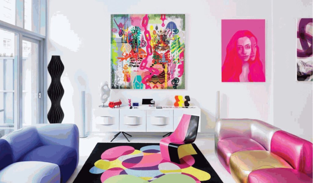
One of the most identifiable design trends is the Memphis Style! Bright neon, primary and pastel colours, geometric designs, and bold, repetitious patterns are all hallmarks of the style. You can’t dispute the Memphis Group’s influence on contemporary interior design, whether you love it or despise it.
Memphis design is one of those trends that would have sounded ludicrous in the early 2000s, but is now back in vogue among tastemakers and influencers.
One of the most unlikely success stories in design history is the Memphis Design Movement. It began as a strategy for its authors to rail against and confuse elite perceptions, as so many artistic replies do. The outcome was an innovative aesthetic that continues to inspire today.
Table of Contents
What is Memphis Design?
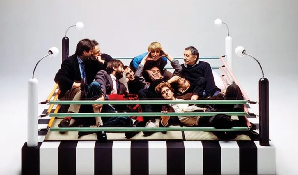
In the early 1980s, the famed Memphis Design collective of Milan-based designers created an important postmodern style known as Memphis Design. It was founded by the great Italian designer Ettore Sottsass (1917-2007), and it had a huge influence on 80s design, pushing for change with its bold mix of styles.
With its vibrant colours, clashing patterns, and radical attitude to design, Memphis Design was a contentious style that was not for the faint of heart. Today, Memphis Design is the subject of museum exhibitions and continues to inspire interior designers, fashion houses, graphics and typography designers, set and costume designers, and others.
Memphis Design is known today as the defining aesthetic of the 1980s, and understanding it completely requires a knowledge of the era in which it was born. Let’s take a look at Memphis Design’s history, as well as the people and influences who shaped it.
History
Ettore Sottsass, an Austrian-born Italian architect and designer, founded the Memphis Design Group in his Milan living room in 1980, bringing together a group of adventurous individuals from all over the world who shared a desire to disrupt the design world. With 55 pieces that premiered at Milan’s Salone del Mobile (now called the Milan Furniture Fair) in 1981, they unveiled their eye-catching, provocative, rule-breaking style, generating a buzzy love-it-or-hate-it kind of style that became instantly famous around the world.

Memphis Design was a reaction against the clean, linear midcentury modern design of the 1950s and 1960s, as well as the minimalism of the 1970s, with its decorative style filled with pop culture and historical references. Starting with the 1960s, Sottsass was involved in the Radical Design and Anti-Design movements in Italy.
His early work includes sculptural furniture he dubbed “totems,” which are now on display at prestigious worldwide museums such as the Metropolitan Museum of Art in New York City. Memphis Design was influenced by a resurgence of interest in the Art Deco movement of the 1920s, as well as mid-century Pop Art, both of which were popular trends in the 1980s, with a dash of 1950s kitsch tossed in for good measure.
Memphis Design was a hit with some people. Others thought it was obnoxious. “A shotgun wedding between Bauhaus and Fisher-Price,” as one critic phrased it.
Sottsass and his collaborators created unusual, whimsical, rule-breaking designs for decorative glass and metal objects, home accessories, ceramics, lighting, textiles, upholstery, structures, interiors, and brand identities. Sottsass famously quipped, “All we ever heard about when I was young was functionalism, functionalism, functionalism, it isn’t sufficient, sensual and engaging design is also important.”

Legendary fashion designer Karl Lagerfeld and David Bowie were both huge supporters of the design style in the 1980s. But Memphis Design wasn’t for everyone, and by the end of the decade, the collective had disbanded, with Sottsass quitting in 1985 and several of the group’s other major designers pursuing solo careers after the band disbanded for good in 1988. Alberto Bianchi Albrici bought the Memphis-Milano brand in the 1990s and continues to produce the collective’s original 1980s designs.
Memphis Design has become a fountain of influence for multi-disciplinary designers, encompassing fashion giants such as Christian Dior and Missoni, as well as new generations of interior designers, type designers, filmmakers, and more, since the early 21st century, as nostalgia for 1980s style has returned.
So, what was the significance of the name Memphis Design for this Italian-born design movement? Its name is a pun on the Bob Dylan song “Stuck Inside of Mobile with the Memphis Blues Again” from his 1966 Blonde on Blonde album, which was playing on repeat in Sottsass’ living room the night the Memphis Design group had its first official meeting.
Memphis Design’s Defining Characteristics
- Shattered preconceived notions of what constitutes excellent taste.
- Defamed the Bauhaus design idea of form following function.
- Unafraid to be loud, outspoken, passionate, playful, and unconstrained.
- Created to elicit a strong emotional reaction
- Uninhibited, loud, bold, passionate, playful
- Colors in unusual combinations are used.
- Bold, contrasting designs are used on purpose.
- Simple geometric shapes are employed.
- Black-and-white graphics are used in this project.
- Edges and curves that have been rounded
- Squiggles are something I’m fond of.
- Terrazzo and plastic laminate are examples of materials used in varied finishes.
- Unconventional shapes, like as round table legs, are used to defy expectations.
In What Way Is Memphis Style Returning?
In Los Angeles, Memphis design resurfaced in 2005. A year before his death, the LACMA displayed a survey of Sottsass’ creations.
Following Sottsass’ death, there was a surge in interest in the Memphis sound. It impacted high-fashion brands Missoni, Karl Lagerfeld, and Christian Dior, with the latter’s 2011 collection serving as a catalyst for the style.

Nathalie Du Pasquier, a founding member of the group, designed a range of patterns for American Apparel several years later in 2014.
Alessandro Mendini, who debuted in the first Memphis exhibition, designed a range of skate decks and clothes for Supreme in 2016.
West Elm debuted a line from contemporary Du Pasquier-inspired business Dusen Dusen in 2017, bringing the trend to a big box shop.
As minimalism took root in the 1990s, Memphis design fell out of favour. Despite this, some 40 years after its revolutionary debut, the “Less is Bore” design philosophy is back in style.
How To Apply Memphis Design In Today’s World
For better or worse, Memphis Design is deliberately dramatic, which can make it difficult to work with. It’s also one of those fashions that’s inextricably linked to its epoch, making the distinction between fashionably retro and antiquated a fine one to walk. Despite these challenges, designers all across the world are demonstrating that the style is more adaptable than you may think. Let’s take a look at some of the more recent Memphis Design variations.
Memphis Design As A Background
One of the most common methods to incorporate a Memphis Design pattern into the background is to use it as a background. Memphis was designed to call attention to itself, but the bright colours and chaotic patterns can also help foreground things stand out via sheer contrast.
A typical strategy is to create a kind of framing for the composition’s subject within the Memphis Design images. Alternatively, a background explosion of abstract colour can be created by scattering shapes directly behind the subject.
Memphis Miniature Artwork
Making a solid first impression has always been a priority for Memphis Design. It’s so potent that, like spicy sauce, a small amount is sometimes all you need to give your project a boost.
This is why, rather than relying only on showy visuals, many designers these days prefer to use small, scattered forms and lines to evoke Memphis Design. As a result, they are able to replicate some of Memphis’ joyous energy without all of the obnoxious show.
Memphis Design With Texture
Although traditional Memphis Design features flat colours and simple black-and-white graphic patterns, several modern designers have added additional variegated textures to the aesthetic.
Watercolour and acrylic paints, layered sketch illustrations, rough paper cut-out edges, and gradient are some examples. The technique not only lends a sense of 3D reality to a design that was already springing off the page, but it also creates shading that reduces the severity of Memphis Design.
Typography Using Memphis Design
Letterforms are good, predictable shapes for containing Memphis Design’s craziness. Consistent lettering, like a star, can serve as a focal point for the surrounding graphic elements, drawing them in and centring them.
Memphis design is frequently layered over the letters themselves. This is especially beneficial when working with 3D writing, as it provides the artist far more surface areas to work with when applying Memphis patterns. This style is best suited to artistic word-marks or hand-lettering projects that can afford to be colourful and inventive at the sacrifice of intelligibility.
Memphis Design With Organic Touch
Although Memphis Design was originally known for its harsh geometry, a common reassessment has attempted to incorporate flowing, oblong organic patterns back into contention. These are a logical extension of the wavy lines and spherical shapes that were popularised with the classic Memphis, instead of a significant departure.
While some may consider this to be a departure from typical Memphis design, that was never the objective. Memphis was known for violating the rules, so it’s only natural that it would break a few of its own.
Some Real-Life Examples of Memphis Design
Paradiso Ibiza Art Hotel

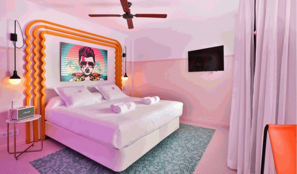
Inside the Paradiso Ibiza Art Hotel, Miami modernism and the Memphis Group collide, creating a new hangout that puts art front and centre. The 60-room hideaway, located in San Antonio Bay on the island, is part of the Concept Hotel Group and features brilliantly coloured decor by Ilmio Design.
The curving Art Deco-style façade of the hotel has a pair of vertical pink fantails that appear as they belong in South Beach. Inside the flamingo pink foyer, guests will encounter an undulating, sunken seating area with curved forms and sweet colours. Above the aqua-blue-tiled reception counter, neon tube lighting hangs from the ceiling, with a wavy Memphis-style design that recurs throughout the hotel’s interiors. Pop art is displayed throughout the Paradiso Ibiza Art Hotel.
The Paradiso Ibiza Art Hotel has an art gallery that is open to both guests and the general public, as well as a residency programme called “Zero Suite.” In exchange for putting their expertise on display and taking over the hotel’s social media channels, creatives are housed in a transparent micro workstation cube in the lobby where they may work and live for free.
A library with modern art publications, an outdoor theatre, and a tattoo studio are available to guests who want to depart with a permanent souvenir of their stay at the Ibiza hotel.

The private guest rooms of the Paradiso Ibiza Art Hotel are just as vibrant as the lobby, with bursts of yellow, pink, and green that reflect the 1970s theme. They were designed as an extension of the gallery space and are decorated with a changing display of artworks, while the furniture pays homage to Ettore Sottsass’ Memphis designs with bold curves and whimsical nature.
The hotel’s rosy-hued swimming pool and lavender tropical vegetation, on the other hand, are on point for the Instagram age.
Game Over Pizza

At this Los Angeles eatery, diners are transported to a Memphis fever dream, where they may order pizza slices with a heavy dose of nostalgia.
Everything from the huge arcade games to the squiggly patterned walls bears homage to a bygone era, with neon-lit Hollywood strip malls serving as inspiration.
The interiors were designed by M-RAD, who used pink and blue neon lights, a tubular couch, and terrazzo-patterned tables straight from the Saved By the Bell canteen. The aesthetic is completed by a glass brick counter lined with stainless steel and leather stools.

Diners can devote themselves to Game Over’s collection of ancient arcade machines or whatever 80s cult blockbuster is playing on its big-screen TVs that night after indulging in a 20″ pie.
Saved By The Bell

With its Saved By The Bell-themed décor and old VHS collection, this time capsule apartment in Texas transports you back to the 1990s.
Guests are watched over by New Kids On The Block posters while they sleep under Memphis-patterned bed covers before tucking into a bowl of Lucky Charms for breakfast.
The owner of the two-bedroom US vacation rental – which starts at £197 per night – has filled the flat with vintage mementos such as an N64 system and a Talk-boy cassette player, as well as 90s music magazines.
An accurate reproduction of The Max cafe from the cult TV show Saved By The Bell serves as the main point. The postmodern features, such as the zig-zag door handle and the colourful vinyl-covered benches, will appeal to fans of the show.
Don’t worry if all of this makes you nostalgic for the past. A collection of Saved By The Bell videos is also available in the flat.
The Ultrafragola Mirror

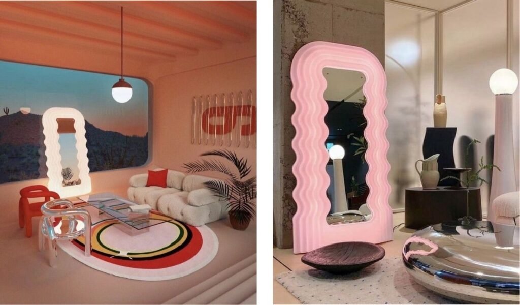
The ultimate selfie mirror that was showcased at Raquel Cayre’s Dream House exhibit in 2018 and has since been owned by celebrities like Katherine Bernahardt, Bella Hadid, Lena Dunham, Kim Jisoo of Blackpink and many more and is also the mirror that inspired this article.
Mobili Grigi, a far-out bedroom series designed by architect Ettore Sottsass, was unveiled by Florentine manufacturer Poltronova at the Eurodomus 3 trade show in Milan in 1970. It was part of the brand’s ambition to bring revolutionary industrial materials, which had previously changed nautical and automobile design, into the house, and it was made of smooth, vacuum molded plastic and cast fibreglass. With one exception: the neon-lit pink mirror known as Ultrafragola, or “the ultimate strawberry,” the radical collection was made in a very limited quantity.
The thermoformed plastic reflector (which appeared a decade before Sottsass founded the Memphis Group) was designed to highlight femininity—the contours of a woman’s figure, the waves of her hair, and a few other key features of her anatomy. That’s what we’d call objectification nowadays. However, women all over the world have flocked to the mirror ($10,500; now available in LED), which is still handcrafted using the original 1970 mould.
The Memphis Uprising Continues To Gain Momentum
Memphis Design was more than just a wild guess or a prank by bored designers. It was a defining moment for a decade and an inspiration for a generation. Its energy, freedom, and bright colours are still relevant today, which is why so many people find it so appealing. However, because of its boldness, it can be divisive. Make sure you’re dealing with a professional designer who understands your audience’s “bad taste” if you want to use Memphis Design to excite them in the correct way.


