As an integral part of the design process, the use architecture fonts is essential for creating visually appealing and effective presentations. From brochures and business cards to building facades and signage, the right font can greatly enhance the overall aesthetic and impact of a project.
However, with so many font options available, selecting the right one can be a daunting task. In this comprehensive guide, we will explore the various types of fonts used in architecture, the factors to consider when choosing a font, and provide some examples of popular font choices in the field.
Table of Contents
Types of Fonts in Architecture
There are four main categories of fonts used in architecture: serif, sans serif, script, and display. Each type serves a specific purpose and should be used appropriately to achieve the desired effect.
Serif fonts

Serif fonts are characterized by small decorative flourishes or strokes at the ends of the letters. These fonts are often seen as traditional and formal, and are well-suited for use in long documents or presentations. Some popular serif fonts in architecture include Times New Roman, Garamond, and Georgia.
Sans serif fonts
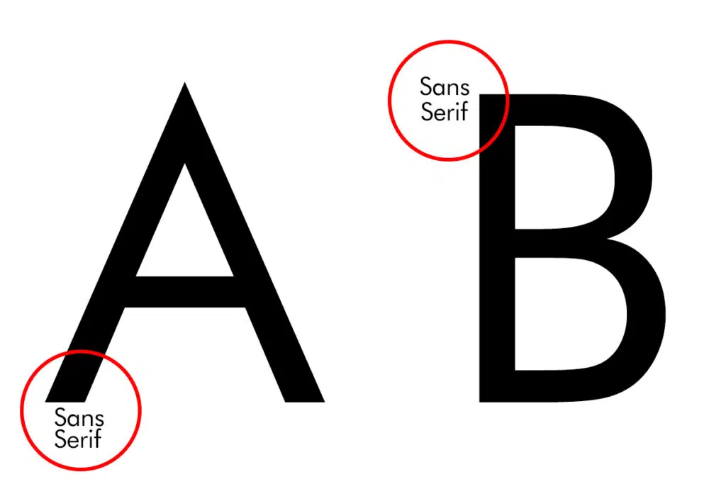
Sans serif fonts, on the other hand, do not have these decorative flourishes and are characterized by clean, simple lines. These fonts are often seen as modern and informal, and are well-suited for use in shorter documents or on web pages. Some popular sans serif fonts in architecture include Arial, Helvetica, Futura, and Gotham.
Script fonts

Script fonts are characterized by a more flowing, cursive style and are often used to add a decorative or formal touch to a design. These fonts can be more difficult to read in large blocks of text, and are best used sparingly for emphasis or as a highlight. Some popular script fonts in architecture include Edwardian Script, Vivaldi, and Black Jack.
Display fonts
Display fonts are designed to be used at larger sizes and are often more decorative or expressive in nature. These fonts are not typically suitable for use in large blocks of text, but can be effective for headlines or logos. Some popular display fonts in architecture include Impact, Cooper Black, and Bauhaus.
Factors to Consider When Choosing a Font
When selecting a font for an architecture project, there are several factors to consider. These include the intended use, audience, and overall aesthetic of the project.
Intended use
The first step in selecting a font is determining its intended use. Will the font be used in a brochure, website, or building facade? Different font types are better suited for different uses, and it’s important to choose a font that is appropriate for the specific context in which it will be used.
Audience
The audience for the project is another important factor to consider when choosing a font. Different fonts can have different connotations and may be more or less appealing to different audiences. For example, a traditional serif font may be more appropriate for a formal presentation to a corporate audience, while a modern sans serif font may be more suitable for a website aimed at a younger demographic.
Aesthetic
The overall aesthetic of the project is also an important consideration when selecting a font. The font should complement the design and help to create a cohesive and visually appealing presentation.
Popular Choices in Architecture Fonts
Given the wide range of font options available, it can be helpful to see some examples of popular font choices in architecture. Here are a few examples of fonts that are commonly used in the field, along with a brief description of each:
Times New Roman

Times New Roman is a classic serif font that is often used in long documents and presentations. It is known for its readability and versatility, and is well-suited for a wide range of applications in architecture. It was first designed in 1931 by Stanley Morison and has since become one of the most widely used fonts in the world.
Arial
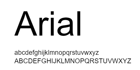
Arial is a popular sans serif font that is often used in web design and shorter documents. It is known for its clean, modern appearance and is widely available on most computers and devices. Arial was designed in 1982 by Robin Nicholas and Patricia Saunders as a replacement for the Times New Roman font, and has since become one of the most widely used fonts in the world.
Futura

Futura is another popular sans serif font that is known for its geometric, modern appearance. It was designed in 1927 by Paul Renner and has a timeless, clean look that is well-suited for use in branding and marketing materials in architecture.
Helvetica
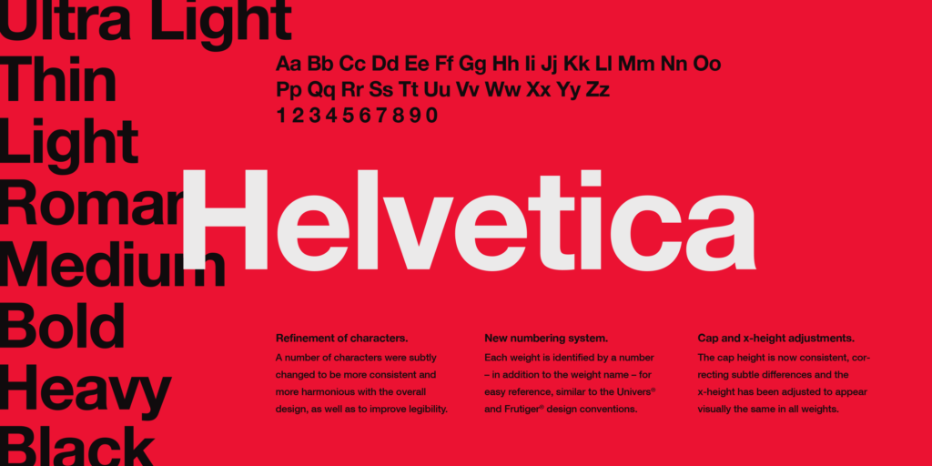
Helvetica is a classic sans serif font that is known for its versatility and clean, modern appearance. It was designed in 1957 by Max Miedinger and has become one of the most widely used fonts in the world. It is often used in signage and branding materials in architecture and has a timeless, professional look.
Gotham
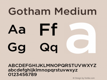
Gotham is a popular sans serif font that is known for its modern, geometric appearance. It was designed in 2000 by Tobias Frere-Jones and has a strong, contemporary look that is well-suited for use in branding and marketing materials in architecture.
Edwardian Script
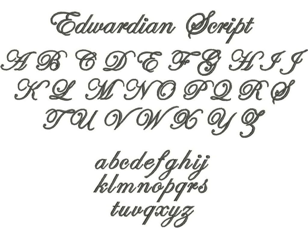
Edwardian Script is a popular script font that is often used for decorative purposes in architecture. It has a formal, elegant appearance and is well-suited for use in invitations or other formal documents. It was designed in 1994 by David West and is based on the handwriting of the English Edwardian era.
Bauhaus

Bauhaus is a popular display font that is known for its geometric, modern appearance. It was designed in 1919 by Walter Gropius and has a strong, contemporary look that is well-suited for use in branding and marketing materials in architecture.
Architekt – Geometric Typeface
Architekt is a popular sans serif font that is known for its geometric, modern appearance. It was designed in 2018 by Radomir Tinkov and has a strong, contemporary look that is well-suited for use in branding and marketing materials in architecture.
Rough Draft

Rough Draft is a popular display font that is known for its expressive, hand-drawn appearance. It was designed in 2015 by Ryan Martinson and is often used for headlines or logos in architecture to add a creative, personalized touch to a design.
Consolas

Consolas is a popular sans serif font that is known for its clean, modern appearance. It was designed in 2006 by Luc(as) de Groot and is often used in technical documents and presentations in architecture for its professional, straightforward look.
Aikido
Aikido is a popular sans serif font that is known for its geometric, modern appearance. It was designed in 2012 by Radomir Tinkov and has a strong, contemporary look that is well-suited for use in branding and marketing materials in architecture.
Brandon Grotesque
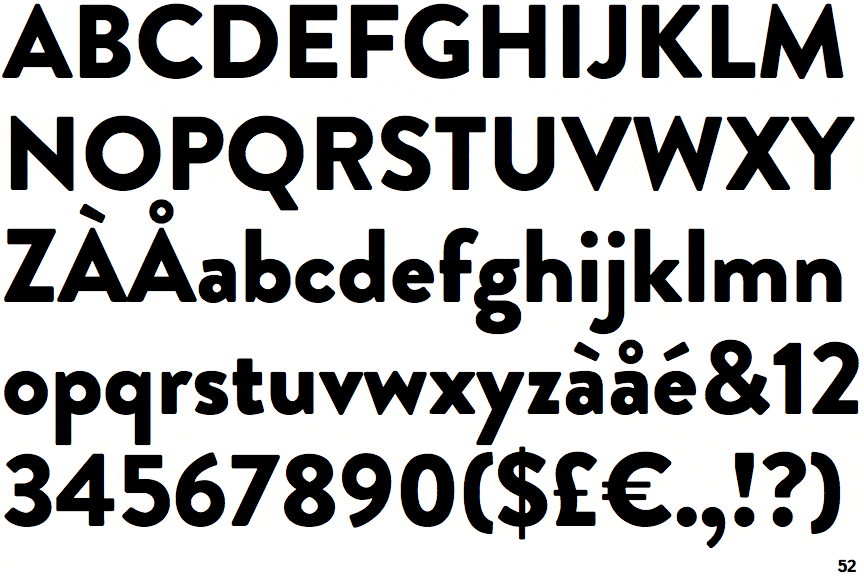
Brandon Grotesque is a popular sans serif font that is known for its clean, modern appearance. It was designed in 2010 by Hannes von Döhren and has a strong, contemporary look that is well-suited for use in branding and marketing materials in architecture.
Metrica Font

Metrica is a popular sans serif font that is known for its clean, modern appearance. It was designed in 2017 by Radomir Tinkov and is often used in technical documents and presentations in architecture for its professional, straightforward look.
Lora

Lora is a popular serif font that is known for its elegant, traditional appearance. It was designed in 2010 by Olga Karpushina and is often used in formal documents and presentations in architecture for its sophisticated, timeless look.
Frank the Architect
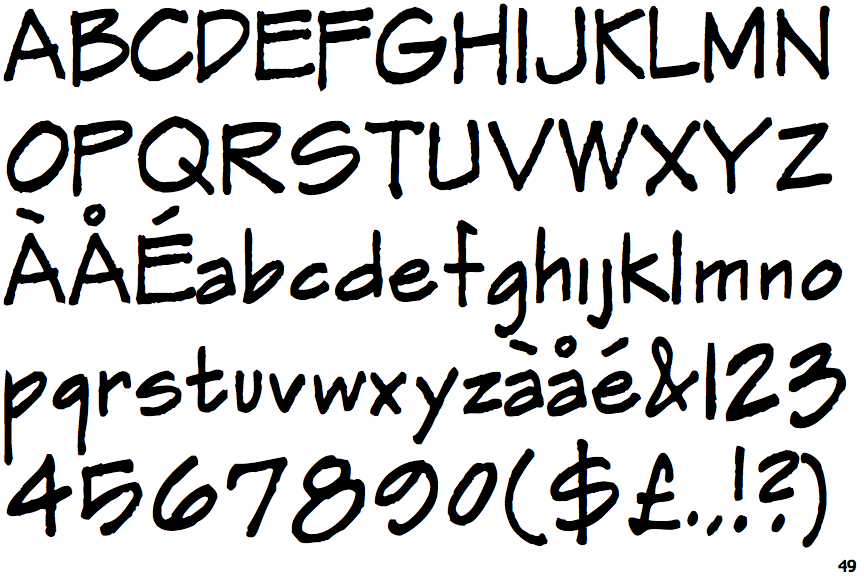
Frank the Architect is a popular sans serif font that is known for its modern, geometric appearance. It was designed in 2016 by Ryan Martinson and has a strong, contemporary look that is well-suited for use in branding and marketing materials in architecture.
Architect Bold
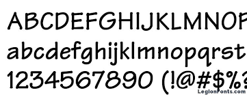
Architect Bold is a popular sans serif font that is known for its bold, expressive appearance. It was designed in 2015 by Ryan Martinson and is often used for headlines or logos in architecture to create a strong visual impact.
Conclusion
In conclusion, the use of fonts in architecture is an important consideration for creating visually appealing and effective presentations. By understanding the different types of fonts available and the factors to consider when choosing a font, architects can select the right font to help communicate their design ideas effectively. With so many font options available, it’s important to take the time to select the right font for each specific project to ensure that it enhances, rather than detracts from, the overall aesthetic and impact of the design.
