Project Information
Design Firm
Studio Aiza
Completion Year
April 2022
Gross Built Area
890 SQ FT
Project Location
Mumbai
Building Function
Interior Design
Lead Architects
Ar. Zibran Sayyed & Ar. Ashraf Sayed
Photography Credits
Studio Varad Anvekar
Project Description
The 890 Sq.Ft. 19th-floor Mumbai-based apartment is owned by a small family living in the very fast-moving, chaotic, and busy urban settlement of Mumbai. The clients wanted a space that would be light & airy, chic yet simple, modern yet uncluttered. A place they could be comfortable in and yet have a feeling of pride. They wanted the space to have an ample amount of storage and multifunctional furniture.
They envisioned a space that is simple and once entered into would make them forget about the hustle-bustle outside and reconnect their lives with a calm, cozy, and colorful surrounding. It had to be a breathable, liveable space that included a high-end touch of creativity, a play in fabrics, metal, wood, and pastel colours.
The home has been designed with a minimalistic theme, but the materials were used in various textures to ensure there was creativity, definition, depth, and interest alongside the simplicity that the space exudes. It had to be an amalgamation of minimal, modern, Scandinavian, and boho design with an orchestra of vibrant yet subtle colours with free-flowing shapes which are balanced with hints of straight lines wherever required.

Entry Wall of Nayak’s Residence
The Nayak’s home is a journey of colours that creates a feeling of awe starting from the entry wall. The Terracotta coloured arched safety door, with the bold nameplate brings in a sense of free flow to the entrance. It is perfectly balanced with the Lord Ganesha idol placed in a circular stamp to the right and you feel the blessing extended to everyone who enters the home.
Entrance Foyer

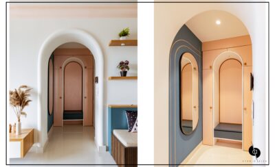
As soon as you enter through the grand white arched door, you see the poetry of shapes, colours and finishes. You are welcomed with a long rustic finished mirror that reflects positivity. Adjacent to it is the very thoughtfully designed and placed arched shoe unit dipped in light peach colour and a hint of white on the arched seating in it.
Living Room
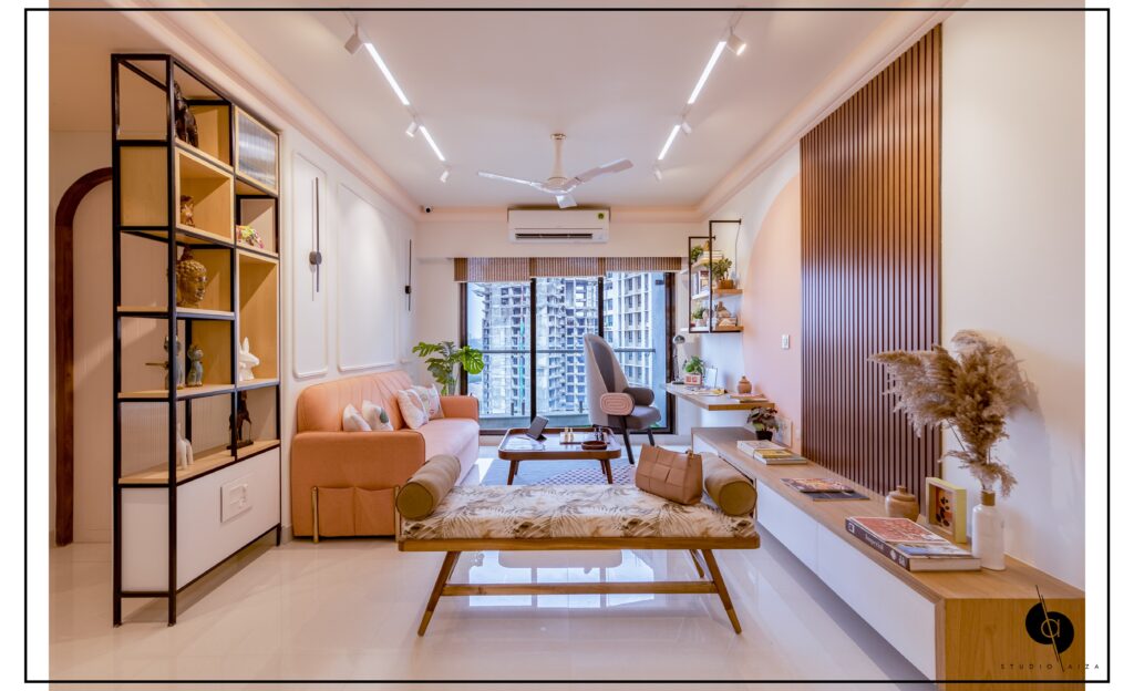
The living room of this home is a visual treat of design, planning with bold shapes, pastel colours, and minimal design. The main highlight is the arch at the entry that adds an energizing yet subtle aura, bringing a minimal yet grand entry into the whole space. The ceiling had fire hydrant pipes which have been cleverly masked with a peach coloured modern cornice, uplifting the character of the living room.
The TV unit wall is accentuated with a large peach inked semicircle merging in harmony with the dark wood panelling, adding a hint of Scandinavian design to the space. The white walls all over soften the interior, the wood and veneer add warmth to the space.
The solid wall between the living room and kitchen was replaced with a glass partition that also works as a serving window for the intimate matte white dining table. The glass adds to the character of the living room by drawing in more light from the kitchen, hence making it airier. The cleverly placed counter adds a very important utility of an informal breakfast or dining table, hence providing a corner for individuals to have profound conversations filled with fun, laughter, and zest.
The clients have a love for reading. Their brief asked for a cosy reading corner. The vibrant green L-shaped seating is a house to two large shelves above for storage of books. The seating is designed as a pull-out bed for extra sleeping space for guests.
The living room connects to the passage that leads to the bold kitchen and beautiful bedrooms. The bedroom doors have been carefully crafted into smooth arch shaped masterpieces by our inhouse carpenters. The old sag wood is used for enhancing the beauty and also giving the doors a better life. The door frames are kept natural to showcase the beauty of the timber used and the shutters are decorated with linear engravings and are coloured mushroom to get into nature and add a sense of warmth to the passage.
Kitchen
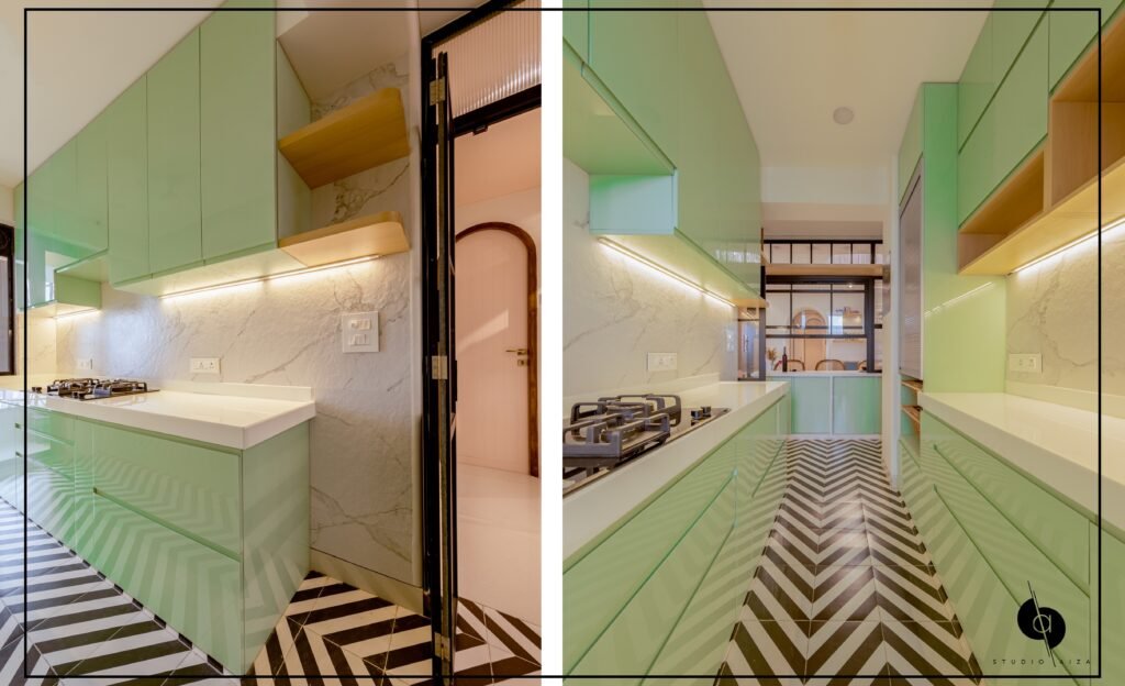
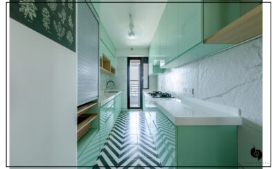
The kitchen is a vibrant, subtle and loud mix of convenience and aesthetics. The element of interest of the space is the aquamarine coloured acrylic used to finish the handle fewer shutters reflecting the flooring and backsplash. The space remains true to the theme of the house with a mix of loud and subtle.
Sandwiched between the overhead storage and counter shutters is stone finished satavrio backsplash with a plain white kitchen counter top adding to the subtle nature, while the herringbone white and black flooring adds to the loudness of the kitchen, making it more playful.
Client’s Bedroom
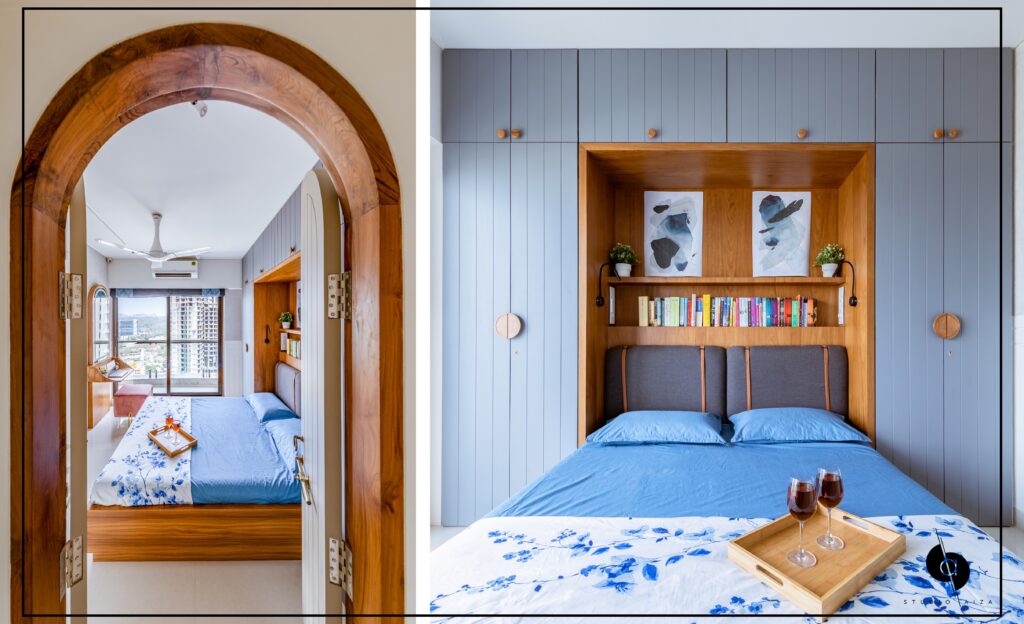
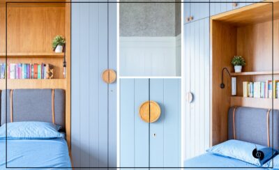
You get an ocular treat once again when the wooden bedroom door slowly takes you inside a room that is a symphony of colors,materials and finishes. This bedroom is again a showcase of minimal and modern approach with a very luxurious vibe. Due to the space crunch the wardrobe had to be designed around the bed, it fit in perfectly like a masterpiece. The bed back adopts a more modern and minimal trend with the veneer finish bringing in a lux and earthy vibe to the modern room.
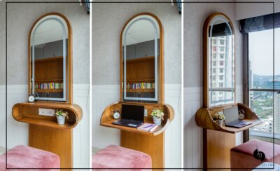
On the wall opposite to the bed the dressing table has a secret study table attached to it.The sag wood table designed in a manner where the table has dual function: When closed it works like a display shelf and when opened, it works as a study table. The light shade of grey in the texture paint on the walls adds a subtle yet loud character to the overall drama of the room.
Parents’ Bedroom

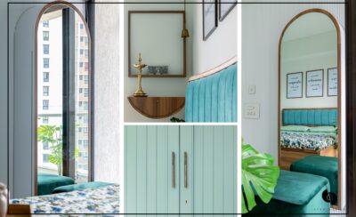
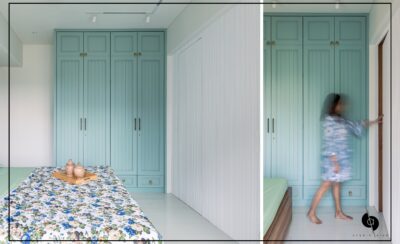
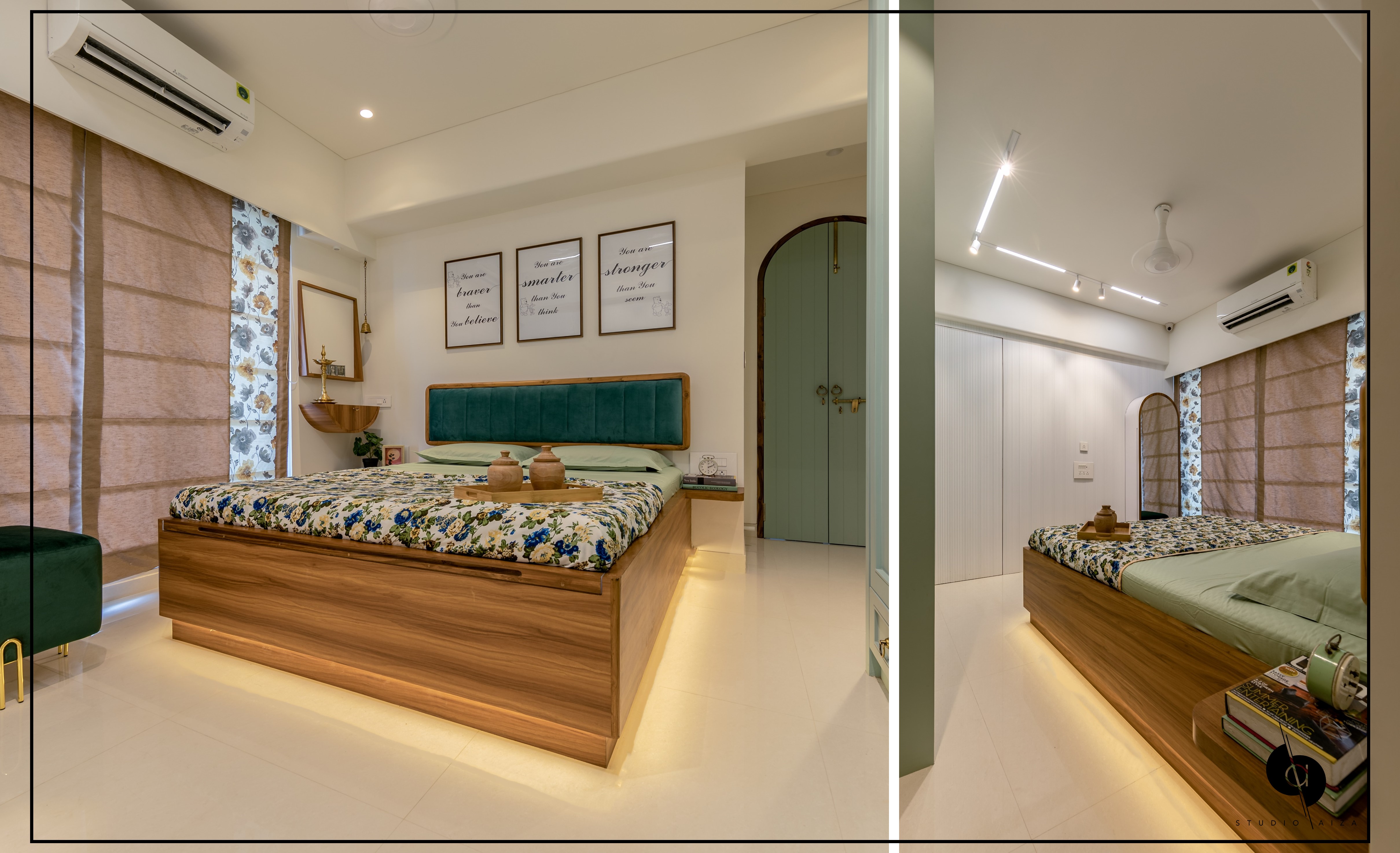
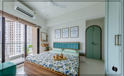
The wooden arched door opens up to the dual-toned bedroom. This bedroom was designed more subtly, keeping in mind the taste of the clients. In the North-east corner of the bedroom is situated the Mandir of the house finished in wooden laminate. The mandir is a modern take on the traditional in-house mandirs. The bed back is made in old sag wood and finished in a green velvet fabric to add a touch of luxury.
Opposite the bed is the TV wall that houses the dressing unit. The TV wall is finished with seamless fluting and carries a hidden entry to the master bathroom. The green full-length wardrobes are designed for maximum storage and add to the style statement of the room.
Gallery

