A splashback is a panel of material that protects the wall behind a sink, stove, or countertop from splashes, stains, and heat. It can also enhance the aesthetic appeal, hygiene, and durability of your kitchen. So how do you make sure to choose the right color? There are many factors you should think about such as the size and layout of your kitchen, decor style and theme you’re going for, cabinet color and material along with countertops. And finally lighting, ventilation and personal preference. In this post we will guide you through some important aspects on choosing a splashback color.
Table of Contents
Factors to Consider When Choosing a Splashback Colour

The colour of your splashback can have a big impact on the overall look and feel of your kitchen. Here are some of the factors that you should take into account when deciding on a splashback colour:
- The size and layout of your kitchen: Depending on how narrow or small your kitchen is, you might want to pick a light color for your splashback. This’ll give off a sense of space and openness. Dark or dull colors tend to make small kitchens feel cramped and gloomy. On the other hand, if you have a big kitchen then go ahead and experiment with darker or bolder colors.
- The style and theme of your décor: Overall, the color of your splashback should match the theme of your kitchen. A modern or minimalist kitchen could do well with sleek and simple colors like white, black, grey, or metallics. Warm colors such as brown are perfect for traditional or rustic kitchens. Lastly, colorful kitchens can range from blue to yellow. If you have one that falls under this category it wouldn’t hurt picking bright and vibrant splashbacks.
- The colour and material of your cabinets and countertops: One thing to consider is the material and color of these two components. You have two options when it comes to matching them with your natural stone splashbacks: uniform for everything to blend together evenly or contrast for a more striking look. For example, if you have white cabinets and countertops, you can either choose a white splashback for a clean and elegant look, or a black marble Splashbacks for a dramatic and sophisticated look.
- The lighting and ventilation: Another factor that gets affected by your choice is the lighting in your kitchen affecting how much air flows around. Lighter colors can reflect more light making the room brighter while darker ones absorb more light making things dimmer hence cosier. Look at how much natural sunlight comes in through windows as well as artificial light coming from bulbs throughout the day.
Popular Splashback Colour Options and Their Effects

The colour of your splashback can create different atmospheres and feelings within your kitchen. Here are some popular options along with the ambiance they evoke:
- White Marble: As soon as you walk into a room with white marble, you’re hit with a wave of elegance. The natural veins and slight color variations within it give it a touch of uniqueness. So in the end, no two splashbacks are ever the same. And that’s just a small fraction of what this material can do. The neutral palette makes it versatile, able to blend seamlessly with any kitchen styles, so there’s no need to worry about whether it will fit your modern or traditional style.
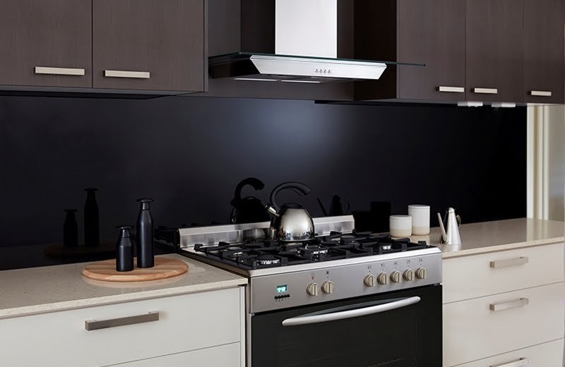
- Black Marble: If you’re looking for something that screams sophistication and modernity then black marble is what you want. It lends a sleek and contemporary look to your kitchen without any effort. When you compare it to lighter colors there’s an instant striking contrast. What this does is create a focal point, drawing eyes to the splashback area and making anything else seem invisible. Additionally it hides stains and splashes very well meaning clean up is always easy. Want to make a bold statement? Go with black marble.
- Green Marble: To those who want to bring a bit of natural light into their kitchen, try green marble! It’s an exotic choice that anyone would love if they’re trying to make a statement. The mix of natural veins and various shades of green brings in an organic and earthy vibe that enhances how warm the space is. Homeowners who like splashes of color but don’t want to move too far from natural neutral tones will really enjoy this choice.
- Neutral Tones: For people who prefer calm and understated looks, neutral colors are the way to go. They provide such subtle backdrops that other elements in your kitchen will shine easily. Another great thing about them is how easily they blend with other colors and materials so you’re never restricted when designing anything else around it.
- Vibrant Colours: Now if boring isn’t in your dictionary then vibrant colors should be at the top of your list. Splash your kitchen with red, yellow, or orange and you’re sure to fall in love with the energy it brings. These bold colors stimulate excitement and creativity. Basically making your kitchen the hub of your home. And even more, a vibrant splashback becomes the focal point of the kitchen, showcasing who you are as a person.
- Metallic Shades: If you want something more modern with a touch of luxury then go for metallic shades like silver, gold or copper. They reflect surfaces that not only brighten up the space but also give it an open and airy feel. With that light-bouncing effect there’s also a sophisticated contrast to both dark and light cabinetry so no matter what style you have going on, it will look great.
Conclusion

The right color for your kitchen’s splashback is important. It can change how it looks and functions. To make the right choice consider things like: kitchen size and layout, style and theme of your decor, cabinet and countertop color and material, lighting and ventilation, personal preference, and mood. You should also test different colors. This can be done with paint swatches, online tools, samples, or mock-ups. After choosing the perfect color to install and maintain it properly. That means following what the manufacturer offers in terms of safety tips and instructions. By doing this you’ll enjoy a great looking splashback for years.
FAQs
What colour splashback goes with a white kitchen?
- As we all know, white is super neutral. With that being said, your options are almost endless. One of the best things about it is that you could use a glass splashback. It offers a range of color choices and textures while also being durable and easy to clean. Clear glass or metallic finishes especially silver are popular because they compliment the white aesthetic well. However, if you’re looking for something more vibrant, bright colors like red, yellow, green, or blue can add a pop of color into the white kitchen.
What colour splashback goes with grey?
- Grey kitchens offer modern and timeless appeal. And when it comes to what color your splashback should be, there’s plenty of options out there, it all depends on what you want your kitchen vibes to be like. If you want bold and eye catching details while still having some warmth in the room then choose colors like pink, red, green ,or terracotta for the backdrop. But if you find yourself on the other side of the fence and prefer harmonious choices then go with white black granite or even a matching grey. Soft pink tones can also give your grey kitchen an interesting look as well as earthy greens like sage or olive. For materials and finishes consider quartz engineered to resemble marble since it has natural shades of grey or just use granite or marble slabs.
What is on trend for splashbacks?
- For 2023 our trends include dramatic marble slabs that reach from ceiling to counter table tops and textured backsplashes with raised or indented patterns . As always classic tiles such as ceramic and porcelain remain timeless choices while glossy tiles made from stone slabs are making their way up in popularity again , but expect them to have handmade qualities in them . Mixing materials isn’t just limited to countertops but can also be applied here for example using saturated colors like deep greens ,reds, and browns that move away from the all white kitchen trend is also becoming popular.
Should backsplash be lighter or darker?
- The choice between using a lighter or darker backsplash really comes down to personal preference and what you want your overall kitchen theme to be. If you’re looking to make it feel more open and less confined then go with a lighter backsplash for brightening up the room. But on the flip side of things if you want to add a little more drama then use a darker one for contrast . Also consider maintenance because light colors will show stains and splashes easier than their counterpart.

