“People think that the most appropriate building is a rectangle because that’s typically the best way of using space. But is that to say that landscape is a waste of space? Remember, the world is not a rectangle.
– Ar. Zaha Hadid
Table of Contents
Introduction
Designing is a process of onboarding ideas, art, and forms on paper, creating a draft, and executing it with precision as a perfect designer.
Design is the most crucial process when it comes to understanding. There is a fragile line between a good design which can be abstract at times and a bad design which is straight and simple as “it’s all about perspective”.
Principles & Elements of Design
Design can only hold good strength when it has a strong structure of principles and elements of design which should be executed in the correct guided design process.
There are five basic principles of design and 7 elements of design that need to be kept in mind while creating a design that is crisp, clean, detailed, distinguished, revolutionary, and dynamic.
Design principles are balance, harmony or unity, emphasis or focus, proportion, and rhythm.
Balance

The visual balance of dimensions in a room between the elements. balance in design can be of 3 types symmetric, asymmetric and radial.
Harmony and Unity
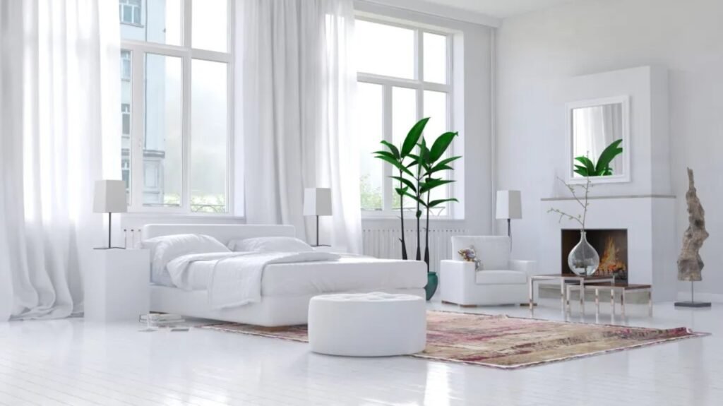
The coordination of objects, colours and elements which make up the design.
Emphasis or Focus
An element used as an accent to the designed space like a featured wall, distinguished colour, highlighted pattern or authentic furniture.
Proportion
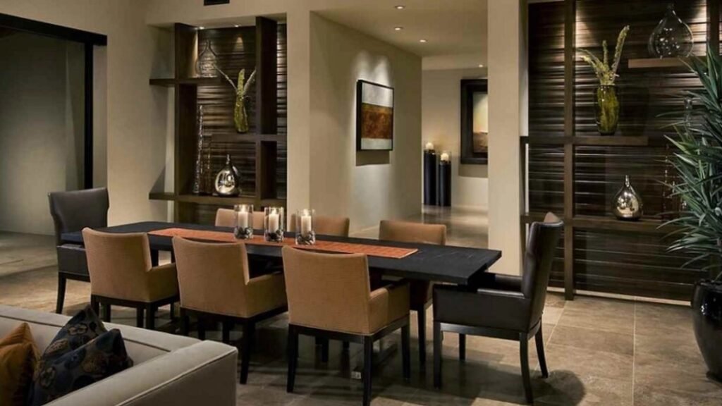
Ensure harmony between all the elements in design whether it is between the furniture pieces or the spatial arrangements, or the balance between colour, pattern and texture.
Rhythm
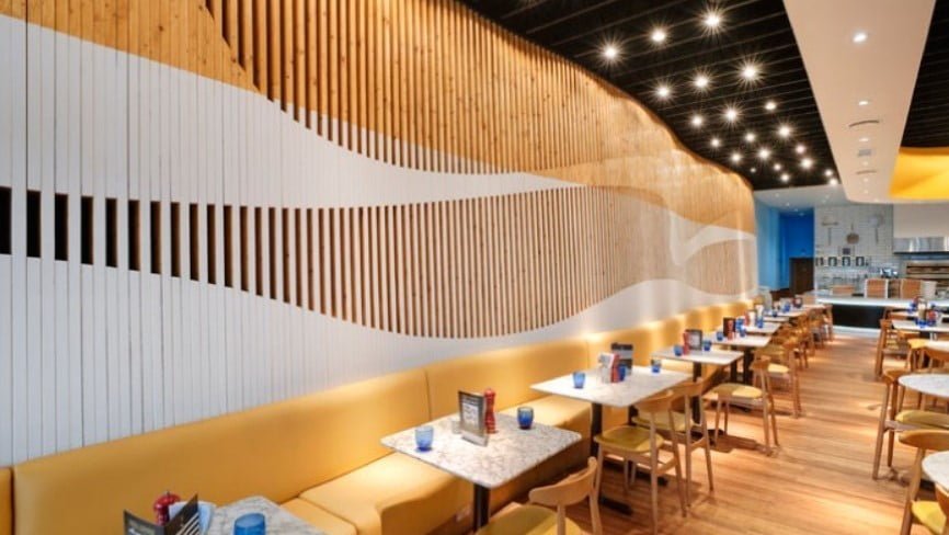
When the elements of design come together and complement, each other are said to be in rhythm.
Elements of design are line, light, form, colour, texture, pattern and space.
Line

Line adds a sense of direction, creativity, and visual flow and creates the structure in the design. Lines are of three types which define the design, horizontal lines are defined by zoning and furniture pieces vertical lines are defined by a vertical structure like walls, doors and windows, arches, columns etc. and dynamic lines are generally defined by stairs like spiral staircases or parametrically designed architecture building.
Light
Light adds mood to design, affects the atmosphere and gives the real warmth or coolness of design, doesn’t matter if the light is present naturally or artificially.
Form

The lines defining a shape in 3- dimension is the form of the design.
Forms can be geometric and organic. Geometric forms define artificial pieces and organic majorly define natural pieces such as furniture pieces and plants, respectively.
Texture
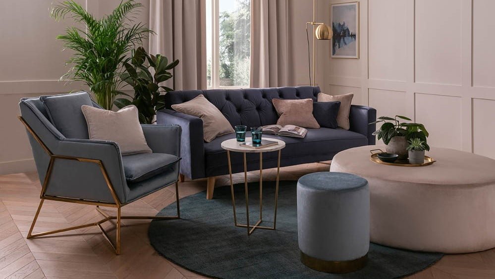
The element adds depth and has a dynamic-static appearance, which can be both visual and physical. Visual texture cannot be felt felt rather gives an illusion visually on the other physical texture can be felt and differentiated.
Pattern
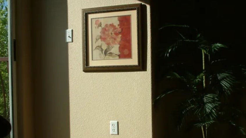
The element with repeated lines, shapes, forms, and, at times, texture is the patterned element of design. It can add excitement pr subtleness to the design.
Color
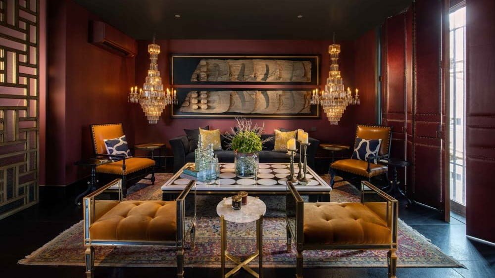
Colour sets the vibe of a design, be it a warm design or cool design, it is all defined by colour, the element of design. Colour psychology helps to choose a person’s personified colour under the personality. For example, extrovert and conversational people love to with warm colours like red, orange and yellow hues and tones while other hand introspective loves to go with cool shades like blue, green, and violet hues and tones.
Space
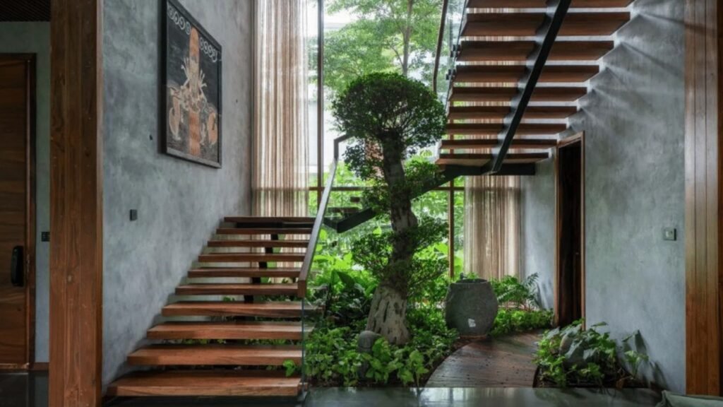
The most important element that when balanced makes the space more inviting and liveable. There are two types of space negative and positive spaces. The field spaces are termed positive and empty ones are termed negative spaces.
A design made by keeping all these principles and elements of design will make your design look more perspectively good and not baffled.
Design Process
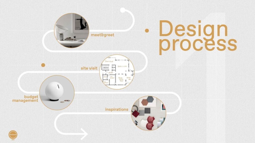
A process in which an imaginative design is executed well by taking into consideration the steps like concept study and development of design until the final execution. The design process, when followed thoroughly, will lead to a keen design perspective and not have a baffling vision for the viewer. The design process consists of the following steps:
Programming
Identifying the problem, preparing a written statement, and studying the area and extent of design work.
Concept development
Rushing the mind with thousands of ideas, selecting the best of them as per the problem, going into the deep study and representing it with schematic diagrams.
Presentation
The diagrammatic representation of design will make it more verbal and bespoke. Also, AI tools can be used for digital presentation of design which is in high demand these days especially post COVID-19 times.
Final design development and documentation
Preparation of final design and presenting it to the viewer who is going to head it.
The presentation of your design should be so exclusive that the design should appear like hyperbole to the viewer after all “presentation matters”.
Execution
The imaginative design as imagined during the programming stage should be as it is executed will make your process a successful design process and design not being baffled.
Evaluation
Every project has its flaws and will aspire the designer every time to do more better as it is rightly said” mistakes are the first step towards being successful”.
Follow the right process of design and make your design look perspectively well and not baffled or inclusive of flaws to the viewer.
How Design Can Be Perspective
“Design is the perspective of vision” by this I mean to justify how a vision creates an illusion and develops the visioner to make his/her perspective towards the design. It can appear simple to someone or abstract to another one completely depending on their perspective of vision.
Perspective in design depends on how a person thinks, what are the choices and what is their lifestyle. For example, if we consider a person with a vintage lifestyle, he or she would most probably prefer the design to be European, roman, or something like an ancient Indian thematic look, on the other hand, the person who is more modern or contemporary will go with contemporary architecture or design with cleaner and sleek look.
Perspective matters, perplexing shatters
Perspective vision also depends on what personality a person adores or admires. For example, an extrovert person is more inclined toward warm colours like orange, red, and yellow so the vision will be highlighting and extravagant with elements being brighter and expressing the warm tones just like warm interiors or a Hollywood glam interior, and an introvert person is more inclined towards minimalistic interiors being every element minimal whether its wall design being in light colour or space planning or design with more open space and fewer elements.
Drawing is based upon perspective, which is nothing else
then a thorough knowledge of the function of the eye.
– Leonardo Da Vinci
Correctly said by the great artisan Leonardo Da Vinci, design executed well with proper knowledge of its ethics, principles and functionalism can never go wrong or look perplexing to anybody. Yet abstract designs can be good designs when made keeping in mind the functionalism of design and its principles.
Everything in this world can reach its best time when planned and executed by gaining proper knowledge from its deep roots, nourishing it with practicality, the result will look like a blooming flower and you will shine like a pinhole light in the dawn of a creative journey.
I strongly believe “imperfections are perfection to a beautiful perspective “, hence good designs cannot be perplexing.
How Design Can Be Perplex
Perplex design is the design which often creates a varied illusion to a visioner and confuses the state of not being a clear and crisp design making it a perplexing vision to the observer.
Perplex design is not to be confused with abstract forms or shapes, they are the design which is not made by keeping track of the significant 7 principles of design.
There is a misconception of abstract designs not to be considered good and simple design is an example of good design as according to me humans tend to visualise that a design having a line of symmetry is more accurate and correct rather an abstract art form, which is also balanced in an artist’s or designer’s vision.
There are different designers and architects with different in designing perspectives some love to go with sleek and contemporary designs some go with abstract ones but they know how to balance them, at the time those abstract or distinctively different designs become their signature design, for example, one of the greatest architects Mr Sanjay puri has his signature design and can be recognized easily that’s why it is correctly said and is the biggest achievement in any architect’s or designer’s journey –
“A design that defies labelling and does not need an introduction while walking into space.”
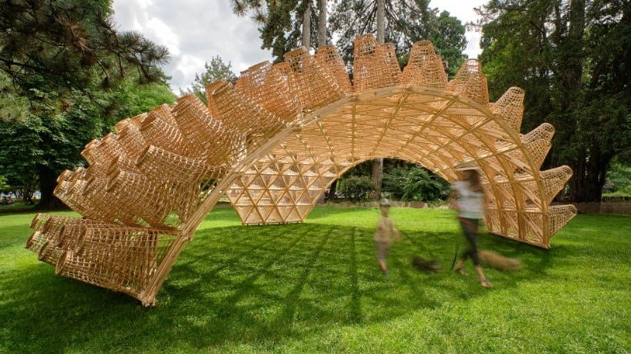
There exists a parametric architecture style which firmly follows one of the principles of design that is “rhythm” and is not perplexing yet it is unique and will be progressive in coming decades.
So, design cannot be perplexing when done under the canopy of principles of design it can have different perspectives when viewed through different pinholes.
Conclusion
The misconception enrooted in the community for abstract or parametric designs has been perplexing and not considered to be perspectively sound, should soon be eradicated for innovations in the designing industry.
Perspective designs being different from each other have their seated audience to praise the respective designs. Very common hearing, if you are in the designing field is that “design is perspective, every designer has their design statement” and hence design can be perspectively different but can never – ever be perplexing to vision.
So next time whenever you see a design not so regular in structure or shape, give a pause look at the design, you will get that symmetry of vision which we usually find in those regular structures rather you will find the design is not perplexing, it’s very interesting.
