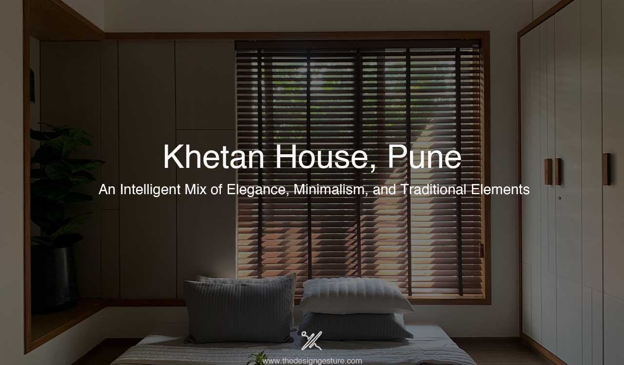
Project Location: Pune
Area: 2000 Sq.Ft.
Year of Completion: January 2023
Architect: Semblance Design Studio – Shreya Khetan
Photography: Shreya Khetan
Khetan House 301 is nestled in the heart of Pune city. The 4BHK living space is designed for a family of 6 individuals, Shreya (the co-designer/architect of the project), her parents, elder sister and grandparents. The family wanted a house that was spacious, airy and well lit. They envisioned their living space to feel warm, minimal and humble with contemporary Indian features.
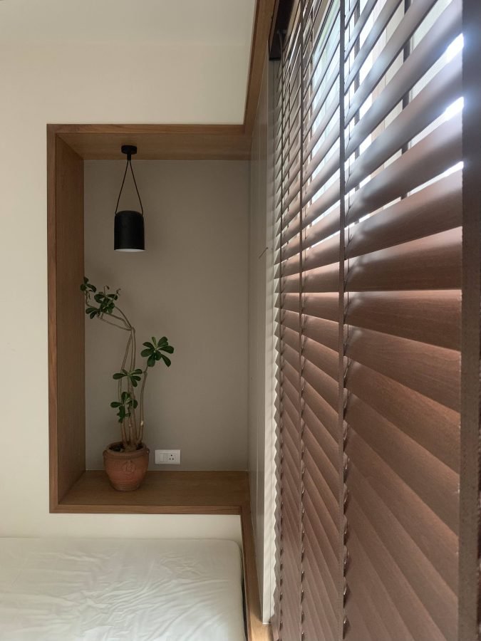
The designer picked a basic traditional Indian material and colour palette for the house; Green Kota stone for flooring and bathroom dado, Black Kadappa stone for terrace flooring, bronze wood for furniture, cement sheet for panels and cream white plastered walls. These materials give the house a traditional yet contemporary look and bound it into one cohesive unit.
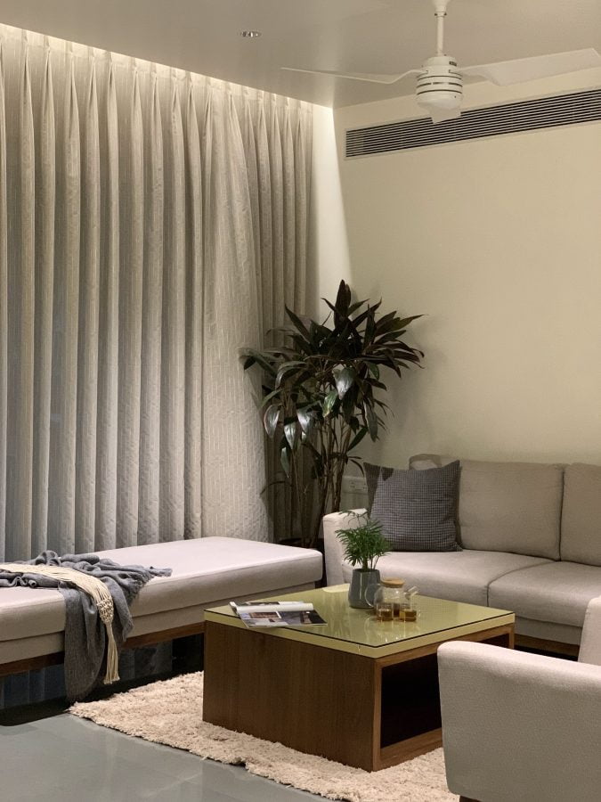
The subdued colour palettes featuring neutral tones such as whites, greys, and beiges set the stage for understated sophistication. The use of natural materials like wood and stone add warmth to the spaces, creating a serene and inviting atmosphere.


Simplicity and functionality, finds a harmonious expression in this contemporary Indian home. Clutter-free spaces, unadorned walls, and sleek furniture with clean lines characterize the minimalistic approach.
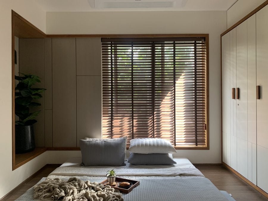
The Khetan house emphasizes spatial efficiency, optimizing every inch of available space. Multi-functional furniture and hidden storage solutions contribute to a clean and uncluttered environment. Traditional seating arrangements like low-height wooden deck are reimagined with a modern twist, offering comfort and functionality in compact living spaces.
Some changes in the standard layout that the designer made to customise the house as per the client’s requirements while also making the spaces more functionally efficient are as follows:
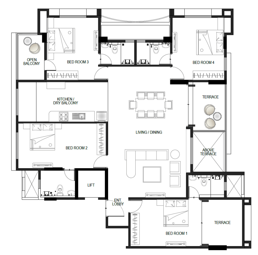

Table of Contents
Changes in the living and dining layout
A space for the temple (indicated in blue) is scooped out by borrowing space from the kitchen and bedroom 2. Proportions of the living room are changed to make it more square-like than rectangular. This prevents the unnecessarily large space from getting wasted while also making it more intimate.
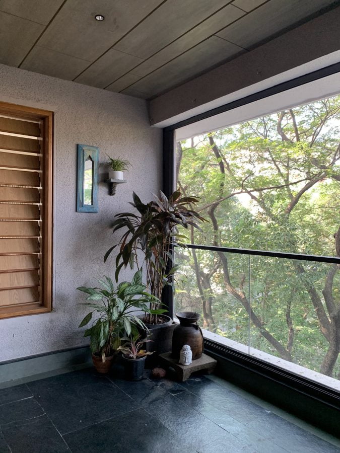
The terrace area of Khetan House is increased to add greenery and view to the space. This also enables the clients to expand the living room area during parties and social gatherings.



Changes in Bedroom 1 (Master Bedroom) layout of Khetan House
The entrance lobby area is increased to make it more welcoming and grand. A walk-in-wardrobe is introduced as a separate dressing area with attached bathroom for easy access. The new bathroom entrance position would also help prevent foul odor from entering the room thereby keeping the room fresh at all times.
While designing this part of the house, the designer planned it in a way that it could be detached from the rest of the house and be let out as a separate studio apartment in future if required. This would be achieved by simply changing the location of the entrance door, placing it in between the living room and entrance lobby. The entrance would then function as a common lobby in between the two separate apartments.


Changes in Bedroom 3 (The Architect’s Room)
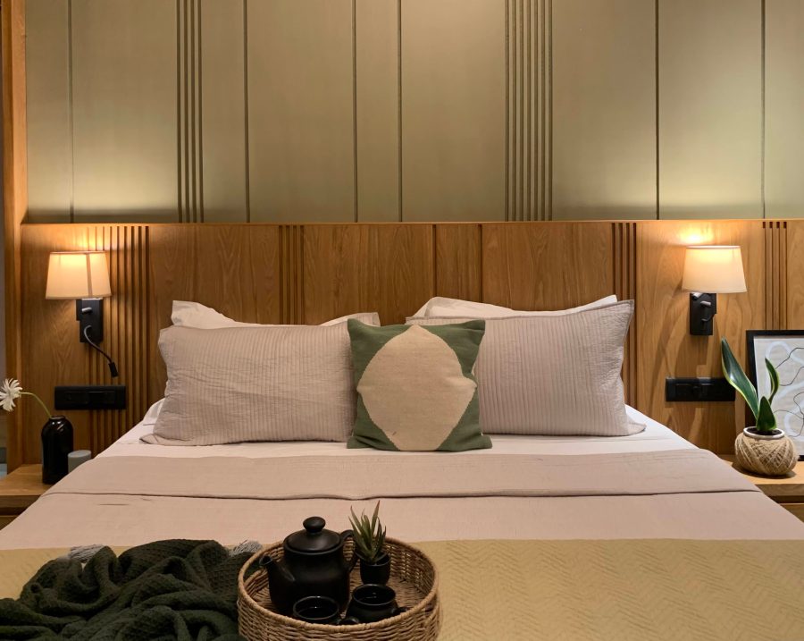
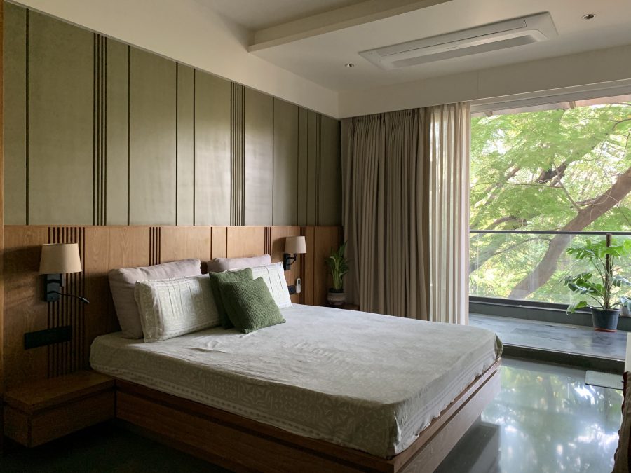
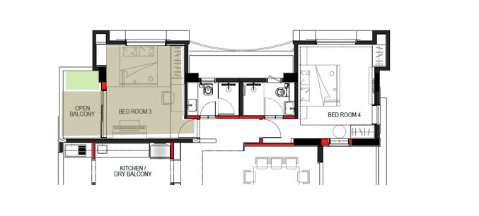
The room is designed to serve as a space to hold small musical gatherings around piano performances, a hobby of the architect’s, while also being her sleeping, work and yoga space.
The wall in between the balcony and the room is replaced with a sleek sliding glass door to allow the interior and exterior spaces to merge making the room bigger to accommodate a bigger group.
The designer introduced a deck bed that functions as a traditional Indian seating during the musical performances. It also allows more space to accommodate an upright piano, a wardrobe and a spacious work station.



Changes in Bedroom 4 (Grandparents’ Bedroom)
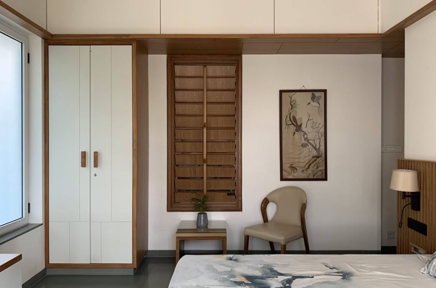
The passage area is taken into the room to allow an indirect entrance to the bathroom preventing foul smell from entering the room. This also freed up the wall space inside the room to accommodate the bed.
As this bedroom has no balcony, the wall in between the living room terrace and the bedroom is opened up by providing a traditional Indian louvered window.


The marriage of subtle elegance, minimalism, and a careful infusion of traditional elements within a contemporary framework of this house resulted in a captivating and harmonious design aesthetic. This approach respects the past, embraces the present, and paves the way for a timeless and sophisticated living environment. It reflects the evolution of design sensibilities, where tradition and modernity not only coexist but complement each other in a delicate dance of form and function.


