Table of Contents
Introduction
The buildings and architecture of Chicago have influenced and reflected the history of American architecture. The man-made environment of Chicago reflects the city’s history and multicultural heritage, featuring prominent buildings in a variety of styles by many important architects. Chicago buildings are noted for their originality rather than their antiquity. Many architects have constructed landmark buildings of varying styles in Chicago. Among them are the so-called “Chicago 7”: James Ingo Freed, Tom Beeby, Larry Booth, Stuart Cohen, James Nagle, Stanley Tigerman, and Ben Weese.
History of Chicago
The Great Chicago Fire in 1871 killed 300 people, destroyed about 3.3 square miles, and left over 100,000 residents homeless. However, by that time Chicago had become the world’s fastest-growing city and its population had risen over 300,000 inhabitants. The fire meant these ambitious citizens had to start again. With admirable strength, the city was reborn from the ashes and some of Chicago’s best architecture was constructed immediately after. Since then, Chicago has only continued adding value to its urban grid and new buildings have been progressively enhancing the city’s beautiful skyline.
Frank Lloyd Wright’s Prairie School influenced both building design and the design of furnishings. In the early half of the 20th century, popular residential neighbourhoods were developed with Chicago Bungalow style houses, many of which still exist. A two-flat includes two apartments, each of which occupies a full floor, usually with a large bay window and with a grey stone or red brick facade. The apartments typically have the same layout with a large living and dining room area at the front, the kitchen at the back, and the bedrooms running down one side of the unit.
Architecture, design, and art lovers, here’s a list of all the mesmerizing places in the city of Chicago that will make you plan a vacation ASAP.
Examples of famous Chicago Architecture
Modern Wing, Art Institute of Chicago

Brief
The Art Institute of Chicago, one of the oldest and largest museums in the United States, was founded in 1879. The new Modern Wing is being built between Michigan Avenue and Columbus Drive; at the northeast corner of the block the Art Institute of Chicago currently occupies. The addition will complete the cultural, urban campus of the museum. On the first floor, a day-lit court is flanked by new educational facilities, public amenities, galleries, and a garden. The second and third floors are dedicated to art and the viewing of art. The third floor will be completely lit by natural light.
Design Process/Style
Limestone, a material used in the construction of the entire museum from its original Beaux arts palace to recent additions, rises from the ground like a topographic relief, massive and solid, as though it has always been there. The Modern Wing shelter will give the museum what it needs in terms of light, much as the open lattice of the Pritzker Pavilion gives shelter to the Great Lawn in terms of sound. Flying above the art pavilion will be a shelter that filters the sun to create the natural shaded light conditions ideal for the enjoyment of art.
Aqua Tower
Brief
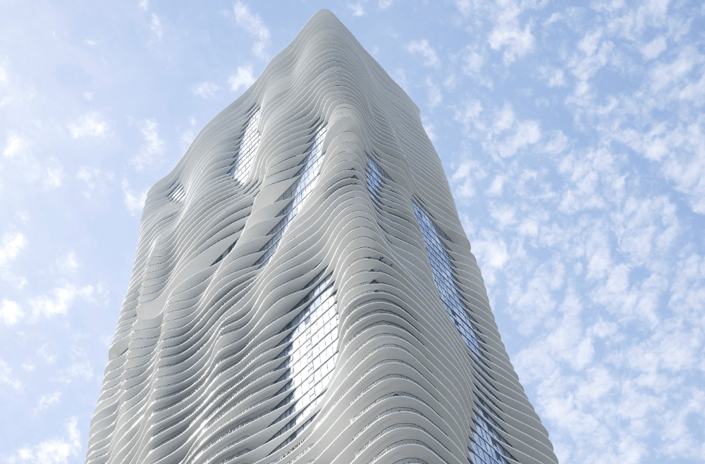
The best 21st-century addition to Chicago’s skyline, Aqua Tower starts with a venerable and well-worn Chicago high-rise trope: the Modernist glass box. But Gang’s design adds sculptured whorls of concrete floor slabs that extend beyond the glass facade. The design was inspired by the striated limestone outcroppings common in the Great Lakes area. But this sinuous shape is not just a mere formal gesture, but it is also a strategy to extend the views and maximize solar shading.
Design Process/Style
These concrete slabs are fenced off as balconies for the building’s apartments, offices and hotel units. Each is custom-designed to give visitors and residents better access to skyline views of the surrounding Loop and Lake Michigan. Together, across 82 stories, they appear to ripple like water. It has got the following amenities: 82-story mixed-use residential tower (819 ft), 215 hotels rooms, 476 rental residential units, 263 condominium units and penthouses, 55,000 sq. ft of retail and office space and 6 levels of underground parking.
Apple Store, Michigan Avenue
Brief
Inspired by the pulse of Chicago’s artistic energy, designed by Architects Fosters+Partners, Apple has created a new platform for performance in a city charged by music. Pioneer Court is an urban plaza steeped in Chicago history. It is the spot where Point de Sable–the founding father of Chicago–first lived and worked. Apple Michigan Avenue sits atop a wide new public stair, created to lead down from the plaza to the river. The gentle descent of levels creates active spaces where people can connect, create, and experience the city and river together.
Design Process/Style
As the interior steps down to the river, it acts as a seating space around the Forum–the hub of Today at Apple and a live source of creativity, education and entertainment. The stairway transitions seamlessly between the outside and inside. It passes through the building’s walls–dematerialized to pure glass–and connects to the store’s buzzing centre, sheltered by an impossibly thin carbon fibre roof, supported on slender stainless-steel columns.
Apple Michigan Avenue is about removing boundaries between inside and outside, reviving important urban connections within the city. It unites a historic city plaza that had been cut off from the water, giving Chicago a dynamic new arena that flows effortlessly down to the river. The design of Apple Michigan Avenue embodies this in its structure and materiality with a glass wall that dissolves into the background, revealing the only visible element of the building–its floating carbon fibre roof.
Robie House
Brief
One of Frank Lloyd Wright’s most favoured projects, the Robie House in Hyde Park, is a culmination of his long-simmering meditation on Midwestern landscapes, and precedes when he departed off to more abstracted experiments such as Fallingwater. It has become emblematic of the architect’s Prairie Style. The Robie House creates a clever arrangement of public and private spaces, slowly distancing itself from the street in a series of horizontal planes. By creating overlaps of the planes with this gesture, it allowed for interior space expanded towards the outdoors while still giving the space a level of enclosure.
Design Process/Style
The prairie has a beauty of its own and we should recognize and accentuate this natural beauty, its quiet level. Hence, gently sloping roofs, low proportions, quiet sky lines, suppressed heavy-set chimneys and sheltering overhangs, low terraces and out-reaching walls sequestering private gardens. As is seen in many of Wright’s project, the entrance of the house is not clearly distinguishable at first glance because Wright believed the procession towards the house should involve a journey.
Inside is a classic Wright composition of dark wood, stained glass and custom-designed high-backed chairs. The house was built for a bicycle and motorcycle manufacturer and was included on the very first National Register of Historic Places list in 1966. Made of artfully composed horizontal lines of red brick and limestone, the strong terraced layers resemble stratified rock. The protrusions of windows on the East and West facade, along with low ceilings, emphasized the long axis of the house and directed views towards the outside. These windows were also stretched on French doors along the entire south wall on the main level, opening up to a balcony.
Willis Tower
Brief
Towering over the windy city of Chicago, the Willis Tower was once the tallest building in the world upon its completion in 1973. The design also had to incorporate extra office space for the expected future growth of the company. The building is 108 stories tall, rising 1,450 feet above the city. The height of the building is because of spacial needs. The company analysed their current spacial needs, as well as the space needed for growth up to the year 2003, being as meticulous as determining the number of desks for personnel.
Design Process/Style
The different heights allow for the building to step back, meeting setback regulations and creating the iconic staggering effect that the building is known for. The structure system also saved ten million dollars in steel costs. Aluminium cladding was used for the structure, and the entire rest of the building was clad in bronze-tinted vision glass panels which allowed the skyscraper to receive ample natural lighting and views from every exterior wall. Completing the tower at the peak of its height are antennas that allow for local radio and television broadcasts.
The 103rd floor of the tower is the location of the famous Skydeck Chicago, which is visited by 1.3 million tourists a year. In just 60 seconds tourists can soar to the Skydeck to experience the swaying of the skyscraper on a windy day and as of 2009, look at the city beneath their feet from glass boxes that protrude from the deck.
IIT McCormick Tribune Campus Center
Brief
The McCormick Tribune Campus Center is one of only a few non-Mies designed buildings at the Illinois Institute of Technology. It also was Rem Koolhaas’ first American project. The entire complex squats under an elevated rapid-transit rail line and contains a bookstore, auditorium and food court. A stainless-steel tunnel dampens the roar of passing trains. The site was previously a heavily used student parking lot with tracks of the Green Line passing overhead. Koolhaas tracked movements of students across the lot, which led to diagonal passageways as the centre’s interior thoroughfares. Campus functions which had been spread around campus, such as the student bookstore and a post office, were relocated between these pathways.
Design Process/Style
With its canted lines, bright orange-tinted glass, and free-form intersecting planes, the building is easy to cast as an arrogant boom-era misfit. But despite Koolhaas’ intellectual Deconstructivist rigour, the structure shows true reverence for Mies van der Rohe’s university campus. A major design challenge was the noise of the Green Line tracks passing over the lot. The solution was to enclose a 160 m section of the tracks in a stainless-steel tube passing over the building. The tube’s support structure is completely independent of the building’s, to minimize vibration passing between them.
Rectilinear right angles have broken apart and reconfigured to create a procession of sculptural spaces, creating quiet study nooks, as well as bright public spaces. A small patch of prairie grasses on a depressed roof garden (visible from the inside) provides relief from the building’s raw, rough materials and dot-matrix glass murals. The university wanted an architecturally significant building to add onto its original main campus, which is home to the densest concentration of buildings designed by Ludwig Mies van der Rohe in the world.
Rookery Building
Brief
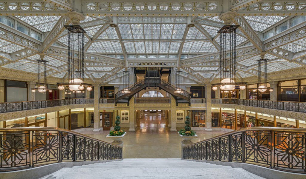
Designed by architects Daniel Burnham and John Wellborn Root of Burnham and Root in 1888, it is one of their masterpiece buildings, and was once the location of their offices. This is an 11-storey office, featuring a red granite base with a Romanesque entrance arch. The building is essentially a cube with a hollow core. Its hybrid structural system uses both load-bearing masonry and steel framing. The building is 181 feet in height, 12 stories tall, and is considered the oldest standing high-rise in Chicago. It has a unique construction style featuring exterior load-bearing walls and an interior steel frame, providing a transition between accepted and new building techniques.
Design Process/Style
Prodigiously using light and ornamentation, Root and Burnham designed a central light court to serve as the focal point for the entire building and provide daylight to interior offices. Rising two stories, the light court received immediate critical acclaim. A reinforced concrete slab that provided the building’s weight with a solid platform atop Chicago’s notoriously swampy soil. The term for the type of foundation that Root designed is grillage foundation, a foundation where iron rails and the structural beams are combined in a crisscross pattern and encased in concrete to support the building’s immense weight without heavy foundation stones.
The building is a combination of Roman Revival and Queen Anne styles that embraced Richardsonian Romanesque architecture. Aside from the first two floors of metal-framed perimeter walls, the walls are all masonry. The building is known for its semi-circular staircase west of the light court.
Jay Pritzker Pavilion
Brief
Designed by Architects Gehry Partners, Jay Pritzker Pavilion is an open-air venue featuring performances by the Grant Park Symphony Orchestra, as well as jazz, blues, and other world music performances. The Pavilion is a highly sculptural design element clad in stainless steel panels. Large glass doors allow the Pavilion to be used during winter months for public functions including banquets, receptions, and lectures. A decorative lighting system enhances the Pavilion with coloured light washes and projections during evening performances.
Design Process/Style
The main seating area accommodates up to 4,000 people in fixed seats and is located immediately next to the Pavilion. Beyond the main seating area, a lawn area can seat up to an additional 7,000 people in a more informal seating. The Pavilion is located atop a 3-level underground parking structure. A bus way and metro rail tracks which run next to Millennium Park pass beneath the Pavilion at the lowest level of the parking structure.
Joe & Rika Mansueto Library

Brief
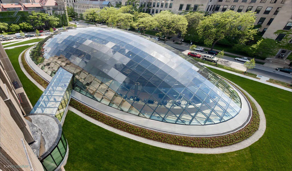
Designed by Architects Murphy/Jahn this site in the centre of the University of Chicago Campus is surrounded by a variety of different buildings with a mixture of styles, ranging from the gothic quadrangle to the south, the Limestone Brutalism of Netsch’s Regenstein Library to the east, the Henry Moore monument and Legorreta’s colourful Student Housing to the north. The people-oriented spaces could thus be at grade in a minimal elliptical glass dome, which fits the context, because it defies conventional relationships.
Design Process/Style
The structural grid-shell of 120 x 240 feet and the insulated glazing represent a very minimal and intelligent system for mediating between the varying exterior conditions and the desired interior comfort. At the interior, there is a seamless integration between lighting, air supply and furnishings, which were fabricated in solid European White Oak.
Sullivan Center
Brief
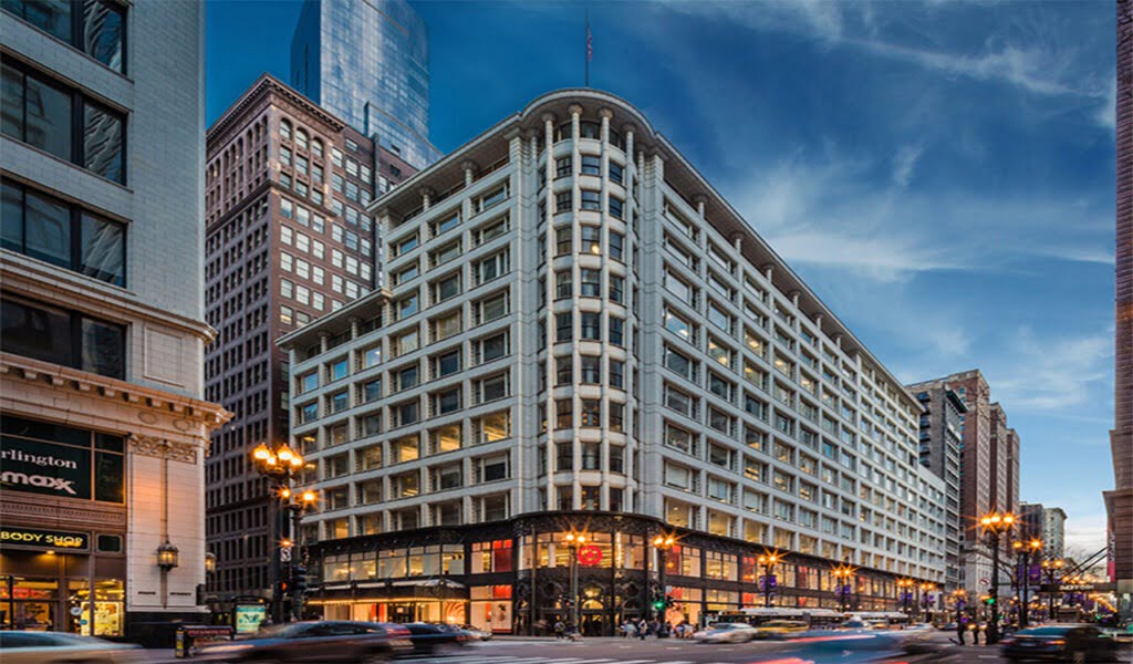
The Sullivan Center, formerly known as the Carson, Pirie, Scott and Company Building, is a commercial building at 1 South State Street at the corner of East Madison Street in Chicago. This commercial behemoth by Louis Sullivan embodies many design traditions that have made Chicago an architectural epicentre. Formerly the Carson Pirie Scott and Co. Building, the structure is clad in white terracotta. It is one of the best examples of the city’s embrace of this fire-resistant material after the Great Fire of 1871.
Design Process/Style
The building is remarkable for its steel-framed structure, which allowed a dramatic increase in window area created by bay-wide windows, which in turn allowed for the greatest amount of daylight into the building interiors. This steel framed structure uses the post-and-lintel technique to provide a strong, light, and fireproof steel skeleton. The exterior of the building consists of a grid of piers and spandrels that reveals the post-and-lintel technique that supports the building. The ground floor is covered in a dark cast iron swirl of nature-inspired reliefs, creating a three-dimensional mural of abstracted leaves, branches, and fruits.


